- Power BI forums
- Updates
- News & Announcements
- Get Help with Power BI
- Desktop
- Service
- Report Server
- Power Query
- Mobile Apps
- Developer
- DAX Commands and Tips
- Custom Visuals Development Discussion
- Health and Life Sciences
- Power BI Spanish forums
- Translated Spanish Desktop
- Power Platform Integration - Better Together!
- Power Platform Integrations (Read-only)
- Power Platform and Dynamics 365 Integrations (Read-only)
- Training and Consulting
- Instructor Led Training
- Dashboard in a Day for Women, by Women
- Galleries
- Community Connections & How-To Videos
- COVID-19 Data Stories Gallery
- Themes Gallery
- Data Stories Gallery
- R Script Showcase
- Webinars and Video Gallery
- Quick Measures Gallery
- 2021 MSBizAppsSummit Gallery
- 2020 MSBizAppsSummit Gallery
- 2019 MSBizAppsSummit Gallery
- Events
- Ideas
- Custom Visuals Ideas
- Issues
- Issues
- Events
- Upcoming Events
- Community Blog
- Power BI Community Blog
- Custom Visuals Community Blog
- Community Support
- Community Accounts & Registration
- Using the Community
- Community Feedback
Register now to learn Fabric in free live sessions led by the best Microsoft experts. From Apr 16 to May 9, in English and Spanish.
- Power BI forums
- Issues
- Issues
- filled map rendering problem
- Subscribe to RSS Feed
- Mark as New
- Mark as Read
- Bookmark
- Subscribe
- Printer Friendly Page
- Report Inappropriate Content
filled map rendering problem
Hi,
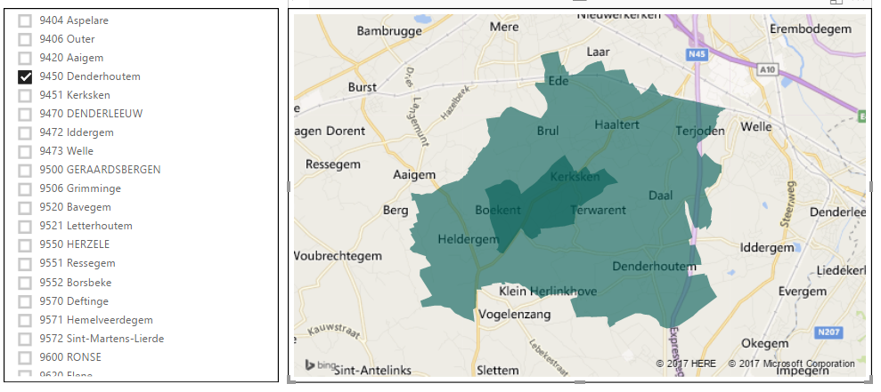
There seems to be a rendering problem in the filled map.
The problem happens when a boundary of an area has another area in it that has to be excluded.
I have a problem with that for a few postcodes in Belgium.
Using the Bing SDK to get the boundaries for postcode '9450, Belgium', the result is as follows (as it should be):
however, in the filled map in Power BI, the area is rendered as:
The inner (darker) area should not be filled while the filled map visual fills it 'twice' (it seems that Power BI first fills the 'outer' area completely and then once again fills the 'inner' area.
Is this a known 'issue' with the Filled Map and will it soon be solved ?
Regards,
Dries
You must be a registered user to add a comment. If you've already registered, sign in. Otherwise, register and sign in.
-
 v-xiaoyan-msft
on:
Frequent "Cache.Key is denied" Refresh Failure on ...
- mrmossevig on: Fabric Capacity App fails to load with 'An error o...
-
 v-yetao1-msft
on:
Something went wrong endless loop
-
 v-xiaoyan-msft
on:
Slicer bug?
-
Element115
 on:
BUG::SLICER::IDbConnection interface
- spindive on: Possible Bug with Rounding
-
 v-xiaoyan-msft
on:
export to excel
-
 v-xiaoyan-msft
on:
Is there any way to see the full name of the colum...
- Lingaraj-Mishra on: Issue with Client Credentials Grant Type for Power...
- MattSwan on: Multi-Select Possible in Filter Panel even when Re...
- New 7,841
- Needs Info 3,356
- Investigating 3,135
- Accepted 2,039
- Declined 38
- Delivered 3,749
-
Reports
9,670 -
Dashboards
3,903 -
Data Modeling
3,857 -
Gateways
2,042 -
Report Server
2,001 -
APIS and Embedding
1,884 -
Custom Visuals
1,670 -
Content Packs
502 -
Mobile
347 -
Need Help
11 -
Show and Tell
2 -
General Comment
2 -
Tips and Tricks
1 -
Power BI Desktop
1

