Go To
- Power BI forums
- Updates
- News & Announcements
- Get Help with Power BI
- Desktop
- Service
- Report Server
- Power Query
- Mobile Apps
- Developer
- DAX Commands and Tips
- Custom Visuals Development Discussion
- Health and Life Sciences
- Power BI Spanish forums
- Translated Spanish Desktop
- Power Platform Integration - Better Together!
- Power Platform Integrations (Read-only)
- Power Platform and Dynamics 365 Integrations (Read-only)
- Training and Consulting
- Instructor Led Training
- Dashboard in a Day for Women, by Women
- Galleries
- Community Connections & How-To Videos
- COVID-19 Data Stories Gallery
- Themes Gallery
- Data Stories Gallery
- R Script Showcase
- Webinars and Video Gallery
- Quick Measures Gallery
- 2021 MSBizAppsSummit Gallery
- 2020 MSBizAppsSummit Gallery
- 2019 MSBizAppsSummit Gallery
- Events
- Ideas
- Custom Visuals Ideas
- Issues
- Issues
- Events
- Upcoming Events
- Community Blog
- Power BI Community Blog
- Custom Visuals Community Blog
- Community Support
- Community Accounts & Registration
- Using the Community
- Community Feedback
Turn on suggestions
Auto-suggest helps you quickly narrow down your search results by suggesting possible matches as you type.
Showing results for
Register now to learn Fabric in free live sessions led by the best Microsoft experts. From Apr 16 to May 9, in English and Spanish.
- Power BI forums
- Issues
- Issues
- X-axis sort order breaks when adding legend in sca...
Idea Options
- Subscribe to RSS Feed
- Mark as New
- Mark as Read
- Bookmark
- Subscribe
- Printer Friendly Page
- Report Inappropriate Content
X-axis sort order breaks when adding legend in scatter chart
Submitted by
ed-freeman
 on
03-26-2020
05:19 AM
Hi there,
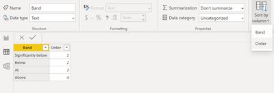
I'm trying to use a scatter chart with a categorical x-axis (i.e. it's more of a dot-plot than a scatter chart). I have sorted the values in my x-axis by an "order" column like below:
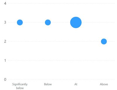
When I apply it to the x-axis on my scatter chart, it's fine:
However, when I add certain fields as a legend to that chart, the order sometimes becomes out of whack somehow:
Does anyone know why this may be happening?
Thanks,
Ed
See more ideas labeled with:
Comments
You must be a registered user to add a comment. If you've already registered, sign in. Otherwise, register and sign in.
Latest Comments
-
 v-xiaoyan-msft
on:
Frequent "Cache.Key is denied" Refresh Failure on ...
- mrmossevig on: Fabric Capacity App fails to load with 'An error o...
-
 v-yetao1-msft
on:
Something went wrong endless loop
-
 v-xiaoyan-msft
on:
Slicer bug?
-
Element115
 on:
BUG::SLICER::IDbConnection interface
- spindive on: Possible Bug with Rounding
-
 v-xiaoyan-msft
on:
export to excel
-
 v-xiaoyan-msft
on:
Is there any way to see the full name of the colum...
- Lingaraj-Mishra on: Issue with Client Credentials Grant Type for Power...
- MattSwan on: Multi-Select Possible in Filter Panel even when Re...
Idea Statuses
- New 7,842
- Needs Info 3,356
- Investigating 3,135
- Accepted 2,039
- Declined 38
- Delivered 3,749
-
Reports
9,670 -
Dashboards
3,903 -
Data Modeling
3,857 -
Gateways
2,042 -
Report Server
2,001 -
APIS and Embedding
1,885 -
Custom Visuals
1,670 -
Content Packs
502 -
Mobile
347 -
Need Help
11 -
Show and Tell
2 -
General Comment
2 -
Tips and Tricks
1 -
Power BI Desktop
1


