- Power BI forums
- Updates
- News & Announcements
- Get Help with Power BI
- Desktop
- Service
- Report Server
- Power Query
- Mobile Apps
- Developer
- DAX Commands and Tips
- Custom Visuals Development Discussion
- Health and Life Sciences
- Power BI Spanish forums
- Translated Spanish Desktop
- Power Platform Integration - Better Together!
- Power Platform Integrations (Read-only)
- Power Platform and Dynamics 365 Integrations (Read-only)
- Training and Consulting
- Instructor Led Training
- Dashboard in a Day for Women, by Women
- Galleries
- Community Connections & How-To Videos
- COVID-19 Data Stories Gallery
- Themes Gallery
- Data Stories Gallery
- R Script Showcase
- Webinars and Video Gallery
- Quick Measures Gallery
- 2021 MSBizAppsSummit Gallery
- 2020 MSBizAppsSummit Gallery
- 2019 MSBizAppsSummit Gallery
- Events
- Ideas
- Custom Visuals Ideas
- Issues
- Issues
- Events
- Upcoming Events
- Community Blog
- Power BI Community Blog
- Custom Visuals Community Blog
- Community Support
- Community Accounts & Registration
- Using the Community
- Community Feedback
Register now to learn Fabric in free live sessions led by the best Microsoft experts. From Apr 16 to May 9, in English and Spanish.
- Power BI forums
- Forums
- Get Help with Power BI
- Desktop
- Unable to draw multiple lines on line chart correc...
- Subscribe to RSS Feed
- Mark Topic as New
- Mark Topic as Read
- Float this Topic for Current User
- Bookmark
- Subscribe
- Printer Friendly Page
- Mark as New
- Bookmark
- Subscribe
- Mute
- Subscribe to RSS Feed
- Permalink
- Report Inappropriate Content
Unable to draw multiple lines on line chart correctly
Alright, it's been a month now and I am exausted in looking for a solution online. I believe I have tried all the known solutions. Let me describe the problem below
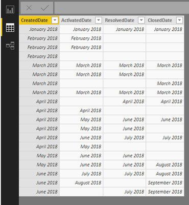
I have a simple table
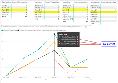
If I do matrix on this table, I got following results (and they are right):
However, if I try to place those values on line chart, numbers messed up
This is my settings for line chart
What magic needs to be done so that numbers are displayed correctly on line chart as in martix? Please advise whoever faced the same problem in PowerBi. Thanks!
- Mark as New
- Bookmark
- Subscribe
- Mute
- Subscribe to RSS Feed
- Permalink
- Report Inappropriate Content
Hi Miguel,
I have understood your DAX function. Sincerely thankful for your help in this.
Cheers!
- Mark as New
- Bookmark
- Subscribe
- Mute
- Subscribe to RSS Feed
- Permalink
- Report Inappropriate Content
Hi @aznariy,
The question you have is related with the row context of your data. When you place one of the date columns on your chart as axis, this set the context of the chart so the count of the dates is not made by the value of each date but by the one that you place on the axis.
What I mean with this is that since you are using the Createdate as your axis, if you have 7 records with CrreatedDate for january 1st all of the others columns are also 7 records you will never get the count of january 2nd because your context is the createdate.
On the matrix / table since you are using the other date columns for context you have the correct results.
You need to do the following:
- Create a calendar table
- Create inactive relationship between the calendar table and all your date columns
- Create the following measures:
Create =
CALCULATE (
    COUNT ( Table1[CreatedDate] );
    USERELATIONSHIP ( Table1[CreatedDate]; 'Calendar'[Date] )
)


Activated =
CALCULATE (
    COUNT ( Table1[ActivatedDate] );
    USERELATIONSHIP ( Table1[ActivatedDate]; 'Calendar'[Date] )
)


Closed =
CALCULATE (
    COUNT ( Table1[ClosedDate] );
    USERELATIONSHIP ( Table1[ClosedDate]; 'Calendar'[Date] )
)


Resolved =
CALCULATE (
    COUNT ( Table1[ResolvedDate] );
    USERELATIONSHIP ( Table1[ResolvedDate]; 'Calendar'[Date] )
)
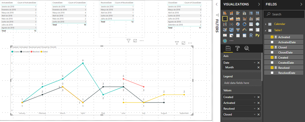
- Use your calendar table as a x-axis and add your measures to the values the end result is below:
If you need sample of PBIX file please tell.
Regards,
MFelix
Regards
Miguel Félix
Did I answer your question? Mark my post as a solution!
Proud to be a Super User!
Check out my blog: Power BI em Português- Mark as New
- Bookmark
- Subscribe
- Mute
- Subscribe to RSS Feed
- Permalink
- Report Inappropriate Content
Hi,
Appreciate if you could share the PBIX file. Thank you!
- Mark as New
- Bookmark
- Subscribe
- Mute
- Subscribe to RSS Feed
- Permalink
- Report Inappropriate Content
Hi @e0318476 ,
Please check the PBIX file attach.
Regards
Miguel Félix
Did I answer your question? Mark my post as a solution!
Proud to be a Super User!
Check out my blog: Power BI em Português- Mark as New
- Bookmark
- Subscribe
- Mute
- Subscribe to RSS Feed
- Permalink
- Report Inappropriate Content
Hi MFelix,
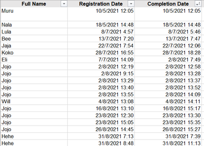
Thank you for your reply. I am working on a file and I am having issues to solve it after viewing your PBIX. Would really appreciate if you could help me with this dataset.
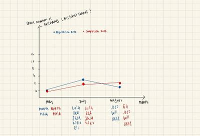
With the sample set above, I would like to acheive this result:
Thank you!
- Mark as New
- Bookmark
- Subscribe
- Mute
- Subscribe to RSS Feed
- Permalink
- Report Inappropriate Content
Hi @e0318476
Check the file attach.
Regards
Miguel Félix
Did I answer your question? Mark my post as a solution!
Proud to be a Super User!
Check out my blog: Power BI em Português- Mark as New
- Bookmark
- Subscribe
- Mute
- Subscribe to RSS Feed
- Permalink
- Report Inappropriate Content
Hi Miguel,
I am facing issues with drilling down my data. For example, I want to look at who have registered for a course the month of July. When I click on the graph, it does not give a drill down of the names.
Please help if possible. Thanks!
- Mark as New
- Bookmark
- Subscribe
- Mute
- Subscribe to RSS Feed
- Permalink
- Report Inappropriate Content
Hi @e0318476 ,
The question here is context since you are not using the full name that is not part of the measures you are using for the line chart you don't get the result you need.
You need to add the data context to your calculation. Add the following measure:
Count rows =
COUNTROWS (
    FILTER (
        SUMMARIZE (
            'Table',
            'Table'[Full Name],
            'Table'[Completion Date],
            'Table'[Registration Date]
        ),
        'Table'[Completion Date]
            IN VALUES ( 'calendar'[Date] )
                || 'calendar'[Completion] IN VALUES ( 'calendar'[Date] )
    )
)
Top char the same has yours, bottom chart with trhe measure above.
Regards
Miguel Félix
Did I answer your question? Mark my post as a solution!
Proud to be a Super User!
Check out my blog: Power BI em PortuguêsHelpful resources

Microsoft Fabric Learn Together
Covering the world! 9:00-10:30 AM Sydney, 4:00-5:30 PM CET (Paris/Berlin), 7:00-8:30 PM Mexico City

Power BI Monthly Update - April 2024
Check out the April 2024 Power BI update to learn about new features.

| User | Count |
|---|---|
| 112 | |
| 97 | |
| 85 | |
| 67 | |
| 59 |
| User | Count |
|---|---|
| 150 | |
| 120 | |
| 100 | |
| 87 | |
| 68 |
