- Power BI forums
- Updates
- News & Announcements
- Get Help with Power BI
- Desktop
- Service
- Report Server
- Power Query
- Mobile Apps
- Developer
- DAX Commands and Tips
- Custom Visuals Development Discussion
- Health and Life Sciences
- Power BI Spanish forums
- Translated Spanish Desktop
- Power Platform Integration - Better Together!
- Power Platform Integrations (Read-only)
- Power Platform and Dynamics 365 Integrations (Read-only)
- Training and Consulting
- Instructor Led Training
- Dashboard in a Day for Women, by Women
- Galleries
- Community Connections & How-To Videos
- COVID-19 Data Stories Gallery
- Themes Gallery
- Data Stories Gallery
- R Script Showcase
- Webinars and Video Gallery
- Quick Measures Gallery
- 2021 MSBizAppsSummit Gallery
- 2020 MSBizAppsSummit Gallery
- 2019 MSBizAppsSummit Gallery
- Events
- Ideas
- Custom Visuals Ideas
- Issues
- Issues
- Events
- Upcoming Events
- Community Blog
- Power BI Community Blog
- Custom Visuals Community Blog
- Community Support
- Community Accounts & Registration
- Using the Community
- Community Feedback
Register now to learn Fabric in free live sessions led by the best Microsoft experts. From Apr 16 to May 9, in English and Spanish.
- Power BI forums
- Issues
- Issues
- Line chart bug when inserting markers
- Subscribe to RSS Feed
- Mark as New
- Mark as Read
- Bookmark
- Subscribe
- Printer Friendly Page
- Report Inappropriate Content
Line chart bug when inserting markers
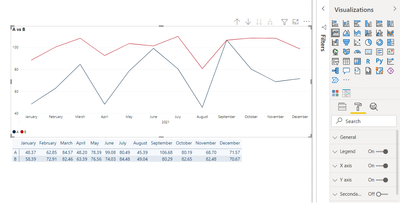
I've recently noticed that there is this strange thing happening while using line charts.
So I need to compare A to B with two lines, I drop them to the chart area using just one axis (secondary is off) and I immediately notice the red line is way too high.
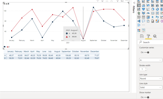
After switching on and off the secondary axis, the situation changes a little, but 49 is way too high for where it is:
I need to insert markers though…
the start of the axis had disappeared and the numbers don't look correct.
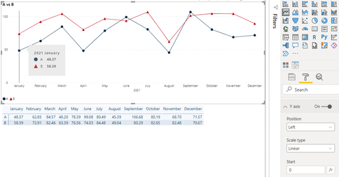
Even if I make the axis start with 0, 58.39 is still too high for my taste 🙂
If I transform it to the line and clustered column chart, all works just fine:
Does anyone have any clue on how to resolve it?
Thanks!
Maria
You must be a registered user to add a comment. If you've already registered, sign in. Otherwise, register and sign in.
-
 v-xiaoyan-msft
on:
Power BI Embedded with DirectLake Dataset Error
- aschkan on: Alarm button in Power BI Service not named correct...
-
 v-yetao1-msft
on:
Unable to create new dataflows Power BI GCC tenant
- OlgaBlesa on: Los filtros Aplicados en un objeto visual no se ac...
-
 v-xiaoyan-msft
on:
Frequent "Cache.Key is denied" Refresh Failure on ...
- mrmossevig on: Fabric Capacity App fails to load with 'An error o...
-
 v-yetao1-msft
on:
Something went wrong endless loop
-
 v-xiaoyan-msft
on:
Slicer bug?
-
Element115
 on:
BUG::SLICER::IDbConnection interface
- spindive on: Possible Bug with Rounding
- New 7,838
- Needs Info 3,355
- Investigating 3,138
- Accepted 2,039
- Declined 38
- Delivered 3,751
-
Reports
9,670 -
Dashboards
3,903 -
Data Modeling
3,857 -
Gateways
2,042 -
Report Server
2,001 -
APIS and Embedding
1,885 -
Custom Visuals
1,670 -
Content Packs
502 -
Mobile
347 -
Need Help
11 -
Show and Tell
2 -
General Comment
2 -
Tips and Tricks
1 -
Power BI Desktop
1


