Go To
- Power BI forums
- Updates
- News & Announcements
- Get Help with Power BI
- Desktop
- Service
- Report Server
- Power Query
- Mobile Apps
- Developer
- DAX Commands and Tips
- Custom Visuals Development Discussion
- Health and Life Sciences
- Power BI Spanish forums
- Translated Spanish Desktop
- Power Platform Integration - Better Together!
- Power Platform Integrations (Read-only)
- Power Platform and Dynamics 365 Integrations (Read-only)
- Training and Consulting
- Instructor Led Training
- Dashboard in a Day for Women, by Women
- Galleries
- Community Connections & How-To Videos
- COVID-19 Data Stories Gallery
- Themes Gallery
- Data Stories Gallery
- R Script Showcase
- Webinars and Video Gallery
- Quick Measures Gallery
- 2021 MSBizAppsSummit Gallery
- 2020 MSBizAppsSummit Gallery
- 2019 MSBizAppsSummit Gallery
- Events
- Ideas
- Custom Visuals Ideas
- Issues
- Issues
- Events
- Upcoming Events
- Community Blog
- Power BI Community Blog
- Custom Visuals Community Blog
- Community Support
- Community Accounts & Registration
- Using the Community
- Community Feedback
Turn on suggestions
Auto-suggest helps you quickly narrow down your search results by suggesting possible matches as you type.
Showing results for
Register now to learn Fabric in free live sessions led by the best Microsoft experts. From Apr 16 to May 9, in English and Spanish.
- Power BI forums
- Issues
- Issues
- Line and Clustered Column Chart no displaying prop...
Idea Options
- Subscribe to RSS Feed
- Mark as New
- Mark as Read
- Bookmark
- Subscribe
- Printer Friendly Page
- Report Inappropriate Content
0
Line and Clustered Column Chart no displaying properly in PBI Service
Submitted by
basont
on
11-24-2020
07:48 AM
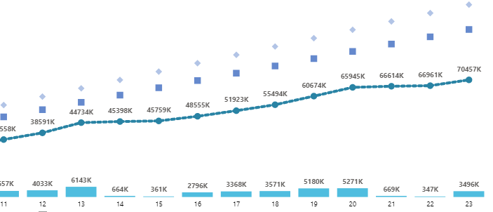
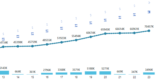
Since the update at the end of October, my visuals with multiple lines in a Line and Clustered column visual has not been displaying properly in Service. My second and third lines look as if something else is running through them.
This is how the chart looks in Desktop
and this is how it looks in Service
I have tried changing the shape type and size and nothing seems to improve what we see in service.
Any ideas or work arounds?
Thanks,
Tammy
See more ideas labeled with:
Comments
You must be a registered user to add a comment. If you've already registered, sign in. Otherwise, register and sign in.
Latest Comments
- spindive on: Possible Bug with Rounding
-
 v-xiaoyan-msft
on:
export to excel
-
 v-xiaoyan-msft
on:
Is there any way to see the full name of the colum...
-
 v-xiaoyan-msft
on:
Issue with Client Credentials Grant Type for Power...
- MattSwan on: Multi-Select Possible in Filter Panel even when Re...
-
 v-xiaoyan-msft
on:
TypeConversionFailure when not trying to convert
-
 Idrissshatila
on:
Power Query Filter Rows Basic UI bug
-
 v-yetao1-msft
on:
Wrong french translation for "reader" permission
-
 v-yetao1-msft
on:
'Select All' option in a slicer is not intuitive w...
- MurtoMan on: Bug in quick filter in PBI Desktop
Idea Statuses
- New 7,841
- Needs Info 3,356
- Investigating 3,134
- Accepted 2,036
- Declined 38
- Delivered 3,747
-
Reports
9,669 -
Dashboards
3,902 -
Data Modeling
3,856 -
Gateways
2,041 -
Report Server
2,001 -
APIS and Embedding
1,882 -
Custom Visuals
1,670 -
Content Packs
502 -
Mobile
347 -
Need Help
11 -
Show and Tell
2 -
General Comment
2 -
Tips and Tricks
1 -
Power BI Desktop
1

