- Power BI forums
- Updates
- News & Announcements
- Get Help with Power BI
- Desktop
- Service
- Report Server
- Power Query
- Mobile Apps
- Developer
- DAX Commands and Tips
- Custom Visuals Development Discussion
- Health and Life Sciences
- Power BI Spanish forums
- Translated Spanish Desktop
- Power Platform Integration - Better Together!
- Power Platform Integrations (Read-only)
- Power Platform and Dynamics 365 Integrations (Read-only)
- Training and Consulting
- Instructor Led Training
- Dashboard in a Day for Women, by Women
- Galleries
- Community Connections & How-To Videos
- COVID-19 Data Stories Gallery
- Themes Gallery
- Data Stories Gallery
- R Script Showcase
- Webinars and Video Gallery
- Quick Measures Gallery
- 2021 MSBizAppsSummit Gallery
- 2020 MSBizAppsSummit Gallery
- 2019 MSBizAppsSummit Gallery
- Events
- Ideas
- Custom Visuals Ideas
- Issues
- Issues
- Events
- Upcoming Events
- Community Blog
- Power BI Community Blog
- Custom Visuals Community Blog
- Community Support
- Community Accounts & Registration
- Using the Community
- Community Feedback
Register now to learn Fabric in free live sessions led by the best Microsoft experts. From Apr 16 to May 9, in English and Spanish.
- Power BI forums
- Issues
- Issues
- Graph formats percentage from tabular model as dec...
- Subscribe to RSS Feed
- Mark as New
- Mark as Read
- Bookmark
- Subscribe
- Printer Friendly Page
- Report Inappropriate Content
Graph formats percentage from tabular model as decimal while table gets it right
Hi,
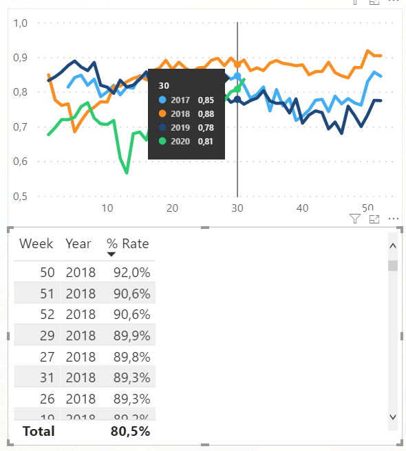
I'm using a tabular model on Azure Analysis Services, which has a few measures formatted as percentage. These measures display correctly in Excel, as well as in tables in Power BI. However, when I put them in a graph, the formatting suddenly changes to decimals, while I didn't change anything to the formatting (which is also not possible in Power BI itself with a live connection).
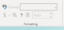
The formatting is definitely correctly set in the model itself, which also shows by the table and the formatting in Excel. I've asked help on the forum but also no luck, it was suggested to post an issue.
The two visuals below are using the exact same measure:
Power BI measure
Analysis Services Formatting
You must be a registered user to add a comment. If you've already registered, sign in. Otherwise, register and sign in.
-
 v-xiaoyan-msft
on:
Power BI Embedded with DirectLake Dataset Error
- aschkan on: Alarm button in Power BI Service not named correct...
-
mvgust
 on:
Unable to create new dataflows Power BI GCC tenant
- OlgaBlesa on: Los filtros Aplicados en un objeto visual no se ac...
-
 v-xiaoyan-msft
on:
Frequent "Cache.Key is denied" Refresh Failure on ...
- mrmossevig on: Fabric Capacity App fails to load with 'An error o...
-
 v-yetao1-msft
on:
Something went wrong endless loop
-
 v-xiaoyan-msft
on:
Slicer bug?
-
Element115
 on:
BUG::SLICER::IDbConnection interface
- spindive on: Possible Bug with Rounding
- New 7,839
- Needs Info 3,355
- Investigating 3,138
- Accepted 2,039
- Declined 38
- Delivered 3,751
-
Reports
9,671 -
Dashboards
3,903 -
Data Modeling
3,858 -
Gateways
2,042 -
Report Server
2,001 -
APIS and Embedding
1,885 -
Custom Visuals
1,670 -
Content Packs
502 -
Mobile
347 -
Need Help
11 -
General Comment
2 -
Show and Tell
2 -
Power BI Desktop
1 -
Tips and Tricks
1


