- Power BI forums
- Updates
- News & Announcements
- Get Help with Power BI
- Desktop
- Service
- Report Server
- Power Query
- Mobile Apps
- Developer
- DAX Commands and Tips
- Custom Visuals Development Discussion
- Health and Life Sciences
- Power BI Spanish forums
- Translated Spanish Desktop
- Power Platform Integration - Better Together!
- Power Platform Integrations (Read-only)
- Power Platform and Dynamics 365 Integrations (Read-only)
- Training and Consulting
- Instructor Led Training
- Dashboard in a Day for Women, by Women
- Galleries
- Community Connections & How-To Videos
- COVID-19 Data Stories Gallery
- Themes Gallery
- Data Stories Gallery
- R Script Showcase
- Webinars and Video Gallery
- Quick Measures Gallery
- 2021 MSBizAppsSummit Gallery
- 2020 MSBizAppsSummit Gallery
- 2019 MSBizAppsSummit Gallery
- Events
- Ideas
- Custom Visuals Ideas
- Issues
- Issues
- Events
- Upcoming Events
- Community Blog
- Power BI Community Blog
- Custom Visuals Community Blog
- Community Support
- Community Accounts & Registration
- Using the Community
- Community Feedback
Register now to learn Fabric in free live sessions led by the best Microsoft experts. From Apr 16 to May 9, in English and Spanish.
- Power BI forums
- Issues
- Issues
- Display issues with multirow card with text values...
- Subscribe to RSS Feed
- Mark as New
- Mark as Read
- Bookmark
- Subscribe
- Printer Friendly Page
- Report Inappropriate Content
Display issues with multirow card with text values (category missing, incorrect order of fields)
I was trying to use the multi-row card to display several measures in my dashboard and it came to a point where I have to use it as a makeshift label. To my surprise, the multi-row card doesn't play nice with text values in measures.
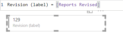
This is the measure that I am trying to display in the multi-row card. Notice how the category label ("Revision (label)" seemingly disappear.
The [Reports Revised] measure is just a simple COUNTROWS measure, with a whole number format value. The category label displays properly in this case.
I then swapped it with a number-to-text converted [Error Rate] measure to test if it's working fine (I can use percentages just fine, but please note that I have to combine both measures in a format similar to the first screenshot). This time, the category label does not display properly.
Below is the multicard with several measures displayed. The first measure displayed is the text-value [Revision (label)] measure, the other is a number-value [Reports Reviewed] measure. Due note that in the Fields pane of the visual, the first item there is the [Reports Reviewed] measure and the [Revision (label)] is the last, but the [Revision (label)] measure shows up as the very first measure in the visual.
This behavior is very unusual and I would think that the visual should treat the values of whatever fields are fed into it uniformly, and that it should show them in the order that they were plugged into the visual.
You must be a registered user to add a comment. If you've already registered, sign in. Otherwise, register and sign in.
- Hari on: Admin Monitoring Workspace - Dataset has removed f...
-
 v-xiaoyan-msft
on:
Report jumps between two profile logins.
- mgast on: Conditional formatting from PowerBI Desktop is not...
- iannedrs on: Error: There is an error in XML document (1, 1).
-
 v-xiaoyan-msft
on:
Cannot share PowerBi reorts and dashboards to my o...
-
rayishome
 on:
Get External Data: Power BI semantic models throws...
-
 v-yetao1-msft
on:
Power BI Desktop April 2024 : Sort by issue. False...
-
rdnguyen
 on:
Power BI Service - NetworkConnectionIssue when sav...
-
 v-yetao1-msft
on:
Power BI semantic model account sign in for every ...
-
 Idrissshatila
on:
Timeline slicer is showing 30 & 31 March under 30 ...
- New 7,841
- Needs Info 3,356
- Investigating 3,127
- Accepted 2,036
- Declined 38
- Delivered 3,743
-
Reports
9,662 -
Dashboards
3,899 -
Data Modeling
3,853 -
Gateways
2,040 -
Report Server
2,001 -
APIS and Embedding
1,882 -
Custom Visuals
1,670 -
Content Packs
502 -
Mobile
347 -
Need Help
11 -
Show and Tell
2 -
General Comment
2 -
Tips and Tricks
1 -
Power BI Desktop
1


