- Power BI forums
- Updates
- News & Announcements
- Get Help with Power BI
- Desktop
- Service
- Report Server
- Power Query
- Mobile Apps
- Developer
- DAX Commands and Tips
- Custom Visuals Development Discussion
- Health and Life Sciences
- Power BI Spanish forums
- Translated Spanish Desktop
- Power Platform Integration - Better Together!
- Power Platform Integrations (Read-only)
- Power Platform and Dynamics 365 Integrations (Read-only)
- Training and Consulting
- Instructor Led Training
- Dashboard in a Day for Women, by Women
- Galleries
- Community Connections & How-To Videos
- COVID-19 Data Stories Gallery
- Themes Gallery
- Data Stories Gallery
- R Script Showcase
- Webinars and Video Gallery
- Quick Measures Gallery
- 2021 MSBizAppsSummit Gallery
- 2020 MSBizAppsSummit Gallery
- 2019 MSBizAppsSummit Gallery
- Events
- Ideas
- Custom Visuals Ideas
- Issues
- Issues
- Events
- Upcoming Events
- Community Blog
- Power BI Community Blog
- Custom Visuals Community Blog
- Community Support
- Community Accounts & Registration
- Using the Community
- Community Feedback
Register now to learn Fabric in free live sessions led by the best Microsoft experts. From Apr 16 to May 9, in English and Spanish.
- Power BI forums
- Issues
- Issues
- Conditional formatting for Data label colors at li...
- Subscribe to RSS Feed
- Mark as New
- Mark as Read
- Bookmark
- Subscribe
- Printer Friendly Page
- Report Inappropriate Content
Conditional formatting for Data label colors at line level
When using conditional formatting for data labels, as introduced in July 2021, the overall number is used for the calculation, instead of the line number average.
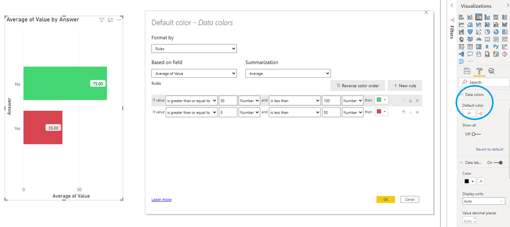
Using "data colors > default color > fx" gives the expected behavior. Bars with an average value above 50 are green, others red:
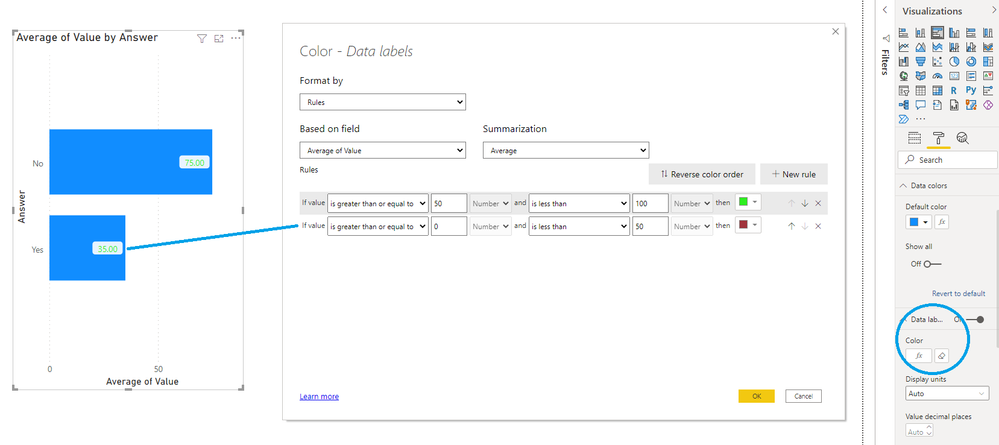
However, when choosing "data labels > color > fx", the same setup results in all data labels shown in a green font:
Expected behavior is that a bar with an average value below 50 shows a data label with a red font color.
Thus, using the context specific calculated value for that line/bar.
You must be a registered user to add a comment. If you've already registered, sign in. Otherwise, register and sign in.
- Pbloke on: On premises gateway self signed certificate now be...
- ClaretBlue on: Dashboards
- GuvenTum on: Unused Artifacts API returns already deleted artif...
-
 v-xiaoyan-msft
on:
"Sort by column" should work regardless of key col...
-
 v-xiaoyan-msft
on:
When `select all` is used, then slicer doesn't res...
-
 v-yetao1-msft
on:
Issue with April 2024 desktop - Grouping objects n...
- Bodvehio on: Mobile Layout - Background stay in White color aft...
-
 v-yetao1-msft
on:
Smart Narratives is not working for simple pie cha...
-
 v-xiaoyan-msft
on:
Urgent Report: Scam Link Exploiting Users
-
 v-yetao1-msft
on:
Small multiple Y axis values disappearing
- New 7,843
- Needs Info 3,351
- Investigating 3,117
- Accepted 2,036
- Declined 38
- Delivered 3,741
-
Reports
9,653 -
Dashboards
3,898 -
Data Modeling
3,852 -
Gateways
2,040 -
Report Server
1,998 -
APIS and Embedding
1,883 -
Custom Visuals
1,668 -
Content Packs
503 -
Mobile
347 -
Need Help
11 -
Show and Tell
2 -
General Comment
2 -
Power BI Desktop
1 -
Tips and Tricks
1

