- Power BI forums
- Updates
- News & Announcements
- Get Help with Power BI
- Desktop
- Service
- Report Server
- Power Query
- Mobile Apps
- Developer
- DAX Commands and Tips
- Custom Visuals Development Discussion
- Health and Life Sciences
- Power BI Spanish forums
- Translated Spanish Desktop
- Power Platform Integration - Better Together!
- Power Platform Integrations (Read-only)
- Power Platform and Dynamics 365 Integrations (Read-only)
- Training and Consulting
- Instructor Led Training
- Dashboard in a Day for Women, by Women
- Galleries
- Community Connections & How-To Videos
- COVID-19 Data Stories Gallery
- Themes Gallery
- Data Stories Gallery
- R Script Showcase
- Webinars and Video Gallery
- Quick Measures Gallery
- 2021 MSBizAppsSummit Gallery
- 2020 MSBizAppsSummit Gallery
- 2019 MSBizAppsSummit Gallery
- Events
- Ideas
- Custom Visuals Ideas
- Issues
- Issues
- Events
- Upcoming Events
- Community Blog
- Power BI Community Blog
- Custom Visuals Community Blog
- Community Support
- Community Accounts & Registration
- Using the Community
- Community Feedback
Register now to learn Fabric in free live sessions led by the best Microsoft experts. From Apr 16 to May 9, in English and Spanish.
- Power BI forums
- Issues
- Issues
- Combo Chart Show Data - Corrupt
- Subscribe to RSS Feed
- Mark as New
- Mark as Read
- Bookmark
- Subscribe
- Printer Friendly Page
- Report Inappropriate Content
Combo Chart Show Data - Corrupt
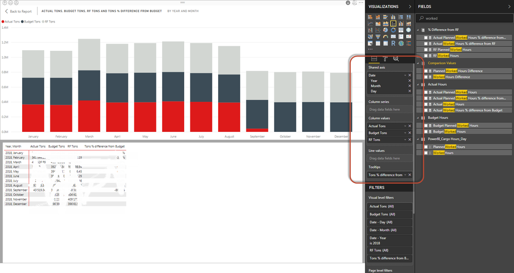
Reports that have been working for a long time now, the line and clustered column chart isno longer showing the Show Data screen correctly.
I noticed that this behavior is shown as soon as a line value is added to the chart:
The headers are no longer shown and also the data displayed is not correct. Without line values, all is good. The setting "secondary y-axis" also does not show any change to that behavior.
This happens for all kinds of data, even with dummy data. I believe this is a bug, this should be fixed asap as all combo charts in production stopped working.
You must be a registered user to add a comment. If you've already registered, sign in. Otherwise, register and sign in.
- P_Segers on: Power BI semantic model account sign in for every ...
-
 v-yetao1-msft
on:
Publish to web url not working
- gfbentes55_sema on: PROBLEM WHEN USE JSON FROM WEB WITH LATITUDE AND L...
- swift_devon on: Error when using AppSource visuals. "Something wen...
- Nameless_LW on: Slicer slider mouseover issue
- mvvessem on: Standard summarization not working
-
 v-xiaoyan-msft
on:
Data Source error: Column not found in rowset
-
 v-yetao1-msft
on:
Datamart unable to refresh due to credentials
- Pbloke on: On premises gateway self signed certificate now be...
- ClaretBlue on: Dashboards
- New 7,845
- Needs Info 3,354
- Investigating 3,120
- Accepted 2,037
- Declined 38
- Delivered 3,741
-
Reports
9,657 -
Dashboards
3,900 -
Data Modeling
3,853 -
Gateways
2,040 -
Report Server
2,000 -
APIS and Embedding
1,883 -
Custom Visuals
1,670 -
Content Packs
503 -
Mobile
347 -
Need Help
11 -
Show and Tell
2 -
General Comment
2 -
Power BI Desktop
1 -
Tips and Tricks
1

