Go To
- Power BI forums
- Updates
- News & Announcements
- Get Help with Power BI
- Desktop
- Service
- Report Server
- Power Query
- Mobile Apps
- Developer
- DAX Commands and Tips
- Custom Visuals Development Discussion
- Health and Life Sciences
- Power BI Spanish forums
- Translated Spanish Desktop
- Power Platform Integration - Better Together!
- Power Platform Integrations (Read-only)
- Power Platform and Dynamics 365 Integrations (Read-only)
- Training and Consulting
- Instructor Led Training
- Dashboard in a Day for Women, by Women
- Galleries
- Community Connections & How-To Videos
- COVID-19 Data Stories Gallery
- Themes Gallery
- Data Stories Gallery
- R Script Showcase
- Webinars and Video Gallery
- Quick Measures Gallery
- 2021 MSBizAppsSummit Gallery
- 2020 MSBizAppsSummit Gallery
- 2019 MSBizAppsSummit Gallery
- Events
- Ideas
- Custom Visuals Ideas
- Issues
- Issues
- Events
- Upcoming Events
- Community Blog
- Power BI Community Blog
- Custom Visuals Community Blog
- Community Support
- Community Accounts & Registration
- Using the Community
- Community Feedback
Turn on suggestions
Auto-suggest helps you quickly narrow down your search results by suggesting possible matches as you type.
Showing results for
Register now to learn Fabric in free live sessions led by the best Microsoft experts. From Apr 16 to May 9, in English and Spanish.
- Power BI forums
- Issues
- Issues
- Clustered bar chart with Constant Lines are not di...
Idea Options
- Subscribe to RSS Feed
- Mark as New
- Mark as Read
- Bookmark
- Subscribe
- Printer Friendly Page
- Report Inappropriate Content
0
Clustered bar chart with Constant Lines are not displaying properly in the Service
Submitted by
sdggruponabeiro
on
10-30-2020
03:36 AM
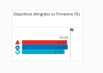
We have a report that uses a Clustered bar chart with a Constant Line to mark 100%.
Power BI Desktop
Starting this week this chart is not displaying properly in the Power BI Service (in Desktop they look fine). The charts are only displaying 3 measures with percentage values and a constant line that indicates 100 %.
Power BI Service
I also try to republish the report but it is not working at all.
Tried multiple browsers and the issue persists across all of them.
See more ideas labeled with:
Comments
You must be a registered user to add a comment. If you've already registered, sign in. Otherwise, register and sign in.
Latest Comments
- Hari on: Admin Monitoring Workspace - Dataset has removed f...
-
 v-xiaoyan-msft
on:
Report jumps between two profile logins.
- mgast on: Conditional formatting from PowerBI Desktop is not...
- iannedrs on: Error: There is an error in XML document (1, 1).
-
 v-xiaoyan-msft
on:
Cannot share PowerBi reorts and dashboards to my o...
-
rayishome
 on:
Get External Data: Power BI semantic models throws...
-
 v-yetao1-msft
on:
Power BI Desktop April 2024 : Sort by issue. False...
-
rdnguyen
 on:
Power BI Service - NetworkConnectionIssue when sav...
-
 v-yetao1-msft
on:
Power BI semantic model account sign in for every ...
-
 Idrissshatila
on:
Timeline slicer is showing 30 & 31 March under 30 ...
Idea Statuses
- New 7,841
- Needs Info 3,356
- Investigating 3,127
- Accepted 2,036
- Declined 38
- Delivered 3,743
-
Reports
9,662 -
Dashboards
3,899 -
Data Modeling
3,853 -
Gateways
2,040 -
Report Server
2,001 -
APIS and Embedding
1,882 -
Custom Visuals
1,670 -
Content Packs
502 -
Mobile
347 -
Need Help
11 -
Show and Tell
2 -
General Comment
2 -
Tips and Tricks
1 -
Power BI Desktop
1


