- Power BI forums
- Updates
- News & Announcements
- Get Help with Power BI
- Desktop
- Service
- Report Server
- Power Query
- Mobile Apps
- Developer
- DAX Commands and Tips
- Custom Visuals Development Discussion
- Health and Life Sciences
- Power BI Spanish forums
- Translated Spanish Desktop
- Power Platform Integration - Better Together!
- Power Platform Integrations (Read-only)
- Power Platform and Dynamics 365 Integrations (Read-only)
- Training and Consulting
- Instructor Led Training
- Dashboard in a Day for Women, by Women
- Galleries
- Community Connections & How-To Videos
- COVID-19 Data Stories Gallery
- Themes Gallery
- Data Stories Gallery
- R Script Showcase
- Webinars and Video Gallery
- Quick Measures Gallery
- 2021 MSBizAppsSummit Gallery
- 2020 MSBizAppsSummit Gallery
- 2019 MSBizAppsSummit Gallery
- Events
- Ideas
- Custom Visuals Ideas
- Issues
- Issues
- Events
- Upcoming Events
- Community Blog
- Power BI Community Blog
- Custom Visuals Community Blog
- Community Support
- Community Accounts & Registration
- Using the Community
- Community Feedback
Register now to learn Fabric in free live sessions led by the best Microsoft experts. From Apr 16 to May 9, in English and Spanish.
- Power BI forums
- Issues
- Issues
- ArcGIS Symbol Color <> Symbol Color for Charts Map...
- Subscribe to RSS Feed
- Mark as New
- Mark as Read
- Bookmark
- Subscribe
- Printer Friendly Page
- Report Inappropriate Content
ArcGIS Symbol Color <> Symbol Color for Charts Mapped to Same Category
Issue:
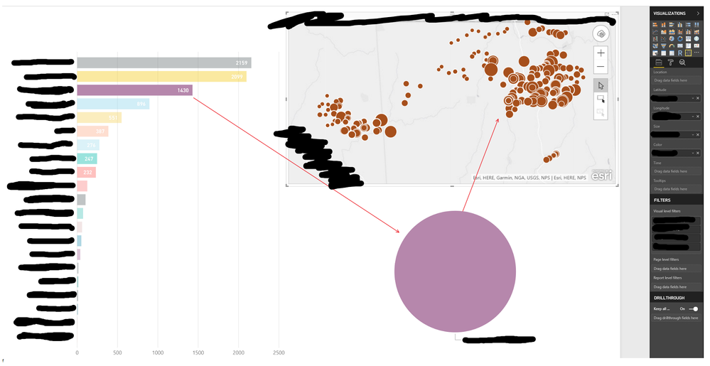
- My dashboard has 3 visuals: 2 charts, 1 ArcGIS map
- Each visual is mapped to a Category (Vendor) and a Value (Sales)
- The ArcGIS map Symbol is set to show Size & Color (Vendor is Color, Sales is Size)
- The mapping of colors to Category (Vendor) used by ArcGIS is different than the Color Scheme used by the Charts
- Thus, a "Drill down" on a specific Category (vendor) in either Chart triggers a drill-down in the ArcGIS map, but the color shown by the ArcGIS map does not match the color shown in the Charts
Attempts at resolution:
- Set the ArcGIS Symbol Color Scheme to different 'Color Ramps' -> Not effective
Requested Follow-up:
- Please advise if there is a setting I have missed and provide path to resolution
- If this is a system glitch, please advise when the glitch will be resolved
Screenshot of issue:

You must be a registered user to add a comment. If you've already registered, sign in. Otherwise, register and sign in.
- Hari on: Admin Monitoring Workspace - Dataset has removed f...
-
 v-xiaoyan-msft
on:
Report jumps between two profile logins.
- mgast on: Conditional formatting from PowerBI Desktop is not...
- iannedrs on: Error: There is an error in XML document (1, 1).
-
 v-xiaoyan-msft
on:
Cannot share PowerBi reorts and dashboards to my o...
-
rayishome
 on:
Get External Data: Power BI semantic models throws...
-
 v-yetao1-msft
on:
Power BI Desktop April 2024 : Sort by issue. False...
-
rdnguyen
 on:
Power BI Service - NetworkConnectionIssue when sav...
-
 v-yetao1-msft
on:
Power BI semantic model account sign in for every ...
-
 Idrissshatila
on:
Timeline slicer is showing 30 & 31 March under 30 ...
- New 7,841
- Needs Info 3,356
- Investigating 3,127
- Accepted 2,036
- Declined 38
- Delivered 3,743
-
Reports
9,662 -
Dashboards
3,899 -
Data Modeling
3,853 -
Gateways
2,040 -
Report Server
2,001 -
APIS and Embedding
1,882 -
Custom Visuals
1,670 -
Content Packs
502 -
Mobile
347 -
Need Help
11 -
Show and Tell
2 -
General Comment
2 -
Tips and Tricks
1 -
Power BI Desktop
1