- Power BI forums
- Updates
- News & Announcements
- Get Help with Power BI
- Desktop
- Service
- Report Server
- Power Query
- Mobile Apps
- Developer
- DAX Commands and Tips
- Custom Visuals Development Discussion
- Health and Life Sciences
- Power BI Spanish forums
- Translated Spanish Desktop
- Power Platform Integration - Better Together!
- Power Platform Integrations (Read-only)
- Power Platform and Dynamics 365 Integrations (Read-only)
- Training and Consulting
- Instructor Led Training
- Dashboard in a Day for Women, by Women
- Galleries
- Community Connections & How-To Videos
- COVID-19 Data Stories Gallery
- Themes Gallery
- Data Stories Gallery
- R Script Showcase
- Webinars and Video Gallery
- Quick Measures Gallery
- 2021 MSBizAppsSummit Gallery
- 2020 MSBizAppsSummit Gallery
- 2019 MSBizAppsSummit Gallery
- Events
- Ideas
- Custom Visuals Ideas
- Issues
- Issues
- Events
- Upcoming Events
- Community Blog
- Power BI Community Blog
- Custom Visuals Community Blog
- Community Support
- Community Accounts & Registration
- Using the Community
- Community Feedback
Register now to learn Fabric in free live sessions led by the best Microsoft experts. From Apr 16 to May 9, in English and Spanish.
- Power BI forums
- Forums
- Get Help with Power BI
- Developer
- Re: radial gauge color
- Subscribe to RSS Feed
- Mark Topic as New
- Mark Topic as Read
- Float this Topic for Current User
- Bookmark
- Subscribe
- Printer Friendly Page
- Mark as New
- Bookmark
- Subscribe
- Mute
- Subscribe to RSS Feed
- Permalink
- Report Inappropriate Content
radial gauge color
Is it possible to modify the radial gauge to change its color if the target value is greater than the value?
a kind of conditional formatting...
if the value does not reach the target value I would like the color to be red, for example, to highlight a negative delta (gap)
thanks
Solved! Go to Solution.
- Mark as New
- Bookmark
- Subscribe
- Mute
- Subscribe to RSS Feed
- Permalink
- Report Inappropriate Content
Unfortunately, Gauge seemed couldn't support dynamically change color to indicate how the value reach the target.
but there are several visuals options around the Power BI Marketplace, you can import use Tachometer, which create fraction of each color and see which color the needle (the actual value) would point
or Slim data bar KPI Visual, which the color will be read if below the target, and turned into green if it passed the target
- Mark as New
- Bookmark
- Subscribe
- Mute
- Subscribe to RSS Feed
- Permalink
- Report Inappropriate Content
Hi @salvatore
In case you haven't see it yet. Here is a tutorial on how to make the Gauge color dynamic.
This feature is almost brand new. From the June Power BI update.
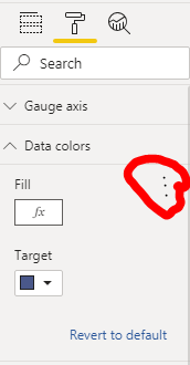
You first create a measure with 'Switch' statement to get the desired color depending on the conditions you need. and then you use this measure in the format tap as show in the following image.
I hope this will help.
- Mark as New
- Bookmark
- Subscribe
- Mute
- Subscribe to RSS Feed
- Permalink
- Report Inappropriate Content
Hi all, Good day! Thanks a lot, @jbgonzalez-I was looking for a Dynamic Gauge color solution. The youtube video shows a simple quick way to define different colors to show up for different values! 🙂
- Mark as New
- Bookmark
- Subscribe
- Mute
- Subscribe to RSS Feed
- Permalink
- Report Inappropriate Content
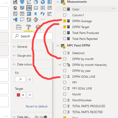
It is important to note that you must create measurements from your data so that your Color measurement has measurements to reference. I may have my lines wrong in the image, but it is to get the point across.
- Mark as New
- Bookmark
- Subscribe
- Mute
- Subscribe to RSS Feed
- Permalink
- Report Inappropriate Content
You may check the post below.
https://community.powerbi.com/t5/Desktop/Gauge-Chart-Conditional-Formatting-colours/td-p/160787
If this post helps, then please consider Accept it as the solution to help the other members find it more quickly.
- Mark as New
- Bookmark
- Subscribe
- Mute
- Subscribe to RSS Feed
- Permalink
- Report Inappropriate Content
no, unfortunately it is not what I need ... I need to be able to dynamically manage the color of the radial gauge if it is possible
- Mark as New
- Bookmark
- Subscribe
- Mute
- Subscribe to RSS Feed
- Permalink
- Report Inappropriate Content
Unfortunately, Gauge seemed couldn't support dynamically change color to indicate how the value reach the target.
but there are several visuals options around the Power BI Marketplace, you can import use Tachometer, which create fraction of each color and see which color the needle (the actual value) would point
or Slim data bar KPI Visual, which the color will be read if below the target, and turned into green if it passed the target
Helpful resources

Microsoft Fabric Learn Together
Covering the world! 9:00-10:30 AM Sydney, 4:00-5:30 PM CET (Paris/Berlin), 7:00-8:30 PM Mexico City

Power BI Monthly Update - April 2024
Check out the April 2024 Power BI update to learn about new features.

| User | Count |
|---|---|
| 14 | |
| 2 | |
| 2 | |
| 1 | |
| 1 |
| User | Count |
|---|---|
| 21 | |
| 2 | |
| 2 | |
| 2 | |
| 2 |


