- Power BI forums
- Updates
- News & Announcements
- Get Help with Power BI
- Desktop
- Service
- Report Server
- Power Query
- Mobile Apps
- Developer
- DAX Commands and Tips
- Custom Visuals Development Discussion
- Health and Life Sciences
- Power BI Spanish forums
- Translated Spanish Desktop
- Power Platform Integration - Better Together!
- Power Platform Integrations (Read-only)
- Power Platform and Dynamics 365 Integrations (Read-only)
- Training and Consulting
- Instructor Led Training
- Dashboard in a Day for Women, by Women
- Galleries
- Community Connections & How-To Videos
- COVID-19 Data Stories Gallery
- Themes Gallery
- Data Stories Gallery
- R Script Showcase
- Webinars and Video Gallery
- Quick Measures Gallery
- 2021 MSBizAppsSummit Gallery
- 2020 MSBizAppsSummit Gallery
- 2019 MSBizAppsSummit Gallery
- Events
- Ideas
- Custom Visuals Ideas
- Issues
- Issues
- Events
- Upcoming Events
- Community Blog
- Power BI Community Blog
- Custom Visuals Community Blog
- Community Support
- Community Accounts & Registration
- Using the Community
- Community Feedback
Register now to learn Fabric in free live sessions led by the best Microsoft experts. From Apr 16 to May 9, in English and Spanish.
- Power BI forums
- Forums
- Get Help with Power BI
- Developer
- Re: Visual/Report Recommendations
- Subscribe to RSS Feed
- Mark Topic as New
- Mark Topic as Read
- Float this Topic for Current User
- Bookmark
- Subscribe
- Printer Friendly Page
- Mark as New
- Bookmark
- Subscribe
- Mute
- Subscribe to RSS Feed
- Permalink
- Report Inappropriate Content
Visual/Report Recommendations
Hello.
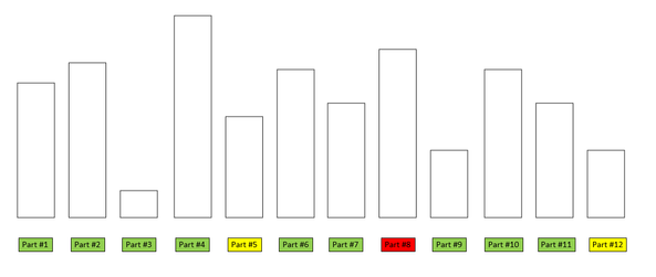
I am looking to create an electronic kanban visual using Power BI. My goal is to bring in five fields of data.
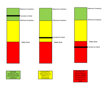
These fields will be "Item Number","Maximum Inventory", "Minimum Inventory", "Safety Inventory", and "Current Inventory".
Each Item will have unique inventory levels based on the current demand of that Item, and these levels will change based on the item number and the current demand that it is currently experiencing (Live data will be pulled).
I would like to use "bars" to visualize how each "Max Inventory" level stacks up with with the other items. (This will allow a visual of the Items that are in the highest demands).
I would like each level to be displayed with a color. Maximum Inventory = Green. Minimum Inventory = Yellow. Safety Inventory = Red. The current inventory shall be displayed with a "line" that goes accross each bar.
Finally, I would like the Item number to be displayed as a color as well based on how the Current Inventory relates to the inventory demands stated above.
I have attached visuals below for reference.
I would like this to be done in Power BI based on the number of Items that I will be needing analysis on.
If anyone has something that they have used that is similar to this, please let me know. I have experimented with the Linear Gauge that X-Viz offers, however there doesn't seem to be an easy way to enter a multitude of items into this gauge.
Thank you in advance for anyone help, I greatly appreciate it!
- Mark as New
- Bookmark
- Subscribe
- Mute
- Subscribe to RSS Feed
- Permalink
- Report Inappropriate Content
Have you considered rolling your own visual with Charticulator or Deneb ?
- Mark as New
- Bookmark
- Subscribe
- Mute
- Subscribe to RSS Feed
- Permalink
- Report Inappropriate Content
I have not. I am fairly new to BI and am not sure exactly what that means. Are you able to give me some more insight on what those tools can accomplish?
- Mark as New
- Bookmark
- Subscribe
- Mute
- Subscribe to RSS Feed
- Permalink
- Report Inappropriate Content
Helpful resources

Microsoft Fabric Learn Together
Covering the world! 9:00-10:30 AM Sydney, 4:00-5:30 PM CET (Paris/Berlin), 7:00-8:30 PM Mexico City

Power BI Monthly Update - April 2024
Check out the April 2024 Power BI update to learn about new features.

| User | Count |
|---|---|
| 16 | |
| 2 | |
| 2 | |
| 1 | |
| 1 |


