- Power BI forums
- Updates
- News & Announcements
- Get Help with Power BI
- Desktop
- Service
- Report Server
- Power Query
- Mobile Apps
- Developer
- DAX Commands and Tips
- Custom Visuals Development Discussion
- Health and Life Sciences
- Power BI Spanish forums
- Translated Spanish Desktop
- Power Platform Integration - Better Together!
- Power Platform Integrations (Read-only)
- Power Platform and Dynamics 365 Integrations (Read-only)
- Training and Consulting
- Instructor Led Training
- Dashboard in a Day for Women, by Women
- Galleries
- Community Connections & How-To Videos
- COVID-19 Data Stories Gallery
- Themes Gallery
- Data Stories Gallery
- R Script Showcase
- Webinars and Video Gallery
- Quick Measures Gallery
- 2021 MSBizAppsSummit Gallery
- 2020 MSBizAppsSummit Gallery
- 2019 MSBizAppsSummit Gallery
- Events
- Ideas
- Custom Visuals Ideas
- Issues
- Issues
- Events
- Upcoming Events
- Community Blog
- Power BI Community Blog
- Custom Visuals Community Blog
- Community Support
- Community Accounts & Registration
- Using the Community
- Community Feedback
Register now to learn Fabric in free live sessions led by the best Microsoft experts. From Apr 16 to May 9, in English and Spanish.
- Power BI forums
- Forums
- Get Help with Power BI
- Developer
- Sorting X and Y axis in Charticulator
- Subscribe to RSS Feed
- Mark Topic as New
- Mark Topic as Read
- Float this Topic for Current User
- Bookmark
- Subscribe
- Printer Friendly Page
- Mark as New
- Bookmark
- Subscribe
- Mute
- Subscribe to RSS Feed
- Permalink
- Report Inappropriate Content
Sorting X and Y axis in Charticulator
Hi everyone,
Need your help.
I created a Chart visual in Charticulator, which is looking fine in charticulator. This visual is a kind of Dot plot where X and Y axis show categorical data. But when i import this visual in Power BI , X and Y axis do not come as sorted.
Please advise.
Thanks
Solved! Go to Solution.
- Mark as New
- Bookmark
- Subscribe
- Mute
- Subscribe to RSS Feed
- Permalink
- Report Inappropriate Content
Hi @Anonymous ,
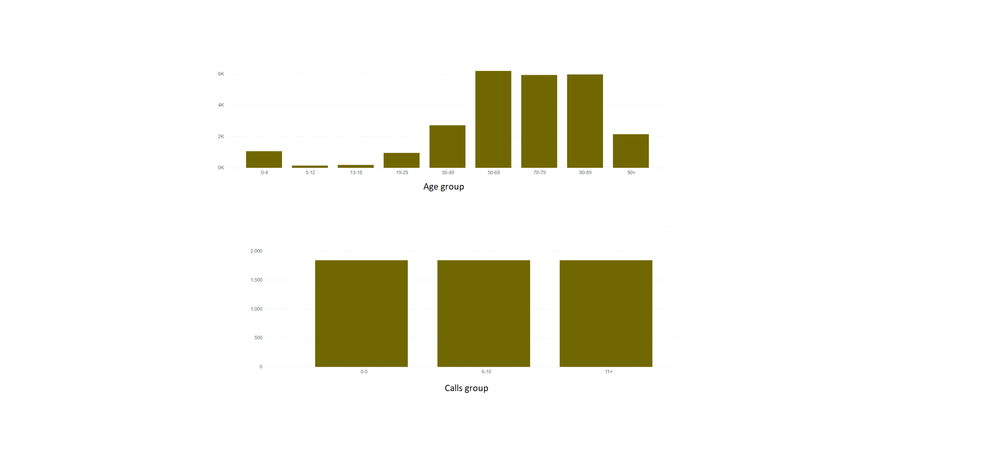
Actually, Power BI sort the text type values based on normal alphabetical order, so you would find age group 5-12 is after 30-49 and calls group 11+ is before 6-10... You can refer the content in the following links to make a custom order by creating a order table:
Sort a Column with a Custom Order in Power BI
Best Regards
If this post helps, then please consider Accept it as the solution to help the other members find it more quickly.
- Mark as New
- Bookmark
- Subscribe
- Mute
- Subscribe to RSS Feed
- Permalink
- Report Inappropriate Content
Hi @Anonymous ,
Could you please provide the related screenshots of chart visual display in Charticulator and Power BI separately? And please provide the sorting rules if it is possible. Thank you.
Best Regards
If this post helps, then please consider Accept it as the solution to help the other members find it more quickly.
- Mark as New
- Bookmark
- Subscribe
- Mute
- Subscribe to RSS Feed
- Permalink
- Report Inappropriate Content
Hi @v-yiruan-msft
Many thanks for your reply.
Here are the screenshots.
The dataset was exported from a Power BI table visual as .csv file. This table has three columns
1. Age group - This group is created in Power BI and a sort column was created to order it
2. Calls group - This group is created in Power BI and a sort column was created to order it
3. No. of calls (Power BI DAX measure)
These groups are showing up as expected in the Power BI default visuals like matrix. Showing up as sorted.
*Note - i tried to sort X and Y axis in Charticualtor which allows you to chanage the order of the X and Y axes labels. I manually reordered them with a drag-and-drop interaction.
- Mark as New
- Bookmark
- Subscribe
- Mute
- Subscribe to RSS Feed
- Permalink
- Report Inappropriate Content
Hi @Anonymous ,
Actually, Power BI sort the text type values based on normal alphabetical order, so you would find age group 5-12 is after 30-49 and calls group 11+ is before 6-10... You can refer the content in the following links to make a custom order by creating a order table:
Sort a Column with a Custom Order in Power BI
Best Regards
If this post helps, then please consider Accept it as the solution to help the other members find it more quickly.
- Mark as New
- Bookmark
- Subscribe
- Mute
- Subscribe to RSS Feed
- Permalink
- Report Inappropriate Content
Thanks for looking into it.
Age group and Calls group are Power BI groups based on Age and call columns and I have already created sort columns in Power BI and sorted Age group and Calls group by those columns. Age group and Calls group show up as sorted in Power BI default visuals.
- Mark as New
- Bookmark
- Subscribe
- Mute
- Subscribe to RSS Feed
- Permalink
- Report Inappropriate Content
Hi @Anonymous ,
If you apply this custom sort to your custom chart visual, will it also work or not?
Best Regards
If this post helps, then please consider Accept it as the solution to help the other members find it more quickly.
Helpful resources

Microsoft Fabric Learn Together
Covering the world! 9:00-10:30 AM Sydney, 4:00-5:30 PM CET (Paris/Berlin), 7:00-8:30 PM Mexico City

Power BI Monthly Update - April 2024
Check out the April 2024 Power BI update to learn about new features.

| User | Count |
|---|---|
| 12 | |
| 2 | |
| 2 | |
| 1 | |
| 1 |


