- Power BI forums
- Updates
- News & Announcements
- Get Help with Power BI
- Desktop
- Service
- Report Server
- Power Query
- Mobile Apps
- Developer
- DAX Commands and Tips
- Custom Visuals Development Discussion
- Health and Life Sciences
- Power BI Spanish forums
- Translated Spanish Desktop
- Power Platform Integration - Better Together!
- Power Platform Integrations (Read-only)
- Power Platform and Dynamics 365 Integrations (Read-only)
- Training and Consulting
- Instructor Led Training
- Dashboard in a Day for Women, by Women
- Galleries
- Community Connections & How-To Videos
- COVID-19 Data Stories Gallery
- Themes Gallery
- Data Stories Gallery
- R Script Showcase
- Webinars and Video Gallery
- Quick Measures Gallery
- 2021 MSBizAppsSummit Gallery
- 2020 MSBizAppsSummit Gallery
- 2019 MSBizAppsSummit Gallery
- Events
- Ideas
- Custom Visuals Ideas
- Issues
- Issues
- Events
- Upcoming Events
- Community Blog
- Power BI Community Blog
- Custom Visuals Community Blog
- Community Support
- Community Accounts & Registration
- Using the Community
- Community Feedback
Register now to learn Fabric in free live sessions led by the best Microsoft experts. From Apr 16 to May 9, in English and Spanish.
- Power BI forums
- Forums
- Get Help with Power BI
- Developer
- PowerBI, Conditional Formatting for Stacked Column...
- Subscribe to RSS Feed
- Mark Topic as New
- Mark Topic as Read
- Float this Topic for Current User
- Bookmark
- Subscribe
- Printer Friendly Page
- Mark as New
- Bookmark
- Subscribe
- Mute
- Subscribe to RSS Feed
- Permalink
- Report Inappropriate Content
PowerBI, Conditional Formatting for Stacked Column Chart
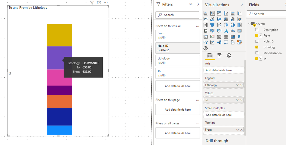
I'm a geologist and trying to create a "Stratigraphic Column" to visualize the progress of Drilling Rig and I realized that Stacked Column Chart is suitable for that visualization.
Everything is perfect except colors. Each lithology has their own color but PowerBI assign random colros to them. There is no any "Conditional Formatting" button in chart properties. That project is very critical for me, is there any code for that or is there any other tool to create something like Stratigraphic Column in PowerBI?
Thats what I want to create similar;
https://i.stack.imgur.com/5hkNI.png
This is my final progress in PowerBI;
https://i.stack.imgur.com/hHXWw.jpg
This is databse where I get data for chart;
https://i.stack.imgur.com/Qz5gG.jpg
Solved! Go to Solution.
- Mark as New
- Bookmark
- Subscribe
- Mute
- Subscribe to RSS Feed
- Permalink
- Report Inappropriate Content
Hi @Anonymous
Power BI will divide your values in different groups by legend and show different colors by gourps.
So if you add From column in Legend, power bi will divide To column by From column and show different colors.
If you want to show different colors by lithology groups, you can add lithology column into legend instead of From column. Then Power BI will show diffrent colors by lithology groups.
Best Regards,
Rico Zhou
If this post helps, then please consider Accept it as the solution to help the other members find it more quickly.
- Mark as New
- Bookmark
- Subscribe
- Mute
- Subscribe to RSS Feed
- Permalink
- Report Inappropriate Content
Hi @v-rzhou-msft , could you share if the color shading of the stacked chart is based on conditional formatting? Thanks!
- Mark as New
- Bookmark
- Subscribe
- Mute
- Subscribe to RSS Feed
- Permalink
- Report Inappropriate Content
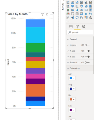
@Anonymous
If you want to apply your own colors for each unit then you will find the Colors section in the Properties and you will be able to pick any existing color or go for More... option from there:
⭕ Subscribe and learn Power BI from these videos
⚪ Website ⚪ LinkedIn ⚪ PBI User Group
Helpful resources

Microsoft Fabric Learn Together
Covering the world! 9:00-10:30 AM Sydney, 4:00-5:30 PM CET (Paris/Berlin), 7:00-8:30 PM Mexico City

Power BI Monthly Update - April 2024
Check out the April 2024 Power BI update to learn about new features.

| User | Count |
|---|---|
| 21 | |
| 2 | |
| 2 | |
| 2 | |
| 2 |


