- Power BI forums
- Updates
- News & Announcements
- Get Help with Power BI
- Desktop
- Service
- Report Server
- Power Query
- Mobile Apps
- Developer
- DAX Commands and Tips
- Custom Visuals Development Discussion
- Health and Life Sciences
- Power BI Spanish forums
- Translated Spanish Desktop
- Power Platform Integration - Better Together!
- Power Platform Integrations (Read-only)
- Power Platform and Dynamics 365 Integrations (Read-only)
- Training and Consulting
- Instructor Led Training
- Dashboard in a Day for Women, by Women
- Galleries
- Community Connections & How-To Videos
- COVID-19 Data Stories Gallery
- Themes Gallery
- Data Stories Gallery
- R Script Showcase
- Webinars and Video Gallery
- Quick Measures Gallery
- 2021 MSBizAppsSummit Gallery
- 2020 MSBizAppsSummit Gallery
- 2019 MSBizAppsSummit Gallery
- Events
- Ideas
- Custom Visuals Ideas
- Issues
- Issues
- Events
- Upcoming Events
- Community Blog
- Power BI Community Blog
- Custom Visuals Community Blog
- Community Support
- Community Accounts & Registration
- Using the Community
- Community Feedback
Register now to learn Fabric in free live sessions led by the best Microsoft experts. From Apr 16 to May 9, in English and Spanish.
- Power BI forums
- Forums
- Get Help with Power BI
- Developer
- Making a bar chart with y-axis up to 100%, but don...
- Subscribe to RSS Feed
- Mark Topic as New
- Mark Topic as Read
- Float this Topic for Current User
- Bookmark
- Subscribe
- Printer Friendly Page
- Mark as New
- Bookmark
- Subscribe
- Mute
- Subscribe to RSS Feed
- Permalink
- Report Inappropriate Content
Making a bar chart with y-axis up to 100%, but don't want entire bar
Hello,
I've been trying to make a bar graph, with the y-axis up to 100%. data is something like this:
| Location | Status | % of Status Total |
| A | Not Started | 50% |
| A | In Progress | 50% |
| A | Completed | 0% |
| B | Not Started | 100% |
| B | In Progress | 0% |
| B | Completed | 0% |
| C | Not Started | 25% |
| C | In Progress | 25% |
| C | Completed | 50% |
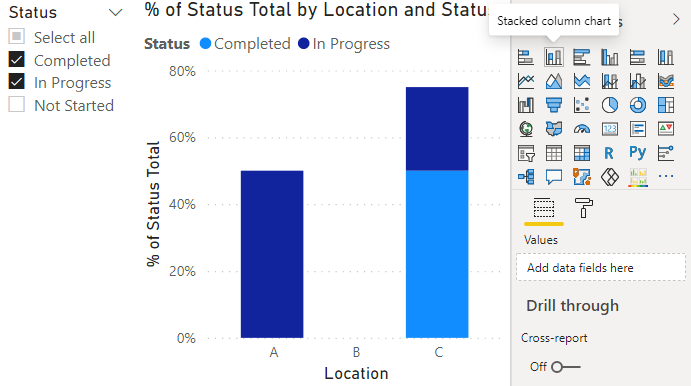
The purpose is to see the % of each category, but I only want to see only the "In Progress" and "Completed" categories. However, everytime I filter out the data, the bar fills up to 100% again, ratios adjusted.
Eg. If I filter out Not Started, location A's bar would be 100% In progress. I want it 50% In progress (bar should be half the size). Location B's bar should be empty, Location C should be 3/4 filled.
I tried using both the "100% stacked column chart" and "stacked column chart", neither works.
Right now, I made it so the data colour for Not Started = white as a temporary solution. However, it still shows up in the legend, and only works because alphabetically, it's last on the list, so the data colours don't float. I'll need a proper solution.
Anyone have any advices? Thanks!
- Mark as New
- Bookmark
- Subscribe
- Mute
- Subscribe to RSS Feed
- Permalink
- Report Inappropriate Content
Hi @shinney,
Can you please share a pbix file with some dummy data(keep similar data structure) and expected results? It should help us clarify your scenario and test to coding formula.
How to Get Your Question Answered Quickly
Regards,
Xiaoxin Sheng
If this post helps, please consider accept as solution to help other members find it more quickly.
- Mark as New
- Bookmark
- Subscribe
- Mute
- Subscribe to RSS Feed
- Permalink
- Report Inappropriate Content
I noticed where the problem is, it's in my measure, a % calculation. (Might need to create new post)
Basically, when I filter out the status, the % changes accordingly, so it reflects on the graph. I noticed this when I started using a table visual and saw the interaction.
What would be the best way to calculate the % in each group so it remains the same %s regardless of slicer?
Here's the current measure:
- Mark as New
- Bookmark
- Subscribe
- Mute
- Subscribe to RSS Feed
- Permalink
- Report Inappropriate Content
Try ALL instead of ALLSELECTED if you don't want the slicer to control the denominator.
- Mark as New
- Bookmark
- Subscribe
- Mute
- Subscribe to RSS Feed
- Permalink
- Report Inappropriate Content
A regular stacked column chart should work fine.
You don't what the 100% version because of the rescaling like you mentioned.
Helpful resources

Microsoft Fabric Learn Together
Covering the world! 9:00-10:30 AM Sydney, 4:00-5:30 PM CET (Paris/Berlin), 7:00-8:30 PM Mexico City

Power BI Monthly Update - April 2024
Check out the April 2024 Power BI update to learn about new features.

| User | Count |
|---|---|
| 12 | |
| 2 | |
| 2 | |
| 1 | |
| 1 |
| User | Count |
|---|---|
| 20 | |
| 3 | |
| 2 | |
| 2 | |
| 2 |

