- Power BI forums
- Updates
- News & Announcements
- Get Help with Power BI
- Desktop
- Service
- Report Server
- Power Query
- Mobile Apps
- Developer
- DAX Commands and Tips
- Custom Visuals Development Discussion
- Health and Life Sciences
- Power BI Spanish forums
- Translated Spanish Desktop
- Power Platform Integration - Better Together!
- Power Platform Integrations (Read-only)
- Power Platform and Dynamics 365 Integrations (Read-only)
- Training and Consulting
- Instructor Led Training
- Dashboard in a Day for Women, by Women
- Galleries
- Community Connections & How-To Videos
- COVID-19 Data Stories Gallery
- Themes Gallery
- Data Stories Gallery
- R Script Showcase
- Webinars and Video Gallery
- Quick Measures Gallery
- 2021 MSBizAppsSummit Gallery
- 2020 MSBizAppsSummit Gallery
- 2019 MSBizAppsSummit Gallery
- Events
- Ideas
- Custom Visuals Ideas
- Issues
- Issues
- Events
- Upcoming Events
- Community Blog
- Power BI Community Blog
- Custom Visuals Community Blog
- Community Support
- Community Accounts & Registration
- Using the Community
- Community Feedback
Register now to learn Fabric in free live sessions led by the best Microsoft experts. From Apr 16 to May 9, in English and Spanish.
- Power BI forums
- Forums
- Get Help with Power BI
- Developer
- Re: Display a chart showing 2 different dates on o...
- Subscribe to RSS Feed
- Mark Topic as New
- Mark Topic as Read
- Float this Topic for Current User
- Bookmark
- Subscribe
- Printer Friendly Page
- Mark as New
- Bookmark
- Subscribe
- Mute
- Subscribe to RSS Feed
- Permalink
- Report Inappropriate Content
Display a chart showing 2 different dates on one axis
Hi, I'm new to Power BI. Can you help me understand how to make a chart containing 2 different dates on one axis (for example y axis) and the supplier on the other (for example x axis)?
The aim is to insert 2 data tables: 1 for the declared dates, 1 for the actual delivery dates. So you can quickly see the suppliers who have not met the delivery date.
Do you think it makes sense? Do you have any other suggestions?
Thanks for your help!
Solved! Go to Solution.
- Mark as New
- Bookmark
- Subscribe
- Mute
- Subscribe to RSS Feed
- Permalink
- Report Inappropriate Content
Add a calendar dimension table to your data model
Make a connection from the calendar to the declared date fact table and to the effective date fact table
Use the calendar date as the x axis
Add your values to the y axis.
Your sample data is unsuitable for representation in a line chart.
- Mark as New
- Bookmark
- Subscribe
- Mute
- Subscribe to RSS Feed
- Permalink
- Report Inappropriate Content
You can have multiple Y axis series, but it's not clear how you would want to visualize this.
Please provide sanitized sample data that fully covers your issue. Paste the data into a table in your post or use one of the file services. Please show the expected outcome.
- Mark as New
- Bookmark
- Subscribe
- Mute
- Subscribe to RSS Feed
- Permalink
- Report Inappropriate Content
Thanks for the reply, I try to explain better.
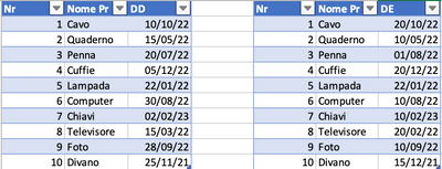
I have these two tables which contain three columns: increasing number, product, declared date / effective date. So the two tables differ only for the third column (declared date / effective date).
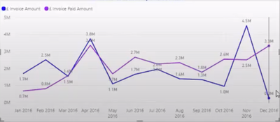
I would like to make a chart like this:
where on the x axis there is the date and on the y axis there is the product. I would obtaine two line: the line obtanied by crossing the product and the declared date and the line obtanied by crossing the product and the effective data, on this graph.
- Mark as New
- Bookmark
- Subscribe
- Mute
- Subscribe to RSS Feed
- Permalink
- Report Inappropriate Content
Add a calendar dimension table to your data model
Make a connection from the calendar to the declared date fact table and to the effective date fact table
Use the calendar date as the x axis
Add your values to the y axis.
Your sample data is unsuitable for representation in a line chart.
Helpful resources

Microsoft Fabric Learn Together
Covering the world! 9:00-10:30 AM Sydney, 4:00-5:30 PM CET (Paris/Berlin), 7:00-8:30 PM Mexico City

Power BI Monthly Update - April 2024
Check out the April 2024 Power BI update to learn about new features.

| User | Count |
|---|---|
| 13 | |
| 2 | |
| 2 | |
| 1 | |
| 1 |
| User | Count |
|---|---|
| 20 | |
| 3 | |
| 2 | |
| 2 | |
| 2 |


