- Power BI forums
- Updates
- News & Announcements
- Get Help with Power BI
- Desktop
- Service
- Report Server
- Power Query
- Mobile Apps
- Developer
- DAX Commands and Tips
- Custom Visuals Development Discussion
- Health and Life Sciences
- Power BI Spanish forums
- Translated Spanish Desktop
- Power Platform Integration - Better Together!
- Power Platform Integrations (Read-only)
- Power Platform and Dynamics 365 Integrations (Read-only)
- Training and Consulting
- Instructor Led Training
- Dashboard in a Day for Women, by Women
- Galleries
- Community Connections & How-To Videos
- COVID-19 Data Stories Gallery
- Themes Gallery
- Data Stories Gallery
- R Script Showcase
- Webinars and Video Gallery
- Quick Measures Gallery
- 2021 MSBizAppsSummit Gallery
- 2020 MSBizAppsSummit Gallery
- 2019 MSBizAppsSummit Gallery
- Events
- Ideas
- Custom Visuals Ideas
- Issues
- Issues
- Events
- Upcoming Events
- Community Blog
- Power BI Community Blog
- Custom Visuals Community Blog
- Community Support
- Community Accounts & Registration
- Using the Community
- Community Feedback
Register now to learn Fabric in free live sessions led by the best Microsoft experts. From Apr 16 to May 9, in English and Spanish.
- Power BI forums
- Forums
- Get Help with Power BI
- Developer
- Custom visual not redrawing correctly after being ...
- Subscribe to RSS Feed
- Mark Topic as New
- Mark Topic as Read
- Float this Topic for Current User
- Bookmark
- Subscribe
- Printer Friendly Page
- Mark as New
- Bookmark
- Subscribe
- Mute
- Subscribe to RSS Feed
- Permalink
- Report Inappropriate Content
Custom visual not redrawing correctly after being cross filtered by other visual!
Hi,
I'm trying to design timeline custom visual for Power BI and I have got stuck with problem where it does not redraw all data points after being filtered by another visual:
I'm newbie. Haven't done much developing before, so don't judge me too much 🙂
Here are some printscreens to ilustrate my issue:
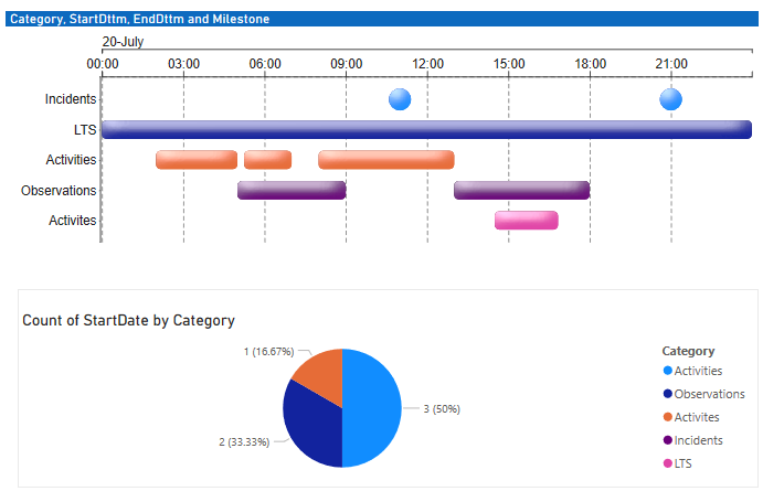
So this is how it looks without anything being filtered:
I just added piechart to filter out my timeline visual.
Then when I click a category on Piechart I get this:
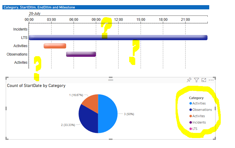
As you see from above filter is passed on ok, but problem is when I click "Activities" category again and it remove the filter. My timeline visual only redraws partially . See pic below:
The data seems to be there, cause if I print out length of my Datapoint array I get what i would expect for unfiltered dataset.
Just for whatever reason it does not draw back everything. Like if I do resizing or any other visual setting change - it redraws correctly. Only when interacting with other visual.
Other thing to notice is that depending on which category i filter using pie chart , it might draw diferent elements on my Timeline Visual. Like if I pick "Observation" category and when unckeck it - it only redraws one bar on my visual and nothing else.
Finally if i click again on piechart any free area - my visual draws back fully showing everything. But I want it to hapen on first click not like when you have to click again.
Any ideas why this keep happening?
Kind Regards,
Edgars
Solved! Go to Solution.
- Mark as New
- Bookmark
- Subscribe
- Mute
- Subscribe to RSS Feed
- Permalink
- Report Inappropriate Content
Hi @doublefacy, and thanks for the code. The good news is, you're incredibly close 🙂
I've set up a custom visual locally with your code and can reproduce. The issue is the enter() / exit() pattern you're using in the drawRangedData() and drawMilestones() functions and this doesn't "catch-up" until a subsequent update of the visual. This also means that the first time your update() function runs for a new visual, I get a blank canvas until the next update(), which is the same root cause.
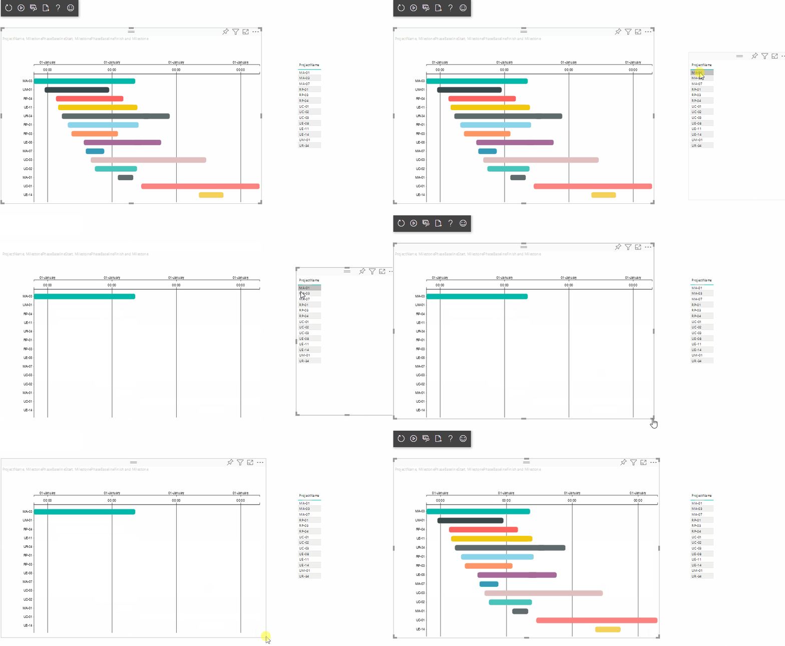
For now, I've commented out drawMilestones() so we can focus on the issue and fix it in drawRangedData(). Here's me reproducing on my machine (although I'm using a table to cross-highligh the visual it works the same way).
You'll notice the reszing 'fixes' the issue - this is because update() is run again - the "catch-up" I alluded to above.
Fixing the Pattern
It's a small tweak to fix so that it works correctly. Let's have a look at drawRangedData() - I've formatted it a little bit first but this the same as the code you've passed me:
private drawRangedData(
    canvas:Selection<any>,
    _rangedData:myDataPoint[],
    _yScale:d3.ScaleBand<string>,
    _xScale:d3.ScaleTime<any,any>
) }
    let events = canvas.selectAll(".events")
            .data(_rangedData);

    events
        .enter()
        .append("rect")
            .classed("events",true);

    events
        .attr("height",_yScale.bandwidth())
        .attr("width",d=>_xScale(d.end)-_xScale(d.start))
        .attr("y",d=>_yScale(d.name))
        .attr("x",d=>_xScale(d.start))
        .attr("rx","5")
        .attr("filter","url(#dropshadow)")
        .style("fill",d=>d.color);

    events.exit().remove();

}
If you re-write so that the enter() is assigned as a new variable and you merge() it to the existing data then it will work, e.g.:
    private drawRangedData(
        canvas:Selection<any>,
        _rangedData:myDataPoint[],
        _yScale:d3.ScaleBand<string>,
        _xScale:d3.ScaleTime<any,any>
    ) {

        let events = canvas.selectAll(".events")
            .data(_rangedData);

        let newEvents = events
            .enter()
            .append("rect")
                .classed("events",true);

        events
            .merge(newEvents)
                .attr("height",_yScale.bandwidth())
                .attr("width",d=>_xScale(d.end)-_xScale(d.start))
                .attr("y",d=>_yScale(d.name))
                .attr("x",d=>_xScale(d.start))
                .attr("rx","5")
                .attr("filter","url(#dropshadow)")
                .style("fill",d=>d.color);

        events
            .exit()
            .remove();

    }
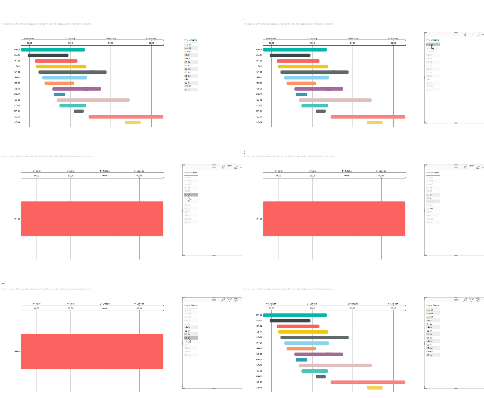
Here's the visual responding to changes now:
If you're using a version of d3 > 5.8, you can re-write this to use selection.join(), which is much simpler, e.g::
    private drawRangedData(
        canvas:Selection<any>,
        _rangedData:myDataPoint[],
        _yScale:d3.ScaleBand<string>,
        _xScale:d3.ScaleTime<any,any>
    ) {

        canvas.selectAll('.events')
            .data(_rangedData)
            .join('rect')
                .classed('events', true)
                .attr('height', _yScale.bandwidth())
                .attr('width', d =>_xScale(d.end) - _xScale(d.start))
                .attr('y', d => _yScale(d.name))
                .attr('x', d => _xScale(d.start))
                .attr('rx', 5)
                .attr('filter', 'url(#dropshadow)')
                .style('fill', d => d.color);

    }
You can then apply the same patterns to drawMilestones() also and this part should be as you expect.
Good luck!
Daniel
Did I answer your question? Mark my post as a solution!
Proud to be a Super User!
My course: Introduction to Developing Power BI Visuals
On how to ask a technical question, if you really want an answer (courtesy of SQLBI)
- Mark as New
- Bookmark
- Subscribe
- Mute
- Subscribe to RSS Feed
- Permalink
- Report Inappropriate Content
Hi @doublefacy, and wleocme aboard!
If your dataView is correct for all scenarios (i.e. the data in there is what you expect) then that means we'll need to have a look at what your code is doing, as the data going into the visual is usually the culprit - beyond that it's a little tricky to debug further than that visually.
Are you able to share your code at all? If you're just using visual.ts for your visual's logic, then that plus your capabilities.json (as it could be a feature you've enabled on in there) should be enough for us to start having a look.If you have sample data or a workbook you can share that helps reproduce the issue, then that's incredibly useful too.
I'll try and take a look as soon as I can if you're able to provide any of this and see if I can offer any assistance 🙂
Thanks,
Daniel
Did I answer your question? Mark my post as a solution!
Proud to be a Super User!
My course: Introduction to Developing Power BI Visuals
On how to ask a technical question, if you really want an answer (courtesy of SQLBI)
- Mark as New
- Bookmark
- Subscribe
- Mute
- Subscribe to RSS Feed
- Permalink
- Report Inappropriate Content
Hi,
Thank you for taking interest in my issue.
To add to previously described issue. When my visual gets filtered by interaction from another visual - it shows correctly filtered values, but when filter is removed - it only re-draws as many datapoints as there were in filtered category, just this time randomly across diferent categories. Lets say if category has 5 datapoint and you filter by that category , it shows those 5 dataoints under that category, once you remove filter and it should show all categories with lets say 20 data points - it shows only 5 across random categories. Its almost like filter doesn't get completely removed with first time.
Here is the link to my visual.ts and capabilities.json files
Custom visual files
Doesnt seem like I can attach them here.
Excuse me for bad coding - like i said I haven't done anything like this before 🙂
Other thing i noticed is that on first time load - sometimes it does not draw data points. It shows axis which are properly labeled with data and all, but no data points and only when i resize or reload or do any interaction - datapoints appear.
- Mark as New
- Bookmark
- Subscribe
- Mute
- Subscribe to RSS Feed
- Permalink
- Report Inappropriate Content
Hi @doublefacy, and thanks for the code. The good news is, you're incredibly close 🙂
I've set up a custom visual locally with your code and can reproduce. The issue is the enter() / exit() pattern you're using in the drawRangedData() and drawMilestones() functions and this doesn't "catch-up" until a subsequent update of the visual. This also means that the first time your update() function runs for a new visual, I get a blank canvas until the next update(), which is the same root cause.
For now, I've commented out drawMilestones() so we can focus on the issue and fix it in drawRangedData(). Here's me reproducing on my machine (although I'm using a table to cross-highligh the visual it works the same way).
You'll notice the reszing 'fixes' the issue - this is because update() is run again - the "catch-up" I alluded to above.
Fixing the Pattern
It's a small tweak to fix so that it works correctly. Let's have a look at drawRangedData() - I've formatted it a little bit first but this the same as the code you've passed me:
private drawRangedData(
    canvas:Selection<any>,
    _rangedData:myDataPoint[],
    _yScale:d3.ScaleBand<string>,
    _xScale:d3.ScaleTime<any,any>
) }
    let events = canvas.selectAll(".events")
            .data(_rangedData);

    events
        .enter()
        .append("rect")
            .classed("events",true);

    events
        .attr("height",_yScale.bandwidth())
        .attr("width",d=>_xScale(d.end)-_xScale(d.start))
        .attr("y",d=>_yScale(d.name))
        .attr("x",d=>_xScale(d.start))
        .attr("rx","5")
        .attr("filter","url(#dropshadow)")
        .style("fill",d=>d.color);

    events.exit().remove();

}
If you re-write so that the enter() is assigned as a new variable and you merge() it to the existing data then it will work, e.g.:
    private drawRangedData(
        canvas:Selection<any>,
        _rangedData:myDataPoint[],
        _yScale:d3.ScaleBand<string>,
        _xScale:d3.ScaleTime<any,any>
    ) {

        let events = canvas.selectAll(".events")
            .data(_rangedData);

        let newEvents = events
            .enter()
            .append("rect")
                .classed("events",true);

        events
            .merge(newEvents)
                .attr("height",_yScale.bandwidth())
                .attr("width",d=>_xScale(d.end)-_xScale(d.start))
                .attr("y",d=>_yScale(d.name))
                .attr("x",d=>_xScale(d.start))
                .attr("rx","5")
                .attr("filter","url(#dropshadow)")
                .style("fill",d=>d.color);

        events
            .exit()
            .remove();

    }
Here's the visual responding to changes now:
If you're using a version of d3 > 5.8, you can re-write this to use selection.join(), which is much simpler, e.g::
    private drawRangedData(
        canvas:Selection<any>,
        _rangedData:myDataPoint[],
        _yScale:d3.ScaleBand<string>,
        _xScale:d3.ScaleTime<any,any>
    ) {

        canvas.selectAll('.events')
            .data(_rangedData)
            .join('rect')
                .classed('events', true)
                .attr('height', _yScale.bandwidth())
                .attr('width', d =>_xScale(d.end) - _xScale(d.start))
                .attr('y', d => _yScale(d.name))
                .attr('x', d => _xScale(d.start))
                .attr('rx', 5)
                .attr('filter', 'url(#dropshadow)')
                .style('fill', d => d.color);

    }
You can then apply the same patterns to drawMilestones() also and this part should be as you expect.
Good luck!
Daniel
Did I answer your question? Mark my post as a solution!
Proud to be a Super User!
My course: Introduction to Developing Power BI Visuals
On how to ask a technical question, if you really want an answer (courtesy of SQLBI)
- Mark as New
- Bookmark
- Subscribe
- Mute
- Subscribe to RSS Feed
- Permalink
- Report Inappropriate Content
Thank you sooo much!!!!
Such a quick response too 🙂
It does work fine now - happy times 🙂 , although I still quite dont understand why it was needed, cause none of tutorials i watched or read really metioned something like this.
So as I understand this part has data that was already drawn on screen
       let events = canvas.selectAll(".events")
            .data(_rangedData);
And is this part that calculates new elements that need adding
        let newEvents = events
            .enter()
            .append("rect")
                .classed("events",true);
Just wondered if i dont use two variables why would it only draw new elements in next update call ?
How exactly merge make it happen on same update call?
I guess i will read some documentation on d3.
This all coding is new to me. I normally do SQL and DAX for building reports and then I was looking for visual that would let us project time events, but could not find one that would fit our comapany needs, so I thought will have a look into developing custom visual and that's how it started.
Thank you again, and its so great to have you Daniel in Power BI community to help newbies like me 🙂
Appreciate.
Helpful resources

Microsoft Fabric Learn Together
Covering the world! 9:00-10:30 AM Sydney, 4:00-5:30 PM CET (Paris/Berlin), 7:00-8:30 PM Mexico City

Power BI Monthly Update - April 2024
Check out the April 2024 Power BI update to learn about new features.

| User | Count |
|---|---|
| 13 | |
| 2 | |
| 2 | |
| 1 | |
| 1 |
| User | Count |
|---|---|
| 20 | |
| 3 | |
| 2 | |
| 2 | |
| 2 |


