- Power BI forums
- Updates
- News & Announcements
- Get Help with Power BI
- Desktop
- Service
- Report Server
- Power Query
- Mobile Apps
- Developer
- DAX Commands and Tips
- Custom Visuals Development Discussion
- Health and Life Sciences
- Power BI Spanish forums
- Translated Spanish Desktop
- Power Platform Integration - Better Together!
- Power Platform Integrations (Read-only)
- Power Platform and Dynamics 365 Integrations (Read-only)
- Training and Consulting
- Instructor Led Training
- Dashboard in a Day for Women, by Women
- Galleries
- Community Connections & How-To Videos
- COVID-19 Data Stories Gallery
- Themes Gallery
- Data Stories Gallery
- R Script Showcase
- Webinars and Video Gallery
- Quick Measures Gallery
- 2021 MSBizAppsSummit Gallery
- 2020 MSBizAppsSummit Gallery
- 2019 MSBizAppsSummit Gallery
- Events
- Ideas
- Custom Visuals Ideas
- Issues
- Issues
- Events
- Upcoming Events
- Community Blog
- Power BI Community Blog
- Custom Visuals Community Blog
- Community Support
- Community Accounts & Registration
- Using the Community
- Community Feedback
Register now to learn Fabric in free live sessions led by the best Microsoft experts. From Apr 16 to May 9, in English and Spanish.
- Power BI forums
- Forums
- Get Help with Power BI
- Developer
- Custom Visuals Spread Out "rect" 4 columns to the ...
- Subscribe to RSS Feed
- Mark Topic as New
- Mark Topic as Read
- Float this Topic for Current User
- Bookmark
- Subscribe
- Printer Friendly Page
- Mark as New
- Bookmark
- Subscribe
- Mute
- Subscribe to RSS Feed
- Permalink
- Report Inappropriate Content
Custom Visuals Spread Out "rect" 4 columns to the left and as many columns downwards as possible:
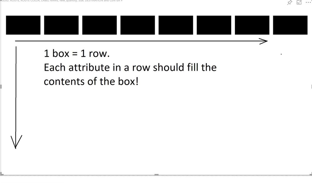
I am creating a custom visual that will append data to a rectangle like this:
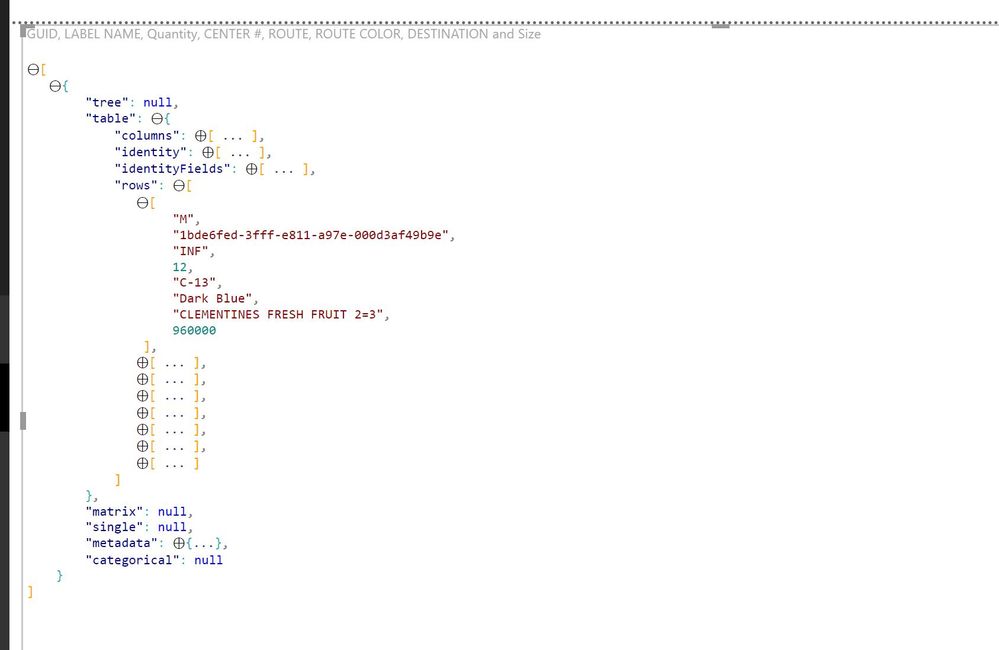
I have already bound the data from the table which looks like this:
This is how the table looks like in the unedited powerbi report:
My Visual.ts file looks like this:
module powerbi.extensibility.visual {
    interface DataPoint {
        label: string;
        name: string;
        quantity: number;
        center: number;
        route: string;
        color: string;
        destination: string;
        size: string;
    };

    interface ViewModel {
        dataPoints: DataPoint[];
    }

    export class Visual implements IVisual {

        private host: IVisualHost;
        private svg: d3.Selection<SVGAElement>;
        private labelGroup: d3.Selection<SVGAElement>;

        private xPadding: number = 0.1;
        private yPadding: number = 0.1;


        constructor(options: VisualConstructorOptions) {
            this.host = options.host;
            this.svg = d3.select(options.element)
                .append("svg")
                .classed("labels", true);
            this.labelGroup = this.svg.append("g")
                .classed("label-group", true);

        }

        public update(options: VisualUpdateOptions) {

            let viewModel = this.getViewModel(options);

            let width = options.viewport.width;
            let height = options.viewport.height;


            this.svg.attr({
                width: width,
                height: height
            });

            let numOfRows = options.dataViews[0].table.rows.length;
            let rows = options.dataViews[0].table.rows;

            let labels = this.labelGroup
                .selectAll(".label")
                .data(options.dataViews[0].table.rows);

            labels.enter()
                .append("rect")
                .classed("label", true);

            labels.attr({
                width: width / 4,
                height: height / numOfRows / 4,
                x: 0, //?
                y: 0, //?
            });

            labels.exit()
                .remove();


        }

        private getViewModel(options: VisualUpdateOptions): ViewModel {

            let dv = options.dataViews;


            let viewModel: ViewModel = {
                dataPoints: [],
            };

            if (!dv
                || !dv[0].table
                || !dv[0].table.rows
                || !dv[0].table.rows[0]
                || !dv[0].table.columns)
                return viewModel;

            let view = dv[0].table;
            let rows = view.rows;
            let values = view.columns;

            for (let i = 0, len = Math.max(rows.length, values.length); i < len; i++) {
                viewModel.dataPoints.push({
                    label: <string>rows[i][0],
                    name: <string>rows[i][1],
                    quantity: <number>rows[i][2],
                    center: <number>rows[i][3],
                    route: <string>rows[i][4],
                    color: <string>rows[i][5],
                    destination: <string>rows[i][6],
                    size: <string>rows[i][7]

                });
            }


            return viewModel;
        }


    }
}
And my capibilities.json files looks like this:
{
    "dataRoles": [
        {
            "displayName": "Label",
            "name": "label",
            "kind": "Grouping"
        },
        {
            "displayName": "Name",
            "name": "name",
            "kind": "Grouping"
        },
        {
            "displayName": "Quantity",
            "name": "quantity",
            "kind": "Grouping"
        },
        {
            "displayName": "Center",
            "name": "center",
            "kind": "Grouping"
        },
        {
            "displayName": "Route",
            "name": "route",
            "kind": "Grouping"
        },
        {
            "displayName": "Color",
            "name": "color",
            "kind": "Grouping"
        },
        {
            "displayName": "Destination",
            "name": "destination",
            "kind": "Grouping"
        },
        {
            "displayName": "Size",
            "name": "size",
            "kind": "Grouping"
        }
    ],
    "dataViewMappings": [
        {
            "table": {
                "rows": {
                    "select": [
                        {
                            "for": {
                                "in": "label"
                            }
                        },
                        {
                            "for": {
                                "in": "name"
                            }
                        },
                        {
                            "for": {
                                "in": "quantity"
                            }
                        },
                        {
                            "for": {
                                "in": "center"
                            }
                        },
                        {
                            "for": {
                                "in": "route"
                            }
                        },
                        {
                            "for": {
                                "in": "color"
                            }
                        },
                        {
                            "for": {
                                "in": "destination"
                            }
                        },
                        {
                            "for": {
                                "in": "size"
                            }
                        }
                    ]
                }
            }
        }
    ]
}
I tried using ordinal scale to achieve this, but as you can see in the picture above I've only managed to get the rectangles to go as far as possible to the left. How can I achieve this?!!
- Mark as New
- Bookmark
- Subscribe
- Mute
- Subscribe to RSS Feed
- Permalink
- Report Inappropriate Content
If I'm not mistaken you can use CSS Flex Box mode (dislay: flex) to achieve what you need.
Have a look at this article to find out more.
Ignat Vilesov,
Software Engineer
Microsoft Power BI Custom Visuals
Helpful resources

Microsoft Fabric Learn Together
Covering the world! 9:00-10:30 AM Sydney, 4:00-5:30 PM CET (Paris/Berlin), 7:00-8:30 PM Mexico City

Power BI Monthly Update - April 2024
Check out the April 2024 Power BI update to learn about new features.

| User | Count |
|---|---|
| 12 | |
| 2 | |
| 2 | |
| 1 | |
| 1 |


