- Power BI forums
- Updates
- News & Announcements
- Get Help with Power BI
- Desktop
- Service
- Report Server
- Power Query
- Mobile Apps
- Developer
- DAX Commands and Tips
- Custom Visuals Development Discussion
- Health and Life Sciences
- Power BI Spanish forums
- Translated Spanish Desktop
- Power Platform Integration - Better Together!
- Power Platform Integrations (Read-only)
- Power Platform and Dynamics 365 Integrations (Read-only)
- Training and Consulting
- Instructor Led Training
- Dashboard in a Day for Women, by Women
- Galleries
- Community Connections & How-To Videos
- COVID-19 Data Stories Gallery
- Themes Gallery
- Data Stories Gallery
- R Script Showcase
- Webinars and Video Gallery
- Quick Measures Gallery
- 2021 MSBizAppsSummit Gallery
- 2020 MSBizAppsSummit Gallery
- 2019 MSBizAppsSummit Gallery
- Events
- Ideas
- Custom Visuals Ideas
- Issues
- Issues
- Events
- Upcoming Events
- Community Blog
- Power BI Community Blog
- Custom Visuals Community Blog
- Community Support
- Community Accounts & Registration
- Using the Community
- Community Feedback
Register now to learn Fabric in free live sessions led by the best Microsoft experts. From Apr 16 to May 9, in English and Spanish.
- Power BI forums
- Forums
- Get Help with Power BI
- Developer
- Create dynamic charts
- Subscribe to RSS Feed
- Mark Topic as New
- Mark Topic as Read
- Float this Topic for Current User
- Bookmark
- Subscribe
- Printer Friendly Page
- Mark as New
- Bookmark
- Subscribe
- Mute
- Subscribe to RSS Feed
- Permalink
- Report Inappropriate Content
Create dynamic charts
Hi all,
I need to implement a dashboard that will present several bar charts based on the number of rows returned in my dataset. As illustration, my dataset is like below:
Category KPI Value
CAT1 KPI A 10
CAT1 KPI B 5
CAT2 KPI C 3
CAT3 KPI D 8
CAT3 KPI E 1
CAT3 KPI F 10
CAT3 KPI G 9
The slicer will contain the list of categories (CAT1, CAT2, CAT3). If the user selects the CAT1 on the slicer, then my dashboard needs to present 2 diferent bar charts for KPI A and KPI B. If the user selects CAT3 then the dashboard will present 4 diferent bar charts.
How to implement that? Do I need to create a custom visual? If so, is there any example to guide me?
Thanks a lot,
Guilherme Soares
- Mark as New
- Bookmark
- Subscribe
- Mute
- Subscribe to RSS Feed
- Permalink
- Report Inappropriate Content
@soaregj wrote:
Hi all,
I need to implement a dashboard that will present several bar charts based on the number of rows returned in my dataset. As illustration, my dataset is like below:
Category KPI Value
CAT1 KPI A 10
CAT1 KPI B 5
CAT2 KPI C 3
CAT3 KPI D 8
CAT3 KPI E 1
CAT3 KPI F 10
CAT3 KPI G 9
The slicer will contain the list of categories (CAT1, CAT2, CAT3). If the user selects the CAT1 on the slicer, then my dashboard needs to present 2 diferent bar charts for KPI A and KPI B. If the user selects CAT3 then the dashboard will present 4 diferent bar charts.
How to implement that? Do I need to create a custom visual? If so, is there any example to guide me?
Thanks a lot,
Guilherme Soares
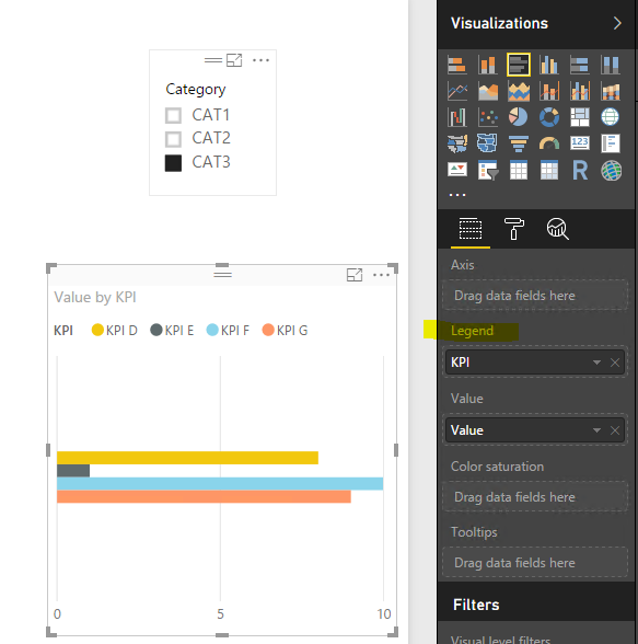
I don't think it is possible, even with custom visual. The slicer visual is for filtering data and it can't control other visuals shown/hidden.
As a workaround, instead of showing different bar charts, show the data in one chart setting the KPI as "Legend" field.
- Mark as New
- Bookmark
- Subscribe
- Mute
- Subscribe to RSS Feed
- Permalink
- Report Inappropriate Content
Thanks @Eric_Zhang. I was probably too simplistic in my example. Sorry for that.
What I need is something like in the link below. Please notice every chart is a KPI and the quantity of KPI's (charts) varies from the location selected in the ChicletSlicer, meaning the charts are dynamically created on the report.
https://drive.google.com/file/d/0B7MRYt91QJPATGd4VEEzeVpzMkE/view
Thanks,
Guilherme
Helpful resources

Microsoft Fabric Learn Together
Covering the world! 9:00-10:30 AM Sydney, 4:00-5:30 PM CET (Paris/Berlin), 7:00-8:30 PM Mexico City

Power BI Monthly Update - April 2024
Check out the April 2024 Power BI update to learn about new features.

| User | Count |
|---|---|
| 15 | |
| 2 | |
| 1 | |
| 1 | |
| 1 |

