- Power BI forums
- Updates
- News & Announcements
- Get Help with Power BI
- Desktop
- Service
- Report Server
- Power Query
- Mobile Apps
- Developer
- DAX Commands and Tips
- Custom Visuals Development Discussion
- Health and Life Sciences
- Power BI Spanish forums
- Translated Spanish Desktop
- Power Platform Integration - Better Together!
- Power Platform Integrations (Read-only)
- Power Platform and Dynamics 365 Integrations (Read-only)
- Training and Consulting
- Instructor Led Training
- Dashboard in a Day for Women, by Women
- Galleries
- Community Connections & How-To Videos
- COVID-19 Data Stories Gallery
- Themes Gallery
- Data Stories Gallery
- R Script Showcase
- Webinars and Video Gallery
- Quick Measures Gallery
- 2021 MSBizAppsSummit Gallery
- 2020 MSBizAppsSummit Gallery
- 2019 MSBizAppsSummit Gallery
- Events
- Ideas
- Custom Visuals Ideas
- Issues
- Issues
- Events
- Upcoming Events
- Community Blog
- Power BI Community Blog
- Custom Visuals Community Blog
- Community Support
- Community Accounts & Registration
- Using the Community
- Community Feedback
Register now to learn Fabric in free live sessions led by the best Microsoft experts. From Apr 16 to May 9, in English and Spanish.
- Power BI forums
- Forums
- Get Help with Power BI
- Desktop
- visual like Timeline visual but without the time a...
- Subscribe to RSS Feed
- Mark Topic as New
- Mark Topic as Read
- Float this Topic for Current User
- Bookmark
- Subscribe
- Printer Friendly Page
- Mark as New
- Bookmark
- Subscribe
- Mute
- Subscribe to RSS Feed
- Permalink
- Report Inappropriate Content
visual like Timeline visual but without the time aspect
Hi,
I am looking or some kind of timeline visual, where it is not obligated to put in time.
I just want to show values.
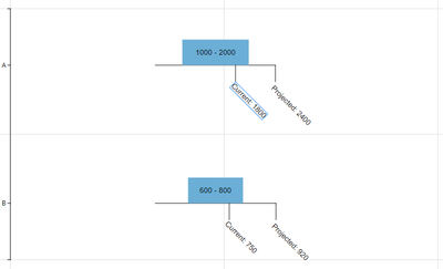
I want to show an agreed range (in blue) and then I want to add 2 markers, 1 for the current status (grey) and 1 for the expected final status. (orange).
I cannot share datasample, as it is really sensitive.
But when category is 1800-5999 as in the example, I have a dimensiontable with a column with startvalue per categorie, so 1800 in the example and a column with endvalue per category, 5999 in the example. Current and expected endvalue are simple measures.
hope anyone can help, it is really hard to google, as I don't know how to capture this in a simple search...
- Mark as New
- Bookmark
- Subscribe
- Mute
- Subscribe to RSS Feed
- Permalink
- Report Inappropriate Content
I was looking for more Charticulator practice, so I made a visual for this. See pic below. If it works for you, I added a link to a folder that has the pbiviz, along with the Charticulator template and chart files in case you need to modify. I put a category on the Y axis, but you can just Filter to one value and it will just show one.
https://drive.google.com/drive/folders/1vPaXyOs2U7oHN7C7HTH8QCXJzkPVQKPZ?usp=sharing
Regards,
Pat
Did I answer your question? Mark my post as a solution! Kudos are also appreciated!
To learn more about Power BI, follow me on Twitter or subscribe on YouTube.
@mahoneypa HoosierBI on YouTube
- Mark as New
- Bookmark
- Subscribe
- Mute
- Subscribe to RSS Feed
- Permalink
- Report Inappropriate Content
If none of the custom visuals in appsource work for you, you can build it yourself with Charticulator (or R or Python).
(2) Can You Say "Charticulator"? - I Knew You Could - Portland Power BI UG - YouTube
Regards,
Pat
Did I answer your question? Mark my post as a solution! Kudos are also appreciated!
To learn more about Power BI, follow me on Twitter or subscribe on YouTube.
@mahoneypa HoosierBI on YouTube
- Mark as New
- Bookmark
- Subscribe
- Mute
- Subscribe to RSS Feed
- Permalink
- Report Inappropriate Content
Hi, @Niki
For your case, you could try custom viusal as below :
https://appsource.microsoft.com/en-us/product/power-bi-visuals/WA200000817?tab=Overview
https://appsource.microsoft.com/en-us/product/power-bi-visuals/WA104381377?tab=Overview
https://appsource.microsoft.com/en-us/product/power-bi-visuals/WA104381136?tab=Overview
Best Regards,
Community Support Team _ Eason
- Mark as New
- Bookmark
- Subscribe
- Mute
- Subscribe to RSS Feed
- Permalink
- Report Inappropriate Content
Hi,
Thanks for your effort.
They are all just not it, first one looks really good, but doesn't giv me the option to color the bar chart properly.
Like in the example, the values should be somewhere in the range (1800 to 5999), so I would like the range to be green, before the range (<1800) orange and over the range (> 5999) to be red. This visual always starts at 0... or sums up (Stacked) To bad because it looked hopefull.
The other to are timelines which both ask for datecolumns, so not usefull.
I a looking at a gauge visual, where it is really easy to put in the colors as described before, but adding the 2 values in a similar way, and formatting them is the challenge..
KR
- Mark as New
- Bookmark
- Subscribe
- Mute
- Subscribe to RSS Feed
- Permalink
- Report Inappropriate Content
Anyone? It may also be a gauge visual. I have one where I can put the range but I cannot add 2 markers (only a actual and a target, and the target does not have te correct formatting options to make it a clear visual)
Really need this!
Helpful resources

Microsoft Fabric Learn Together
Covering the world! 9:00-10:30 AM Sydney, 4:00-5:30 PM CET (Paris/Berlin), 7:00-8:30 PM Mexico City

Power BI Monthly Update - April 2024
Check out the April 2024 Power BI update to learn about new features.

| User | Count |
|---|---|
| 110 | |
| 95 | |
| 76 | |
| 65 | |
| 51 |
| User | Count |
|---|---|
| 146 | |
| 109 | |
| 106 | |
| 88 | |
| 61 |


