- Power BI forums
- Updates
- News & Announcements
- Get Help with Power BI
- Desktop
- Service
- Report Server
- Power Query
- Mobile Apps
- Developer
- DAX Commands and Tips
- Custom Visuals Development Discussion
- Health and Life Sciences
- Power BI Spanish forums
- Translated Spanish Desktop
- Power Platform Integration - Better Together!
- Power Platform Integrations (Read-only)
- Power Platform and Dynamics 365 Integrations (Read-only)
- Training and Consulting
- Instructor Led Training
- Dashboard in a Day for Women, by Women
- Galleries
- Community Connections & How-To Videos
- COVID-19 Data Stories Gallery
- Themes Gallery
- Data Stories Gallery
- R Script Showcase
- Webinars and Video Gallery
- Quick Measures Gallery
- 2021 MSBizAppsSummit Gallery
- 2020 MSBizAppsSummit Gallery
- 2019 MSBizAppsSummit Gallery
- Events
- Ideas
- Custom Visuals Ideas
- Issues
- Issues
- Events
- Upcoming Events
- Community Blog
- Power BI Community Blog
- Custom Visuals Community Blog
- Community Support
- Community Accounts & Registration
- Using the Community
- Community Feedback
Register now to learn Fabric in free live sessions led by the best Microsoft experts. From Apr 16 to May 9, in English and Spanish.
- Power BI forums
- Forums
- Get Help with Power BI
- Desktop
- Re: unable to generate proper line chart
- Subscribe to RSS Feed
- Mark Topic as New
- Mark Topic as Read
- Float this Topic for Current User
- Bookmark
- Subscribe
- Printer Friendly Page
- Mark as New
- Bookmark
- Subscribe
- Mute
- Subscribe to RSS Feed
- Permalink
- Report Inappropriate Content
unable to generate proper line chart
Hi Colleagues,
could You please help me with the below issue I have faced?
I have a ticket database with opened and closure date (where applicable). I would like to use line chart to see how much tickets are opened and closed in a particular calendar week. For this I have converted the dates to necessary format (year/week), but when I put the "count of opened date" and "count of closed date" to the line chart, I was not sure what to use in the axis. if I put there either "opened date" or "closed date" to list there the year/week values in axis, the outcome was not proper. after that I have created a separate table only for year/week values using DISTINCT function from "opened date", and I would have used this column for axis. however, this is in different table and I cannot connect this column to both "opened date" and"closed date" in the other table since more relations are not supported. Do You know if there is an easyer method to solve this?
| ticket | opened date (YYYY/WW) | closed date (YYYY/WW) |
| a | 2019/23 | 2019/23 |
| b | 2019/24 | 2019/26 |
| c | 2019/26 | 2019/27 |
| d | 2019/26 | 2019/27 |
| e | 2019/26 | 2019/27 |
| f | 2019/28 |
thanks in advance
Solved! Go to Solution.
- Mark as New
- Bookmark
- Subscribe
- Mute
- Subscribe to RSS Feed
- Permalink
- Report Inappropriate Content
Hi @prb
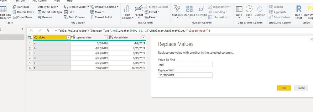
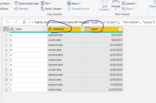
In Edit queries,
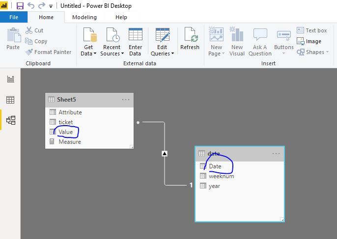
Close&&aplly, create a date table
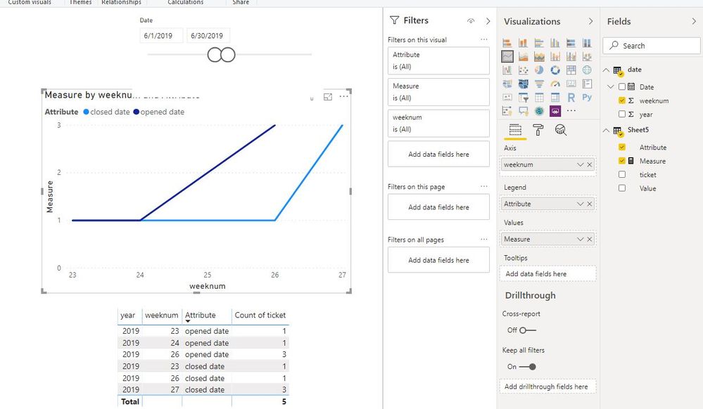
date = ADDCOLUMNS( CALENDARAUTO(),"year",YEAR([Date]),"weeknum",WEEKNUM([Date]))
then create ameausre
Measure = DISTINCTCOUNT(Sheet5[ticket])
Maggie
If this post helps, then please consider Accept it as the solution to help the other members find it more quickly.
- Mark as New
- Bookmark
- Subscribe
- Mute
- Subscribe to RSS Feed
- Permalink
- Report Inappropriate Content
Hi there -
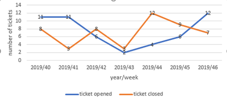
Could you please share a line chart (probably drawn on a piece of paper and taken a photo) of what you are expecting to see as the outcome? I am unable to visualize exactly what you are after, sorry about that.
Regards
- Mark as New
- Bookmark
- Subscribe
- Mute
- Subscribe to RSS Feed
- Permalink
- Report Inappropriate Content
Hi
indeed, sorry I was not so explicit. I was looking for some similar chart. note: this is not in synch with the table above.
thanks in advance
- Mark as New
- Bookmark
- Subscribe
- Mute
- Subscribe to RSS Feed
- Permalink
- Report Inappropriate Content
Hi @prb
In Edit queries,
Close&&aplly, create a date table
date = ADDCOLUMNS( CALENDARAUTO(),"year",YEAR([Date]),"weeknum",WEEKNUM([Date]))
then create ameausre
Measure = DISTINCTCOUNT(Sheet5[ticket])
Maggie
If this post helps, then please consider Accept it as the solution to help the other members find it more quickly.
Helpful resources

Microsoft Fabric Learn Together
Covering the world! 9:00-10:30 AM Sydney, 4:00-5:30 PM CET (Paris/Berlin), 7:00-8:30 PM Mexico City

Power BI Monthly Update - April 2024
Check out the April 2024 Power BI update to learn about new features.

| User | Count |
|---|---|
| 109 | |
| 99 | |
| 77 | |
| 66 | |
| 54 |
| User | Count |
|---|---|
| 144 | |
| 104 | |
| 102 | |
| 87 | |
| 64 |
