- Power BI forums
- Updates
- News & Announcements
- Get Help with Power BI
- Desktop
- Service
- Report Server
- Power Query
- Mobile Apps
- Developer
- DAX Commands and Tips
- Custom Visuals Development Discussion
- Health and Life Sciences
- Power BI Spanish forums
- Translated Spanish Desktop
- Power Platform Integration - Better Together!
- Power Platform Integrations (Read-only)
- Power Platform and Dynamics 365 Integrations (Read-only)
- Training and Consulting
- Instructor Led Training
- Dashboard in a Day for Women, by Women
- Galleries
- Community Connections & How-To Videos
- COVID-19 Data Stories Gallery
- Themes Gallery
- Data Stories Gallery
- R Script Showcase
- Webinars and Video Gallery
- Quick Measures Gallery
- 2021 MSBizAppsSummit Gallery
- 2020 MSBizAppsSummit Gallery
- 2019 MSBizAppsSummit Gallery
- Events
- Ideas
- Custom Visuals Ideas
- Issues
- Issues
- Events
- Upcoming Events
- Community Blog
- Power BI Community Blog
- Custom Visuals Community Blog
- Community Support
- Community Accounts & Registration
- Using the Community
- Community Feedback
Register now to learn Fabric in free live sessions led by the best Microsoft experts. From Apr 16 to May 9, in English and Spanish.
- Power BI forums
- Forums
- Get Help with Power BI
- Desktop
- Re: % total of one group relative to the overall t...
- Subscribe to RSS Feed
- Mark Topic as New
- Mark Topic as Read
- Float this Topic for Current User
- Bookmark
- Subscribe
- Printer Friendly Page
- Mark as New
- Bookmark
- Subscribe
- Mute
- Subscribe to RSS Feed
- Permalink
- Report Inappropriate Content
% total of one group relative to the overall total (in a stacked bar chart when filtered)
Hello - I have looked at the forums and not been able to get an answer that works yet.
I've tried adding a picture of the graph I currently have, but it seems this forum has changed how that works...it now brings up a window asking for the source, rather than bringing up a normal "add file" type of window. In any case, I have no idea now how to upload an image.
I have 5 sales teams. I have their sales (by team), in the following measure.
SAM = CALCULATE('FLU_Shipped Orders'[Total Shipped Value],FILTER('FLU_Shipped Orders','FLU_Shipped Orders'[Salesperson Group]="SAMs"))
This works great if I put each team's measure in a stacked bar chart. I can see the contribution of each team (totalling up to 100%).
The problem happens when I select one of the teams in a filter. When I select one team, the bar chart shows 100%. While I understand this, what I am trying to do is to have the bar chart show that particular team's percentage, and then the remaining total percentage. So for example, if I selected our SAM team, it would show 38% in one section of the bar chart, then the remaining 62% in the other section. I'm sure it's simple!
Solved! Go to Solution.
- Mark as New
- Bookmark
- Subscribe
- Mute
- Subscribe to RSS Feed
- Permalink
- Report Inappropriate Content
Hey,
please excuse if my prior answer has been a little short.
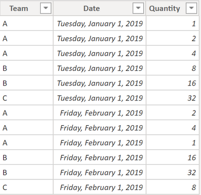
My table look like this:
The Team Measure are looking like this:
Team A =
CALCULATE(
    SUM('Table'[Quantity])
    , AND('Table'[Team] = "A" , "A" in VALUES('Table'[Team]))
)
Each Team has its own measure 🙂
The measure Other looks like this:
Other =
CALCULATE(
    SUM('Table'[Quantity])
    , ALL('Table'[Team])
)
- [Team A]
- [Team B]
- [Team C]
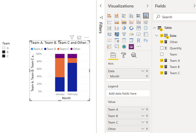
This allows me to create something like this:
Please be aware that the chart is the visual: 100% Stacked column chart.
Hopefully this is what you are looking for.
Regards,
Tom
Did I answer your question? Mark my post as a solution, this will help others!
Proud to be a Super User!
I accept Kudos 😉
Hamburg, Germany
- Mark as New
- Bookmark
- Subscribe
- Mute
- Subscribe to RSS Feed
- Permalink
- Report Inappropriate Content
Hey,
I would simply add a 6th measure to the stacked bar chart. Call the 6th measure something like this "Other".
The calculation is maybe quite straightforward:
Other = 100 - M1 - M2 - M3 - M4 - M5
Hopefully this provides you with ideas to tackle your problem
Regards,
Tom
Did I answer your question? Mark my post as a solution, this will help others!
Proud to be a Super User!
I accept Kudos 😉
Hamburg, Germany
- Mark as New
- Bookmark
- Subscribe
- Mute
- Subscribe to RSS Feed
- Permalink
- Report Inappropriate Content
Hi Tom,
Thanks for that suggestion - unfortunately it still did not work. When I select one of the Teams in a filter, it just shows that team as a 100% value in the bar chart. What I need it to do is to show that team relative to the aggregrate of the other teams.
So, let's say I filtered on Team 1, and it was 30% of the total, it would show in the stacked bar chart 30% and then 70% for the rest of the teams (aggregated). I cannot get this behavior to work.
- Mark as New
- Bookmark
- Subscribe
- Mute
- Subscribe to RSS Feed
- Permalink
- Report Inappropriate Content
Hey,
please excuse if my prior answer has been a little short.
My table look like this:
The Team Measure are looking like this:
Team A =
CALCULATE(
    SUM('Table'[Quantity])
    , AND('Table'[Team] = "A" , "A" in VALUES('Table'[Team]))
)
Each Team has its own measure 🙂
The measure Other looks like this:
Other =
CALCULATE(
    SUM('Table'[Quantity])
    , ALL('Table'[Team])
)
- [Team A]
- [Team B]
- [Team C]
This allows me to create something like this:
Please be aware that the chart is the visual: 100% Stacked column chart.
Hopefully this is what you are looking for.
Regards,
Tom
Did I answer your question? Mark my post as a solution, this will help others!
Proud to be a Super User!
I accept Kudos 😉
Hamburg, Germany
- Mark as New
- Bookmark
- Subscribe
- Mute
- Subscribe to RSS Feed
- Permalink
- Report Inappropriate Content
Hi Tom - It looks like what I'm trying to achieve....will give it a go in a couple of hours and let you know.
Appreciate your efforts! Stand by for more feedback...
- Mark as New
- Bookmark
- Subscribe
- Mute
- Subscribe to RSS Feed
- Permalink
- Report Inappropriate Content
Thanks Tom. This seemed to work!
Helpful resources

Microsoft Fabric Learn Together
Covering the world! 9:00-10:30 AM Sydney, 4:00-5:30 PM CET (Paris/Berlin), 7:00-8:30 PM Mexico City

Power BI Monthly Update - April 2024
Check out the April 2024 Power BI update to learn about new features.

| User | Count |
|---|---|
| 114 | |
| 100 | |
| 75 | |
| 73 | |
| 49 |
| User | Count |
|---|---|
| 145 | |
| 109 | |
| 109 | |
| 90 | |
| 64 |


