- Power BI forums
- Updates
- News & Announcements
- Get Help with Power BI
- Desktop
- Service
- Report Server
- Power Query
- Mobile Apps
- Developer
- DAX Commands and Tips
- Custom Visuals Development Discussion
- Health and Life Sciences
- Power BI Spanish forums
- Translated Spanish Desktop
- Power Platform Integration - Better Together!
- Power Platform Integrations (Read-only)
- Power Platform and Dynamics 365 Integrations (Read-only)
- Training and Consulting
- Instructor Led Training
- Dashboard in a Day for Women, by Women
- Galleries
- Community Connections & How-To Videos
- COVID-19 Data Stories Gallery
- Themes Gallery
- Data Stories Gallery
- R Script Showcase
- Webinars and Video Gallery
- Quick Measures Gallery
- 2021 MSBizAppsSummit Gallery
- 2020 MSBizAppsSummit Gallery
- 2019 MSBizAppsSummit Gallery
- Events
- Ideas
- Custom Visuals Ideas
- Issues
- Issues
- Events
- Upcoming Events
- Community Blog
- Power BI Community Blog
- Custom Visuals Community Blog
- Community Support
- Community Accounts & Registration
- Using the Community
- Community Feedback
Register now to learn Fabric in free live sessions led by the best Microsoft experts. From Apr 16 to May 9, in English and Spanish.
- Power BI forums
- Forums
- Get Help with Power BI
- Desktop
- eRe: @Re: sum of average after groupby
- Subscribe to RSS Feed
- Mark Topic as New
- Mark Topic as Read
- Float this Topic for Current User
- Bookmark
- Subscribe
- Printer Friendly Page
- Mark as New
- Bookmark
- Subscribe
- Mute
- Subscribe to RSS Feed
- Permalink
- Report Inappropriate Content
sum of average after groupby
I have data as below. There are multiple other columns on the sides but these are the ones I'm interested in.
| Month | Category | Value |
| 1 | B | 8 |
| 1 | A | 3 |
| 2 | A | 3 |
| 2 | A | 3 |
| 3 | A | 3 |
| 3 | A | 3 |
| 3 | A | 3 |
I am trying to create a measure in a bar chart with the month on the x-axis. For the y-axis I want to create a measure that groups the values based on the month and category, but takes the sum per each month.
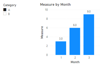
So if I have a slicer to look at category A, then for the month 1 I want the bar to 3 units high. Month 2 should have the bar 6 units high. Month 3 should have it 9 units high. Can I get help for this?
Solved! Go to Solution.
- Mark as New
- Bookmark
- Subscribe
- Mute
- Subscribe to RSS Feed
- Permalink
- Report Inappropriate Content
hey @goalie
maybe this measure is what you are looking for:
Measure =
var t =
    VALUES(
        'Table'[Category]
    )
return
SUMX(
    t
    ,
    var __m = MIN( 'Table'[Month] )
    return
    SUMX(
        FILTER( ALL( 'Table'[Month] ) , 'Table'[Month] <= __m )
        , CALCULATE( AVERAGE( 'Table'[Value] ) ) --average to honor the multiple values of category / month in the sample data
    )
)
This allows to create this visual:
Hopefully, this is what you are looking for.
If not, create a pbix file that contains sample data, reflects your data model, and also contains any measures that you already created.
Upload the pbix to onedrive or dropbox and share the link. If you are using an xlsx to create the sample data, share the xlsx as well.
Regards,
Tom
Did I answer your question? Mark my post as a solution, this will help others!
Proud to be a Super User!
I accept Kudos 😉
Hamburg, Germany
- Mark as New
- Bookmark
- Subscribe
- Mute
- Subscribe to RSS Feed
- Permalink
- Report Inappropriate Content
Hey @goalie_ ,
not sure but I assume this measure provides what you are looking for:
Measure =
AVERAGEX(
    VALUES( 'Table'[Category] )
    , CALCULATE( SUM( 'Table'[Value] ) )
)
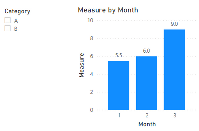
This allows to create this visualization:
And this is the result if no category is filtered
Hopefully, this is what you are looking for.
Regards,
Tom
Did I answer your question? Mark my post as a solution, this will help others!
Proud to be a Super User!
I accept Kudos 😉
Hamburg, Germany
- Mark as New
- Bookmark
- Subscribe
- Mute
- Subscribe to RSS Feed
- Permalink
- Report Inappropriate Content
@TomMartens almost. However, if you do something like this:(extra value in month 2, and 1 less in month 3)
| Month | Category | Value |
| 1 | B | 8 |
| 1 | A | 3 |
| 2 | A | 3 |
| 2 | A | 3 |
| 2 | A | 3 |
| 3 | A | 3 |
| 3 | A | 3 |
you'll get a graph where it has for 9 for month 2 and 6 for month 3. I still need it to be 6 for month 2, 9 for month 3
- Mark as New
- Bookmark
- Subscribe
- Mute
- Subscribe to RSS Feed
- Permalink
- Report Inappropriate Content
Hey @goalie_ ,
please explain how
6 is computed for month 2 and
9 is computed for month 3
based on the data you provided.
Regards,
Tom
Did I answer your question? Mark my post as a solution, this will help others!
Proud to be a Super User!
I accept Kudos 😉
Hamburg, Germany
- Mark as New
- Bookmark
- Subscribe
- Mute
- Subscribe to RSS Feed
- Permalink
- Report Inappropriate Content
Month 2 being 6 and Month 3 being 9 are predetermined values. The values column are goals that have been set. They are the accumulation of the values month to month. The values come from a left join from another table. It's possible for a month to be a different value. For example,
| Month | Category | Value |
| 1 | B | 8 |
| 1 | A | 3 |
| 2 | A | 4 |
| 2 | A | 4 |
| 2 | A | 4 |
| 3 | A | 3 |
| 3 | A | 3 |
When Category A is selected. I'd want the bar for month 1 to be 3, month 2 to be 7, and month 3 to be 10. When all categories are selected, I'd want month 1 to be 11, month 2 to be 7, and month 3 to be 10.
Hope that clarifies.
- Mark as New
- Bookmark
- Subscribe
- Mute
- Subscribe to RSS Feed
- Permalink
- Report Inappropriate Content
Hey @goalie_ ,
basically this clarifies nothing, from the table you provided it's still not clear how 7 is calculated for category A in Month 2
I recommend to create a second table that contains the predetermined values a single row for category/month.
Then create additional tables for
- categories
- months
Relate the tables accordingly (https://docs.microsoft.com/en-us/learn/modules/model-data-power-bi/)
Then you can create mesures and/or calculated columns to populate your chart.
Regards,
Tom
Did I answer your question? Mark my post as a solution, this will help others!
Proud to be a Super User!
I accept Kudos 😉
Hamburg, Germany
- Mark as New
- Bookmark
- Subscribe
- Mute
- Subscribe to RSS Feed
- Permalink
- Report Inappropriate Content
Hi @TomMartens let's try this again.
Month 1 is 3.
Month 2 is 4. the accumulation of month 1 and month 2 is 3+4 = 7
Month 3 is 3. the accumulation of months 1-3 is 3+4+3=10.
- Mark as New
- Bookmark
- Subscribe
- Mute
- Subscribe to RSS Feed
- Permalink
- Report Inappropriate Content
Hey,
I understand that, but nevertheless this does not explain why the accumulation of Month 2 is still 7, and does not honor the existence in of category B in month 1.
I'm wondering if this could make the rule for the accumulation:
Just accumulate the categories in all the preceding months.
I'm wondering what would be if there is a category B in Month 3, but not in Month 2 in these cases
- category B is selected
- no category is selected
Regards,
Tom
Did I answer your question? Mark my post as a solution, this will help others!
Proud to be a Super User!
I accept Kudos 😉
Hamburg, Germany
- Mark as New
- Bookmark
- Subscribe
- Mute
- Subscribe to RSS Feed
- Permalink
- Report Inappropriate Content
The value for each month is just a goal for that category. For each category there are subcategories. I simplified down my intial case to use an example to create a measure.
If there is a month 3 in category B, it should be the sum of category B and A (in month 3) if no category is selected(because no selection = select all in a slicer). If only category B is selected, then it'll show the months for category B.
I don't know the proper DAX to create the measure.
- Mark as New
- Bookmark
- Subscribe
- Mute
- Subscribe to RSS Feed
- Permalink
- Report Inappropriate Content
hey @goalie
maybe this measure is what you are looking for:
Measure =
var t =
    VALUES(
        'Table'[Category]
    )
return
SUMX(
    t
    ,
    var __m = MIN( 'Table'[Month] )
    return
    SUMX(
        FILTER( ALL( 'Table'[Month] ) , 'Table'[Month] <= __m )
        , CALCULATE( AVERAGE( 'Table'[Value] ) ) --average to honor the multiple values of category / month in the sample data
    )
)
This allows to create this visual:
Hopefully, this is what you are looking for.
If not, create a pbix file that contains sample data, reflects your data model, and also contains any measures that you already created.
Upload the pbix to onedrive or dropbox and share the link. If you are using an xlsx to create the sample data, share the xlsx as well.
Regards,
Tom
Did I answer your question? Mark my post as a solution, this will help others!
Proud to be a Super User!
I accept Kudos 😉
Hamburg, Germany
Helpful resources

Microsoft Fabric Learn Together
Covering the world! 9:00-10:30 AM Sydney, 4:00-5:30 PM CET (Paris/Berlin), 7:00-8:30 PM Mexico City

Power BI Monthly Update - April 2024
Check out the April 2024 Power BI update to learn about new features.

| User | Count |
|---|---|
| 106 | |
| 93 | |
| 75 | |
| 62 | |
| 50 |
| User | Count |
|---|---|
| 147 | |
| 107 | |
| 105 | |
| 87 | |
| 61 |


