- Power BI forums
- Updates
- News & Announcements
- Get Help with Power BI
- Desktop
- Service
- Report Server
- Power Query
- Mobile Apps
- Developer
- DAX Commands and Tips
- Custom Visuals Development Discussion
- Health and Life Sciences
- Power BI Spanish forums
- Translated Spanish Desktop
- Power Platform Integration - Better Together!
- Power Platform Integrations (Read-only)
- Power Platform and Dynamics 365 Integrations (Read-only)
- Training and Consulting
- Instructor Led Training
- Dashboard in a Day for Women, by Women
- Galleries
- Community Connections & How-To Videos
- COVID-19 Data Stories Gallery
- Themes Gallery
- Data Stories Gallery
- R Script Showcase
- Webinars and Video Gallery
- Quick Measures Gallery
- 2021 MSBizAppsSummit Gallery
- 2020 MSBizAppsSummit Gallery
- 2019 MSBizAppsSummit Gallery
- Events
- Ideas
- Custom Visuals Ideas
- Issues
- Issues
- Events
- Upcoming Events
- Community Blog
- Power BI Community Blog
- Custom Visuals Community Blog
- Community Support
- Community Accounts & Registration
- Using the Community
- Community Feedback
Register now to learn Fabric in free live sessions led by the best Microsoft experts. From Apr 16 to May 9, in English and Spanish.
- Power BI forums
- Forums
- Get Help with Power BI
- Desktop
- show status from previous month
- Subscribe to RSS Feed
- Mark Topic as New
- Mark Topic as Read
- Float this Topic for Current User
- Bookmark
- Subscribe
- Printer Friendly Page
- Mark as New
- Bookmark
- Subscribe
- Mute
- Subscribe to RSS Feed
- Permalink
- Report Inappropriate Content
show status from previous month
Dear All,
I would like to ask for your help on the below topic.
What I am trying to see is how many people came back from maternity and under which status per month.
| Date | Name | Status |
| 31/07/2020 | Goerge Michael | Maternity/Paternity |
| 31/08/2020 | Goerge Michael | Active |
| 31/07/2020 | Shakira | Maternity/Paternity |
| 31/08/2020 | Shakira | Unpaid Leave |
so at the end of the day i want to see that I have 1 active and 1 updaid leave. Think also that the list is big and there are people who are always active or contuining maternity.
thank you,
Paris
Solved! Go to Solution.
- Mark as New
- Bookmark
- Subscribe
- Mute
- Subscribe to RSS Feed
- Permalink
- Report Inappropriate Content
Hi @ppatris ,
Here are the steps you can follow to achieve:
1.Create a calendar Table, Column, Measure.
Table:
Date = CALENDARAUTO()

Column:
Status End date =
var_nextsdate=CALCULATE(MAX('Table'[Date]),FILTER(ALL('Table'),'Table'[Name]=EARLIER('Table'[Name])&&'Table'[Date]>EARLIER('Table'[Date])&&'Table'[Status]<>EARLIER('Table'[Status])))
return _nextsdate

Measure:
Count =
var _count= CALCULATE (
    DISTINCTCOUNT( 'Table'[Name]) ,
    FILTER (
        'Table',
        (
           'Table'[Date] <= MIN( 'Date'[Date] )
                &&if(ISBLANK('Table'[Status End date]),CALCULATE(MAX('Date'[Date]),ALL('Date'[Date])),'Table'[Status End date]) > MAX ( 'Date'[Date]  )
       )
    ),
    VALUES ('Table'[Name]))

return _count
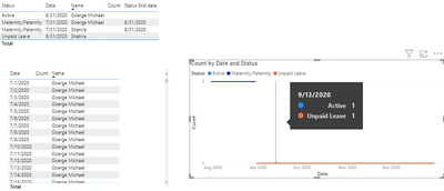
2. Create a line chart.
3. Result.
You can downloaded PBIX file from here.
If I misunderstood your logic, you can express your logic more clearly.
Best Regards,
Liu Yang
If this post helps, then please consider Accept it as the solution to help the other members find it more quickly.
- Mark as New
- Bookmark
- Subscribe
- Mute
- Subscribe to RSS Feed
- Permalink
- Report Inappropriate Content
Hi @ppatris ,
Here is another method, the measure is modified:
1. Create a calendar Table, Measure.
Table:
Date = CALENDARAUTO()


Measure:
Count1 =
var _count= CALCULATE (
    DISTINCTCOUNT( 'Table'[Name]) ,
    FILTER (
        ALLSELECTED('Table'),         YEAR('Table'[Date])=YEAR(MAX('Table'[Date])&&MONTH('Table'[Date])=MONTH(MAX('Table'[Date]))
    )
    ))

return _count
If I misunderstood your logic, you can express your logic more clearly.
Best Regards,
Liu Yang
If this post helps, then please consider Accept it as the solution to help the other members find it more quickly.
- Mark as New
- Bookmark
- Subscribe
- Mute
- Subscribe to RSS Feed
- Permalink
- Report Inappropriate Content
Hi @ppatris ,
Here are the steps you can follow to achieve:
1.Create a calendar Table, Column, Measure.
Table:
Date = CALENDARAUTO()

Column:
Status End date =
var_nextsdate=CALCULATE(MAX('Table'[Date]),FILTER(ALL('Table'),'Table'[Name]=EARLIER('Table'[Name])&&'Table'[Date]>EARLIER('Table'[Date])&&'Table'[Status]<>EARLIER('Table'[Status])))
return _nextsdate

Measure:
Count =
var _count= CALCULATE (
    DISTINCTCOUNT( 'Table'[Name]) ,
    FILTER (
        'Table',
        (
           'Table'[Date] <= MIN( 'Date'[Date] )
                &&if(ISBLANK('Table'[Status End date]),CALCULATE(MAX('Date'[Date]),ALL('Date'[Date])),'Table'[Status End date]) > MAX ( 'Date'[Date]  )
       )
    ),
    VALUES ('Table'[Name]))

return _count
2. Create a line chart.
3. Result.
You can downloaded PBIX file from here.
If I misunderstood your logic, you can express your logic more clearly.
Best Regards,
Liu Yang
If this post helps, then please consider Accept it as the solution to help the other members find it more quickly.
- Mark as New
- Bookmark
- Subscribe
- Mute
- Subscribe to RSS Feed
- Permalink
- Report Inappropriate Content
Hi @Anonymous ,
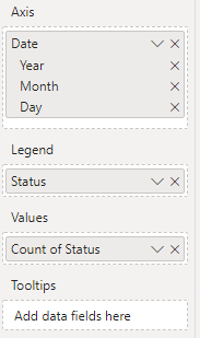
As your data is not sufficient to create a sensible line chart, try as below:
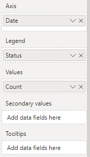
- Select a LIne chart visual and move your column fields as shown in the screenshot below:
See if this helps.
Thanks,
Pragati
- Mark as New
- Bookmark
- Subscribe
- Mute
- Subscribe to RSS Feed
- Permalink
- Report Inappropriate Content
@Anonymous , Try with time intelligence and date table
last MTD Sales = CALCULATE(MAx(Table[Status]),DATESMTD(dateadd('Date'[Date],-1,MONTH)))
To get the best of the time intelligence function. Make sure you have a date calendar and it has been marked as the date in model view. Also, join it with the date column of your fact/s. Refer :
https://radacad.com/creating-calendar-table-in-power-bi-using-dax-functions
https://www.archerpoint.com/blog/Posts/creating-date-table-power-bi
Appreciate your Kudos.
Microsoft Power BI Learning Resources, 2023 !!
Learn Power BI - Full Course with Dec-2022, with Window, Index, Offset, 100+ Topics !!
Did I answer your question? Mark my post as a solution! Appreciate your Kudos !! Proud to be a Super User! !!
Helpful resources

Microsoft Fabric Learn Together
Covering the world! 9:00-10:30 AM Sydney, 4:00-5:30 PM CET (Paris/Berlin), 7:00-8:30 PM Mexico City

Power BI Monthly Update - April 2024
Check out the April 2024 Power BI update to learn about new features.

| User | Count |
|---|---|
| 109 | |
| 96 | |
| 77 | |
| 66 | |
| 53 |
| User | Count |
|---|---|
| 144 | |
| 105 | |
| 102 | |
| 89 | |
| 63 |


