- Power BI forums
- Updates
- News & Announcements
- Get Help with Power BI
- Desktop
- Service
- Report Server
- Power Query
- Mobile Apps
- Developer
- DAX Commands and Tips
- Custom Visuals Development Discussion
- Health and Life Sciences
- Power BI Spanish forums
- Translated Spanish Desktop
- Power Platform Integration - Better Together!
- Power Platform Integrations (Read-only)
- Power Platform and Dynamics 365 Integrations (Read-only)
- Training and Consulting
- Instructor Led Training
- Dashboard in a Day for Women, by Women
- Galleries
- Community Connections & How-To Videos
- COVID-19 Data Stories Gallery
- Themes Gallery
- Data Stories Gallery
- R Script Showcase
- Webinars and Video Gallery
- Quick Measures Gallery
- 2021 MSBizAppsSummit Gallery
- 2020 MSBizAppsSummit Gallery
- 2019 MSBizAppsSummit Gallery
- Events
- Ideas
- Custom Visuals Ideas
- Issues
- Issues
- Events
- Upcoming Events
- Community Blog
- Power BI Community Blog
- Custom Visuals Community Blog
- Community Support
- Community Accounts & Registration
- Using the Community
- Community Feedback
Register now to learn Fabric in free live sessions led by the best Microsoft experts. From Apr 16 to May 9, in English and Spanish.
- Power BI forums
- Forums
- Get Help with Power BI
- Desktop
- Re: show months names on x axis without aggregatin...
- Subscribe to RSS Feed
- Mark Topic as New
- Mark Topic as Read
- Float this Topic for Current User
- Bookmark
- Subscribe
- Printer Friendly Page
- Mark as New
- Bookmark
- Subscribe
- Mute
- Subscribe to RSS Feed
- Permalink
- Report Inappropriate Content
show months names on x axis without aggregating data
Hello,
I have a table with prices for every day wihin a given period.
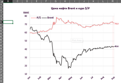
I need x axis to have Months' names only, but without aggregating data like in Ecxcel chart:
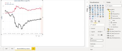
Now I have the folowing result, an x axis have abbreviated months names with years. But I need to have only months:
When I change from column to hierarchy and delete years and quanters, power bi does show months, but it also aggregates data. I need data to be displayed without aggregation.
Is there a soluton to this? Thank you!
- Mark as New
- Bookmark
- Subscribe
- Mute
- Subscribe to RSS Feed
- Permalink
- Report Inappropriate Content
Hi @OlegV ,
Has your problem been solved, if so, please consider Accept a correct reply as the solution or share your own solution to help others find it.
Best Regards
Lucien
- Mark as New
- Bookmark
- Subscribe
- Mute
- Subscribe to RSS Feed
- Permalink
- Report Inappropriate Content
If the data spans several years, which non-aggregated data are you hoping to see for each month?
Do you have a date table marked as such in the model?
You can add the Year field and expand the visual to show year & month. If you turn off contatenation in the x-axis formatting options you will get the months grouped by year.
Did I answer your question? Mark my post as a solution!
In doing so, you are also helping me. Thank you!
Proud to be a Super User!
Paul on Linkedin.
- Mark as New
- Bookmark
- Subscribe
- Mute
- Subscribe to RSS Feed
- Permalink
- Report Inappropriate Content
Hello,
1)"If the data spans several years, which non-aggregated data are you hoping to see for each month?"
No, in this case, the data spans one year. I hope to see a for each month with a day granularity.
2)"Do you have a date table marked as such in the model?"
Yes, I have a date table marked as such.
3)"You can add the Year field and expand the visual to show year & month. If you turn off contatenation in the x-axis formatting options you will get the months grouped by year."
I have tried. What I did:
- I used a date column and changed column name to hierarchy;
- I deleted years and quaters and left only months and days;
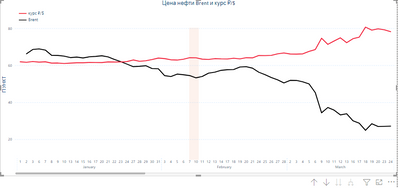
I got this result:
- after than I turned off concatenation.
Here is the filnal result...
... and it is not what I need. I need to keep the day granularity, but hide days' numbers and shrink the length of an x-axis.
- Mark as New
- Bookmark
- Subscribe
- Mute
- Subscribe to RSS Feed
- Permalink
- Report Inappropriate Content
I don't think you will get anything better than what you have so far with the default line chart. You migth want to explore the custom visual store to see if there are other line chart options which offer a better alternative
Did I answer your question? Mark my post as a solution!
In doing so, you are also helping me. Thank you!
Proud to be a Super User!
Paul on Linkedin.
- Mark as New
- Bookmark
- Subscribe
- Mute
- Subscribe to RSS Feed
- Permalink
- Report Inappropriate Content
Thank you for you assistance.
Yes. Apparently, so as to get what I need, the PowerBI team needs to add x axis options like in Excel:
- granularity of data,
- units to use
- custom formatting option.
For example, to present a date 11/03/1900 on an axis as a month "Mar".
- Mark as New
- Bookmark
- Subscribe
- Mute
- Subscribe to RSS Feed
- Permalink
- Report Inappropriate Content
you might want to check if there is a similar request on the ideas forum and vote for it...
https://ideas.powerbi.com/ideas/
or create a new request
Did I answer your question? Mark my post as a solution!
In doing so, you are also helping me. Thank you!
Proud to be a Super User!
Paul on Linkedin.
- Mark as New
- Bookmark
- Subscribe
- Mute
- Subscribe to RSS Feed
- Permalink
- Report Inappropriate Content
Are you using your Date column as the x-axis and have it set to Continuous? Please see this article.
Creating a simpler and chart-friendly Date table in Power BI - SQLBI
Pat
Did I answer your question? Mark my post as a solution! Kudos are also appreciated!
To learn more about Power BI, follow me on Twitter or subscribe on YouTube.
@mahoneypa HoosierBI on YouTube
- Mark as New
- Bookmark
- Subscribe
- Mute
- Subscribe to RSS Feed
- Permalink
- Report Inappropriate Content
Hello,
Thank you for your answer.
Yes, I use a Date column with a day granularity (year, month, day) and set a type of x axis to continuous.
But the method in the article did not help me.
What I have done, after reading articles:
1) I created a month column with a DAX formular
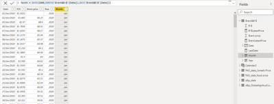
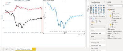
I need an x axis to look like I did in Excel:

Helpful resources

Microsoft Fabric Learn Together
Covering the world! 9:00-10:30 AM Sydney, 4:00-5:30 PM CET (Paris/Berlin), 7:00-8:30 PM Mexico City

Power BI Monthly Update - April 2024
Check out the April 2024 Power BI update to learn about new features.

| User | Count |
|---|---|
| 114 | |
| 101 | |
| 78 | |
| 75 | |
| 49 |
| User | Count |
|---|---|
| 145 | |
| 108 | |
| 107 | |
| 89 | |
| 61 |
