- Power BI forums
- Updates
- News & Announcements
- Get Help with Power BI
- Desktop
- Service
- Report Server
- Power Query
- Mobile Apps
- Developer
- DAX Commands and Tips
- Custom Visuals Development Discussion
- Health and Life Sciences
- Power BI Spanish forums
- Translated Spanish Desktop
- Power Platform Integration - Better Together!
- Power Platform Integrations (Read-only)
- Power Platform and Dynamics 365 Integrations (Read-only)
- Training and Consulting
- Instructor Led Training
- Dashboard in a Day for Women, by Women
- Galleries
- Community Connections & How-To Videos
- COVID-19 Data Stories Gallery
- Themes Gallery
- Data Stories Gallery
- R Script Showcase
- Webinars and Video Gallery
- Quick Measures Gallery
- 2021 MSBizAppsSummit Gallery
- 2020 MSBizAppsSummit Gallery
- 2019 MSBizAppsSummit Gallery
- Events
- Ideas
- Custom Visuals Ideas
- Issues
- Issues
- Events
- Upcoming Events
- Community Blog
- Power BI Community Blog
- Custom Visuals Community Blog
- Community Support
- Community Accounts & Registration
- Using the Community
- Community Feedback
Register now to learn Fabric in free live sessions led by the best Microsoft experts. From Apr 16 to May 9, in English and Spanish.
- Power BI forums
- Forums
- Get Help with Power BI
- Desktop
- show months data seperately on a graph
- Subscribe to RSS Feed
- Mark Topic as New
- Mark Topic as Read
- Float this Topic for Current User
- Bookmark
- Subscribe
- Printer Friendly Page
- Mark as New
- Bookmark
- Subscribe
- Mute
- Subscribe to RSS Feed
- Permalink
- Report Inappropriate Content
show months data seperately on a graph

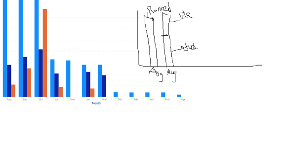
I am trying to achieve a combo chart that shows
1. amount paid on time.
2.planned amount
3.late amount from previous months paid this month.
Ideally, I wanted a combo chart that would show the planned amount independently, and the on time and late stacked together, that's not possible in power bi unless I use the line and stacked chart.
That not being possible, is there a way I can maybe show for example.
May - Planned 100
May - On time 60
May - Late make up 50
A chart showing the three may value, and maybe I can try to reduce the spacing between them to be seen as independent and stacked.
I am not sure If explained well and if there's a way to achieve this without using the line and combo chart. Any help would be highly appreciated.
I have uploaded the picture on top since powerbi only allows one month, can I have two months, and have one as an independent and the other one stacked.
Sorry for the poor pic explanation.
TIA!
Solved! Go to Solution.
- Mark as New
- Bookmark
- Subscribe
- Mute
- Subscribe to RSS Feed
- Permalink
- Report Inappropriate Content
Hi @Dee ,
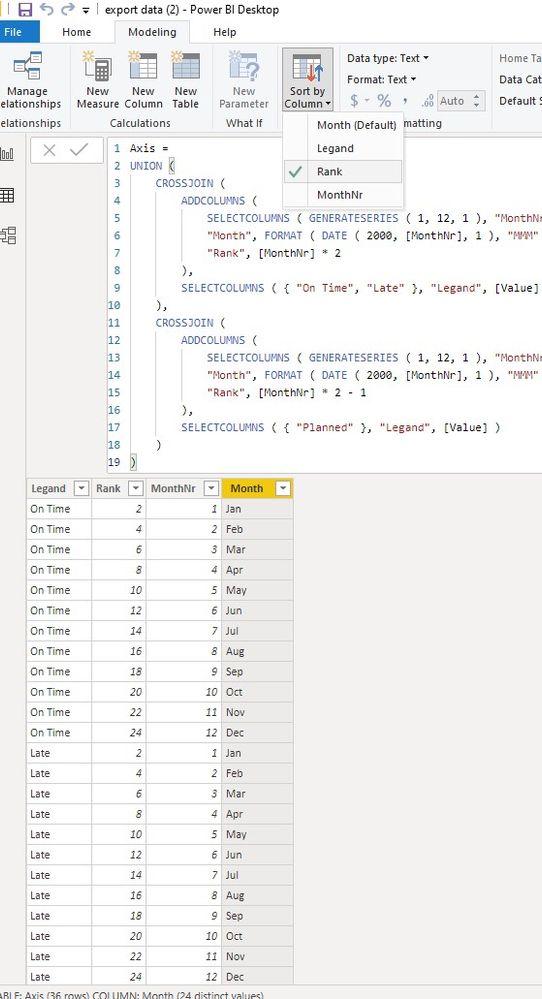
We can also use the axis table as a workaround:
1. create a calculated table and sort by rank column
Axis =
UNION (
    CROSSJOIN (
        ADDCOLUMNS (
            SELECTCOLUMNS ( GENERATESERIES ( 1, 12, 1 ), "MonthNr", [Value] ),
            "Month", FORMAT ( DATE ( 2000, [MonthNr], 1 ), "MMM" ),
            "Rank", [MonthNr] * 2
        ),
        SELECTCOLUMNS ( { "On Time", "Late" }, "Legand", [Value] )
    ),
    CROSSJOIN (
        ADDCOLUMNS (
            SELECTCOLUMNS ( GENERATESERIES ( 1, 12, 1 ), "MonthNr", [Value] ),
            "Month", FORMAT ( DATE ( 2000, [MonthNr], 1 ), "MMM" ) & "-Planned",
            "Rank", [MonthNr] * 2 - 1
        ),
        SELECTCOLUMNS ( { "Planned" }, "Legand", [Value] )
    )
)
2. create a measure to show the value
Value =
Var t = FILTER (
                ALLSELECTED ( 'export (2)' ),
                'export (2)'[Month]
                    IN SELECTCOLUMNS ( 'Axis', "Month", SUBSTITUTE ( [Month], "-Planned", BLANK () ) )
            )
return
SUMX (
    DISTINCT ( 'Axis'[Legand] ),
    SWITCH (
        [Legand],
        "Late", CALCULATE (
            SUM ( 'export (2)'[late] ),
            t
        ),
        "on Time", CALCULATE (
            SUM ( 'export (2)'[On time t] ),
            t
        ),
        "Planned", CALCULATE (
            SUM ( 'export (2)'[Planned ] ),
            t
        )
    )
)
Best regards,
If this post helps, then please consider Accept it as the solution to help the other members find it more quickly.
- Mark as New
- Bookmark
- Subscribe
- Mute
- Subscribe to RSS Feed
- Permalink
- Report Inappropriate Content
Hi @Dee ,
How about the result after you follow the suggestions mentioned in my original post?Could you please provide more details about it If it doesn't meet your requirement?
Best regards,
If this post helps, then please consider Accept it as the solution to help the other members find it more quickly.
- Mark as New
- Bookmark
- Subscribe
- Mute
- Subscribe to RSS Feed
- Permalink
- Report Inappropriate Content
Hi @Dee ,
We can also use the axis table as a workaround:
1. create a calculated table and sort by rank column
Axis =
UNION (
    CROSSJOIN (
        ADDCOLUMNS (
            SELECTCOLUMNS ( GENERATESERIES ( 1, 12, 1 ), "MonthNr", [Value] ),
            "Month", FORMAT ( DATE ( 2000, [MonthNr], 1 ), "MMM" ),
            "Rank", [MonthNr] * 2
        ),
        SELECTCOLUMNS ( { "On Time", "Late" }, "Legand", [Value] )
    ),
    CROSSJOIN (
        ADDCOLUMNS (
            SELECTCOLUMNS ( GENERATESERIES ( 1, 12, 1 ), "MonthNr", [Value] ),
            "Month", FORMAT ( DATE ( 2000, [MonthNr], 1 ), "MMM" ) & "-Planned",
            "Rank", [MonthNr] * 2 - 1
        ),
        SELECTCOLUMNS ( { "Planned" }, "Legand", [Value] )
    )
)
2. create a measure to show the value
Value =
Var t = FILTER (
                ALLSELECTED ( 'export (2)' ),
                'export (2)'[Month]
                    IN SELECTCOLUMNS ( 'Axis', "Month", SUBSTITUTE ( [Month], "-Planned", BLANK () ) )
            )
return
SUMX (
    DISTINCT ( 'Axis'[Legand] ),
    SWITCH (
        [Legand],
        "Late", CALCULATE (
            SUM ( 'export (2)'[late] ),
            t
        ),
        "on Time", CALCULATE (
            SUM ( 'export (2)'[On time t] ),
            t
        ),
        "Planned", CALCULATE (
            SUM ( 'export (2)'[Planned ] ),
            t
        )
    )
)
Best regards,
If this post helps, then please consider Accept it as the solution to help the other members find it more quickly.
- Mark as New
- Bookmark
- Subscribe
- Mute
- Subscribe to RSS Feed
- Permalink
- Report Inappropriate Content
Thank you so much for this!!
- Mark as New
- Bookmark
- Subscribe
- Mute
- Subscribe to RSS Feed
- Permalink
- Report Inappropriate Content
Hey @Dee ,
I have to admit that I do not fully understand what the visual should look like.
Please prepare a simple drawing and attach an image.
It is also very helpful if you provide sample data, upload the pbix that contains the sample data (it should also represent your data model) to onedrive or dropbox and then share the link.
But you can check the bullet chart from OKviz available from the market place.
Regards,
Tom
Did I answer your question? Mark my post as a solution, this will help others!
Proud to be a Super User!
I accept Kudos 😉
Hamburg, Germany
- Mark as New
- Bookmark
- Subscribe
- Mute
- Subscribe to RSS Feed
- Permalink
- Report Inappropriate Content
@TomMartens I have updated the post, uploaded the pic and the pbix link.
Am trying to see if there's a way I can add maybe two months so that one is independent -Planned and the other two late and on time as stacked, so two months same data.
- Mark as New
- Bookmark
- Subscribe
- Mute
- Subscribe to RSS Feed
- Permalink
- Report Inappropriate Content
from my experience this is currently not possible using the default visuals or one of the existing custom visuals.
But from my experience this should be doable using one http://charticulator.com/
You might also look to powerbi.tips as they adopted charticulator and provide a different version of charticulator.
It's easy to export a pbiviz file from charticulator.
Hopefully this provides some new ideas that will help to tackle this challenge.
Regards,
Tom
Did I answer your question? Mark my post as a solution, this will help others!
Proud to be a Super User!
I accept Kudos 😉
Hamburg, Germany
Helpful resources

Microsoft Fabric Learn Together
Covering the world! 9:00-10:30 AM Sydney, 4:00-5:30 PM CET (Paris/Berlin), 7:00-8:30 PM Mexico City

Power BI Monthly Update - April 2024
Check out the April 2024 Power BI update to learn about new features.

| User | Count |
|---|---|
| 106 | |
| 93 | |
| 75 | |
| 62 | |
| 50 |
| User | Count |
|---|---|
| 147 | |
| 107 | |
| 105 | |
| 87 | |
| 61 |


