- Power BI forums
- Updates
- News & Announcements
- Get Help with Power BI
- Desktop
- Service
- Report Server
- Power Query
- Mobile Apps
- Developer
- DAX Commands and Tips
- Custom Visuals Development Discussion
- Health and Life Sciences
- Power BI Spanish forums
- Translated Spanish Desktop
- Power Platform Integration - Better Together!
- Power Platform Integrations (Read-only)
- Power Platform and Dynamics 365 Integrations (Read-only)
- Training and Consulting
- Instructor Led Training
- Dashboard in a Day for Women, by Women
- Galleries
- Community Connections & How-To Videos
- COVID-19 Data Stories Gallery
- Themes Gallery
- Data Stories Gallery
- R Script Showcase
- Webinars and Video Gallery
- Quick Measures Gallery
- 2021 MSBizAppsSummit Gallery
- 2020 MSBizAppsSummit Gallery
- 2019 MSBizAppsSummit Gallery
- Events
- Ideas
- Custom Visuals Ideas
- Issues
- Issues
- Events
- Upcoming Events
- Community Blog
- Power BI Community Blog
- Custom Visuals Community Blog
- Community Support
- Community Accounts & Registration
- Using the Community
- Community Feedback
Register now to learn Fabric in free live sessions led by the best Microsoft experts. From Apr 16 to May 9, in English and Spanish.
- Power BI forums
- Forums
- Get Help with Power BI
- Desktop
- Re: scatter chart
- Subscribe to RSS Feed
- Mark Topic as New
- Mark Topic as Read
- Float this Topic for Current User
- Bookmark
- Subscribe
- Printer Friendly Page
- Mark as New
- Bookmark
- Subscribe
- Mute
- Subscribe to RSS Feed
- Permalink
- Report Inappropriate Content
scatter chart
Hi,
Do you have any idea how to create a scatter chart for below data? The axis are not numerical.
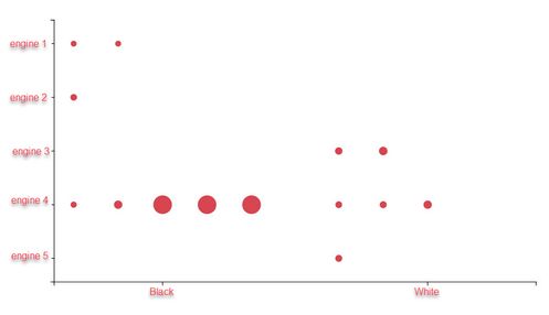
I would like to present what is the most common pair of car's engine and car's color.
Scatter chart proposal
Data format
| VIN | Engine | Color |
| AAAZZZ01 | 1.2 CBZA | Blue |
| AAAZZZ02 | 1.2 CBZB | Green |
| AAAZZZ03 | 2.0 CBDC | Silver |
| AAAZZZ04 | 2.0 CBAA | Black |
| AAAZZZ05 | 1.4 CAVD | White |
| AAAZZZ06 | 1.6 CAYB | Gold |
| AAAZZZ07 | 1.6 BSE | Red |
| AAAZZZ08 | 1.6 CAYC | Blue |
| AAAZZZ09 | 1.8 CDAA | Green |
| AAAZZZ10 | 2.0 CBDC | Silver |
| AAAZZZ11 | 2.0 CBAA | Black |
| AAAZZZ12 | 2.0 CBDB | White |
| AAAZZZ13 | 2.0 CBBB | Gold |
| AAAZZZ14 | 2.0 CBFA | Red |
| AAAZZZ15 | 2.0 CCZB | Blue |
| AAAZZZ16 | 2.0 CDLG | Green |
| AAAZZZ17 | 2.0 CBDC | Silver |
| AAAZZZ18 | 2.0 CBAA | Black |
| AAAZZZ19 | 2.0 CCZB | White |
| AAAZZZ20 | 2.0 CDLG | Gold |
| AAAZZZ21 | 1.2 CBZB | Red |
- Mark as New
- Bookmark
- Subscribe
- Mute
- Subscribe to RSS Feed
- Permalink
- Report Inappropriate Content
Hi @jtomczyk
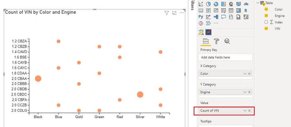
I tried the custom visual. Seems if I remove field from Primary Key, the chart displays correctly. I use Count of VIN for Value.
Best Regards,
Community Support Team _ Jing
- Mark as New
- Bookmark
- Subscribe
- Mute
- Subscribe to RSS Feed
- Permalink
- Report Inappropriate Content
Please see this post for how to create a chart with category fields on both X and Y axes.
Solved: Categorical data as X and Y axis - Microsoft Power BI Community
Pat
Did I answer your question? Mark my post as a solution! Kudos are also appreciated!
To learn more about Power BI, follow me on Twitter or subscribe on YouTube.
@mahoneypa HoosierBI on YouTube
- Mark as New
- Bookmark
- Subscribe
- Mute
- Subscribe to RSS Feed
- Permalink
- Report Inappropriate Content
Hi Pat,
Thanks for prompt reply. I have tried that. Unfortunetly it does not work as I would like.
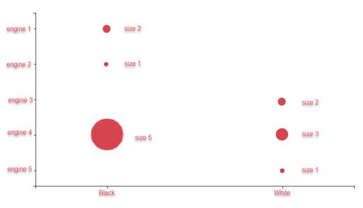
Here are the screen shot of the chart when puting
Primary Key VIN
X category Color
Y category Engine
Value VIN
However accoding to the data
Engine 1 with black should have one circle with size 2
Engine 2 with black should have one circle with size 1
Engine 3 with white should have one circle with size 2
Engine 4 with black should have one circle with size 5 and have one circle with size 3
Engine 5 with white should have one circle with size 1
like that
I have tried to change that but without success... Any idea why it is like that?
Can you please let me know how to edit XYCategory.pbiviz ?
Helpful resources

Microsoft Fabric Learn Together
Covering the world! 9:00-10:30 AM Sydney, 4:00-5:30 PM CET (Paris/Berlin), 7:00-8:30 PM Mexico City

Power BI Monthly Update - April 2024
Check out the April 2024 Power BI update to learn about new features.

| User | Count |
|---|---|
| 110 | |
| 95 | |
| 76 | |
| 65 | |
| 51 |
| User | Count |
|---|---|
| 146 | |
| 109 | |
| 106 | |
| 88 | |
| 61 |


