- Power BI forums
- Updates
- News & Announcements
- Get Help with Power BI
- Desktop
- Service
- Report Server
- Power Query
- Mobile Apps
- Developer
- DAX Commands and Tips
- Custom Visuals Development Discussion
- Health and Life Sciences
- Power BI Spanish forums
- Translated Spanish Desktop
- Power Platform Integration - Better Together!
- Power Platform Integrations (Read-only)
- Power Platform and Dynamics 365 Integrations (Read-only)
- Training and Consulting
- Instructor Led Training
- Dashboard in a Day for Women, by Women
- Galleries
- Community Connections & How-To Videos
- COVID-19 Data Stories Gallery
- Themes Gallery
- Data Stories Gallery
- R Script Showcase
- Webinars and Video Gallery
- Quick Measures Gallery
- 2021 MSBizAppsSummit Gallery
- 2020 MSBizAppsSummit Gallery
- 2019 MSBizAppsSummit Gallery
- Events
- Ideas
- Custom Visuals Ideas
- Issues
- Issues
- Events
- Upcoming Events
- Community Blog
- Power BI Community Blog
- Custom Visuals Community Blog
- Community Support
- Community Accounts & Registration
- Using the Community
- Community Feedback
Register now to learn Fabric in free live sessions led by the best Microsoft experts. From Apr 16 to May 9, in English and Spanish.
- Power BI forums
- Forums
- Get Help with Power BI
- Desktop
- scatter chart, point size
- Subscribe to RSS Feed
- Mark Topic as New
- Mark Topic as Read
- Float this Topic for Current User
- Bookmark
- Subscribe
- Printer Friendly Page
- Mark as New
- Bookmark
- Subscribe
- Mute
- Subscribe to RSS Feed
- Permalink
- Report Inappropriate Content
scatter chart, point size
Hi,
I have a scatter chart on my dashboard, and I am looking for a way to shrink the size of the pints on the chart. Since I have large amount of data on the chart, I would like to see just a small dot, instead of around 1.5 mm circle/filled point I can get currently, for each data. I don't mean the size of bubble created by a field.
Thanks,
Erin
- Mark as New
- Bookmark
- Subscribe
- Mute
- Subscribe to RSS Feed
- Permalink
- Report Inappropriate Content
A colleague of mine Dan has found a solution to this as I was having the same problem. The size property on the visual is your scaling factor, the marker size in the format menu is the start point. What threw me and others above is that the marker size start point when using scaling is different vs not using scaling. That makes little sense to me but anyway... the solution here is that you can actually set the marker size (the start point) to a negative amount, up to minus 30 (-30). That should really help, it did for me 😊.
If this post does help, then please consider 'Accept it as the solution' to help the other members find it more quickly.
- Mark as New
- Bookmark
- Subscribe
- Mute
- Subscribe to RSS Feed
- Permalink
- Report Inappropriate Content
Good morning:
I´m using a scatter chart, and many values falls into the same space in the grid. And when I click in that point, it only shows me the first value and do not allow me to see the other values behind.
Can you help me on how to show all the other values that are behind the point?
Please help. Thanks.
- Mark as New
- Bookmark
- Subscribe
- Mute
- Subscribe to RSS Feed
- Permalink
- Report Inappropriate Content
Hi Erin,
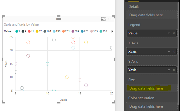
In a scatter chart, if we do not add value to size, then each bubble has the same size.
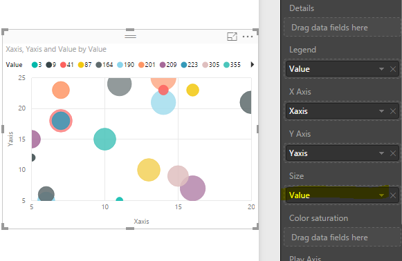
If we add value to szie, then the bubble size is chanaged based on the values on size automically.
Reference
https://powerbi.microsoft.com/en-us/documentation/powerbi-service-tutorial-scatter/
If this is not what you want, please elaborate your issue, if possible provide us some screenshots, so that we can make further analysis.
Regards,
Charlie Liao
- Mark as New
- Bookmark
- Subscribe
- Mute
- Subscribe to RSS Feed
- Permalink
- Report Inappropriate Content
We are having the same issue. The default size of the dots in the scatterplot is too large. We want all the dots to be the same size, just smaller. For example if they're 12 pt right now, we want 8 pt. If we add a field to "size", the bubbles get really big, even if the value is small. It's possible to do in Excel. Here's where someone had the same issue in Excel: https://answers.yahoo.com/question/index?qid=20140131071700AAA4SjR
- Mark as New
- Bookmark
- Subscribe
- Mute
- Subscribe to RSS Feed
- Permalink
- Report Inappropriate Content
I have the same problem. I suspect it can't be done with current functionality. Even if I create a column like
PointSize = 0.2
Then set 'Size' to 'Average of PointSize'
I then get huge circles.
- Mark as New
- Bookmark
- Subscribe
- Mute
- Subscribe to RSS Feed
- Permalink
- Report Inappropriate Content
Though it has known limitations (see https://powerbi.microsoft.com/en-us/documentation/powerbi-desktop-r-visuals/), an R visual lets you control more features, but can be fiddly to format just right I suspect - e.g. simple scatter plot:
library(ggplot2) # Needed for ggplot

# Avoid having to reference dataset$ each time in function calls
attach(dataset)

#Plot the dataset by XAxis and YAxis, with Value to set the fill colour
ggplot(dataset,aes(x=`XAxis`, y=`YAxis`, colour=`Value`)) +

#Plot as (filled) points with a dot of size 2.8mm (2.8mm =~8 pt)
geom_point(size=2.8)
Helpful resources

Microsoft Fabric Learn Together
Covering the world! 9:00-10:30 AM Sydney, 4:00-5:30 PM CET (Paris/Berlin), 7:00-8:30 PM Mexico City

Power BI Monthly Update - April 2024
Check out the April 2024 Power BI update to learn about new features.

| User | Count |
|---|---|
| 110 | |
| 95 | |
| 76 | |
| 65 | |
| 51 |
| User | Count |
|---|---|
| 146 | |
| 109 | |
| 106 | |
| 88 | |
| 61 |


