- Power BI forums
- Updates
- News & Announcements
- Get Help with Power BI
- Desktop
- Service
- Report Server
- Power Query
- Mobile Apps
- Developer
- DAX Commands and Tips
- Custom Visuals Development Discussion
- Health and Life Sciences
- Power BI Spanish forums
- Translated Spanish Desktop
- Power Platform Integration - Better Together!
- Power Platform Integrations (Read-only)
- Power Platform and Dynamics 365 Integrations (Read-only)
- Training and Consulting
- Instructor Led Training
- Dashboard in a Day for Women, by Women
- Galleries
- Community Connections & How-To Videos
- COVID-19 Data Stories Gallery
- Themes Gallery
- Data Stories Gallery
- R Script Showcase
- Webinars and Video Gallery
- Quick Measures Gallery
- 2021 MSBizAppsSummit Gallery
- 2020 MSBizAppsSummit Gallery
- 2019 MSBizAppsSummit Gallery
- Events
- Ideas
- Custom Visuals Ideas
- Issues
- Issues
- Events
- Upcoming Events
- Community Blog
- Power BI Community Blog
- Custom Visuals Community Blog
- Community Support
- Community Accounts & Registration
- Using the Community
- Community Feedback
Register now to learn Fabric in free live sessions led by the best Microsoft experts. From Apr 16 to May 9, in English and Spanish.
- Power BI forums
- Forums
- Get Help with Power BI
- Desktop
- "Too many values" calculation is incorrect when ad...
- Subscribe to RSS Feed
- Mark Topic as New
- Mark Topic as Read
- Float this Topic for Current User
- Bookmark
- Subscribe
- Printer Friendly Page
- Mark as New
- Bookmark
- Subscribe
- Mute
- Subscribe to RSS Feed
- Permalink
- Report Inappropriate Content
"Too many values" calculation is incorrect when adding a legend.
I have a chart that has every mniute of the day along the x axis. This works great in Power BI desktop and the Web.
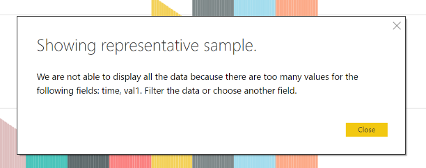
When adding a series that is wholely dependant on the x axis (i.e. daypart against minute of the day - there can only ever be one value), Power BI complians that there are now too many rows, even though the number of rows has not changed, as far as the dataset is concerned, there is only one additional column.
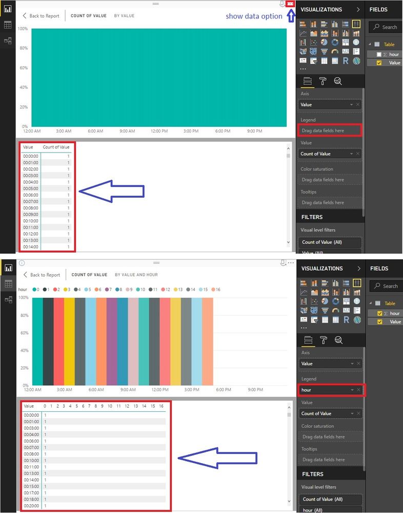
In my example below, I have minute of the day coloured by the hour of the day. Every minute can only exist in a single hour of the day, and yet this is produced more rows.
- Mark as New
- Bookmark
- Subscribe
- Mute
- Subscribe to RSS Feed
- Permalink
- Report Inappropriate Content
Hi @neilp1,
There are too many values indeed though they are blanks. You can see how the legend works from the following picture.
We still can show the data of your visual.
What would you like to do exactly? Maybe there is better solution.
Best Regards!
Dale
If this post helps, then please consider Accept it as the solution to help the other members find it more quickly.
- Mark as New
- Bookmark
- Subscribe
- Mute
- Subscribe to RSS Feed
- Permalink
- Report Inappropriate Content
I'm not sure I understand. Could you explain exactly how there are too many values? The number of rows is the same!
It sounds like PowerBI is being over protective here - the number of possible rows is higher, but the error is showing even though the number of actual rows is within the allowed limit.
- Mark as New
- Bookmark
- Subscribe
- Mute
- Subscribe to RSS Feed
- Permalink
- Report Inappropriate Content
Hi @neilp1,
Let's go on this example. There are only three rows at the start. But when the Color legend is added in, the rows turn to every Color multiply every year. That's why there are many many records.
Best Regards!
Dale
If this post helps, then please consider Accept it as the solution to help the other members find it more quickly.
- Mark as New
- Bookmark
- Subscribe
- Mute
- Subscribe to RSS Feed
- Permalink
- Report Inappropriate Content
Hi Dale,
I understand that in your example, although in your example your source data has more rows than the 3. In my example, all the source rows are displayed in the first example, so there are no more possible rows.
It seems that power bi limits the data based on the possible values, not the actual number of rows in the source dataset.
if I chart x by a legend of y - Power BI will tell me there are 50 possible rows (10x5), whereas the source data only actually has 10?. Is that correct?
x,y
1,a
2,a
3,b
4,b
5,b
6,b
7,c
8,d
9,b
10,e
If so, can this behavour be changed so that it will chart the 10 rows because it never really has 50? My point it that the limit is being applied too agressively when it is assuming more rows than really exist in the data.
- Mark as New
- Bookmark
- Subscribe
- Mute
- Subscribe to RSS Feed
- Permalink
- Report Inappropriate Content
Hi @neilp1,
I'm afraid this is how legend works. But if you share the expected result you want, maybe we can find the proper solution.
Best Regards!
Dale
If this post helps, then please consider Accept it as the solution to help the other members find it more quickly.
- Mark as New
- Bookmark
- Subscribe
- Mute
- Subscribe to RSS Feed
- Permalink
- Report Inappropriate Content
All I'm trying to achive is to colour the bars differently, based on the ranges of the axis.
Using my time axis example, I'm plotting data by every minute of the day, but would like to change the colour of the bar based on the hour of the day. Using the legend feels like the best way to do this as it will both handle the colour and draw the key.
Helpful resources

Microsoft Fabric Learn Together
Covering the world! 9:00-10:30 AM Sydney, 4:00-5:30 PM CET (Paris/Berlin), 7:00-8:30 PM Mexico City

Power BI Monthly Update - April 2024
Check out the April 2024 Power BI update to learn about new features.

| User | Count |
|---|---|
| 110 | |
| 94 | |
| 82 | |
| 66 | |
| 58 |
| User | Count |
|---|---|
| 151 | |
| 121 | |
| 104 | |
| 87 | |
| 67 |


