- Power BI forums
- Updates
- News & Announcements
- Get Help with Power BI
- Desktop
- Service
- Report Server
- Power Query
- Mobile Apps
- Developer
- DAX Commands and Tips
- Custom Visuals Development Discussion
- Health and Life Sciences
- Power BI Spanish forums
- Translated Spanish Desktop
- Power Platform Integration - Better Together!
- Power Platform Integrations (Read-only)
- Power Platform and Dynamics 365 Integrations (Read-only)
- Training and Consulting
- Instructor Led Training
- Dashboard in a Day for Women, by Women
- Galleries
- Community Connections & How-To Videos
- COVID-19 Data Stories Gallery
- Themes Gallery
- Data Stories Gallery
- R Script Showcase
- Webinars and Video Gallery
- Quick Measures Gallery
- 2021 MSBizAppsSummit Gallery
- 2020 MSBizAppsSummit Gallery
- 2019 MSBizAppsSummit Gallery
- Events
- Ideas
- Custom Visuals Ideas
- Issues
- Issues
- Events
- Upcoming Events
- Community Blog
- Power BI Community Blog
- Custom Visuals Community Blog
- Community Support
- Community Accounts & Registration
- Using the Community
- Community Feedback
Register now to learn Fabric in free live sessions led by the best Microsoft experts. From Apr 16 to May 9, in English and Spanish.
- Power BI forums
- Forums
- Get Help with Power BI
- Desktop
- "Same value" line values not aligning
- Subscribe to RSS Feed
- Mark Topic as New
- Mark Topic as Read
- Float this Topic for Current User
- Bookmark
- Subscribe
- Printer Friendly Page
- Mark as New
- Bookmark
- Subscribe
- Mute
- Subscribe to RSS Feed
- Permalink
- Report Inappropriate Content
"Same value" line values not aligning
Hi everyone,
I have a couple of simple visuals that show how many people have left, in which month, and how many weeks they worked on average before they left.
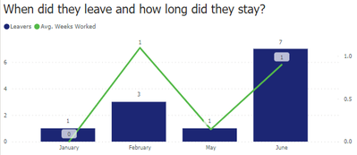
My issue is, when I change my Weeks Worked to show as an average in the visualisation panel, my average values aren't algining:
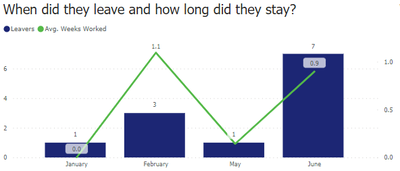
As you can see, the "1" in the first graph aren't aligned - the second is slightly lower; same with the "7" in the second graph. This is because the average line is deviating because of the decimals:
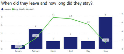
I want the "1.1" and "0.9" on the first graph to show as "1" and the line to be flat. Same on the second graph - I want the "7.1" and "6.8" to show as "7" and be a flat line.
I have tried changing the data type to whole numbers and fiddled with the axis but I can't get the average line to round to the nearest 0.
Any help would be greatly appreciated!
Thanks
Solved! Go to Solution.
- Mark as New
- Bookmark
- Subscribe
- Mute
- Subscribe to RSS Feed
- Permalink
- Report Inappropriate Content
Hi @jgdgsf2 ,
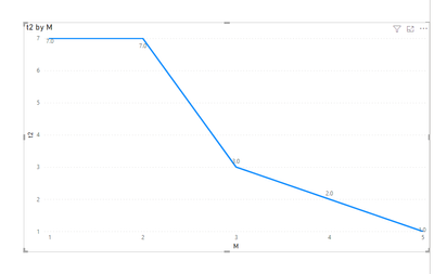
Pls add round on the base measure.
ROUND(MAX('Table'[value]),0)Refer the below :
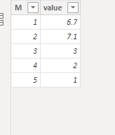
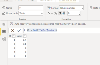
base data:
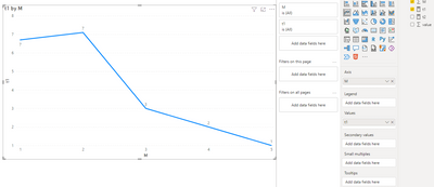
measure1:(then same question as yours)
t1 = MAX('Table'[value])Then create visual:
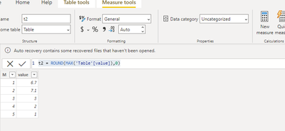
measure2:
t2 = ROUND(MAX('Table'[value]),0)visual:
Did I answer your question? Mark my post as a solution!
Best Regards
Lucien
- Mark as New
- Bookmark
- Subscribe
- Mute
- Subscribe to RSS Feed
- Permalink
- Report Inappropriate Content
Hi @jgdgsf2
For your avg weeks worked measure could you see if there are decimal places shown for the values. If there are try changing it to 0
Kind regards,
Seanan
If this post helped, please consider accepting it as the solution.
- Mark as New
- Bookmark
- Subscribe
- Mute
- Subscribe to RSS Feed
- Permalink
- Report Inappropriate Content
Yep there are definitely no decimals and I have the data type set to whole number - no matter what I try the line deviates slightly.
Helpful resources

Microsoft Fabric Learn Together
Covering the world! 9:00-10:30 AM Sydney, 4:00-5:30 PM CET (Paris/Berlin), 7:00-8:30 PM Mexico City

Power BI Monthly Update - April 2024
Check out the April 2024 Power BI update to learn about new features.

| User | Count |
|---|---|
| 113 | |
| 99 | |
| 82 | |
| 70 | |
| 60 |
| User | Count |
|---|---|
| 149 | |
| 114 | |
| 107 | |
| 89 | |
| 67 |
