- Power BI forums
- Updates
- News & Announcements
- Get Help with Power BI
- Desktop
- Service
- Report Server
- Power Query
- Mobile Apps
- Developer
- DAX Commands and Tips
- Custom Visuals Development Discussion
- Health and Life Sciences
- Power BI Spanish forums
- Translated Spanish Desktop
- Power Platform Integration - Better Together!
- Power Platform Integrations (Read-only)
- Power Platform and Dynamics 365 Integrations (Read-only)
- Training and Consulting
- Instructor Led Training
- Dashboard in a Day for Women, by Women
- Galleries
- Community Connections & How-To Videos
- COVID-19 Data Stories Gallery
- Themes Gallery
- Data Stories Gallery
- R Script Showcase
- Webinars and Video Gallery
- Quick Measures Gallery
- 2021 MSBizAppsSummit Gallery
- 2020 MSBizAppsSummit Gallery
- 2019 MSBizAppsSummit Gallery
- Events
- Ideas
- Custom Visuals Ideas
- Issues
- Issues
- Events
- Upcoming Events
- Community Blog
- Power BI Community Blog
- Custom Visuals Community Blog
- Community Support
- Community Accounts & Registration
- Using the Community
- Community Feedback
Register now to learn Fabric in free live sessions led by the best Microsoft experts. From Apr 16 to May 9, in English and Spanish.
- Power BI forums
- Forums
- Get Help with Power BI
- Desktop
- "Color Saturation" now showing in shape map visual...
- Subscribe to RSS Feed
- Mark Topic as New
- Mark Topic as Read
- Float this Topic for Current User
- Bookmark
- Subscribe
- Printer Friendly Page
- Mark as New
- Bookmark
- Subscribe
- Mute
- Subscribe to RSS Feed
- Permalink
- Report Inappropriate Content
"Color Saturation" now showing in shape map visual on power bi desktop
Hello friends,
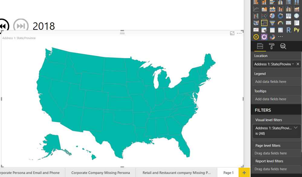
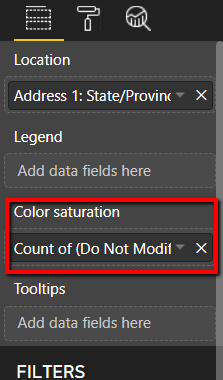
The shape map visual is currently in preview feature, however, the "Color Saturation" section is now showing after I turn on the visual. I only have location, legend and tooltips so no place for me to put my "Count data"See my attached here:
Does someone know what is wrong here?
Much appreciated
Solved! Go to Solution.
- Mark as New
- Bookmark
- Subscribe
- Mute
- Subscribe to RSS Feed
- Permalink
- Report Inappropriate Content
Thanks for the reply. The color saturation tab is showing now.
- Mark as New
- Bookmark
- Subscribe
- Mute
- Subscribe to RSS Feed
- Permalink
- Report Inappropriate Content
Maybe I'm not allowed to say anything about this since it's a "Preview" feature, but the colour saturation in Shape Maps does not work at all for me, and I do not see the link for advanced options.
- Mark as New
- Bookmark
- Subscribe
- Mute
- Subscribe to RSS Feed
- Permalink
- Report Inappropriate Content
I agree, this feature is confusing and just doesn't work very well. It keeps on shading zip codes that have a count of zero. Poorly implemented and confusing.
- Mark as New
- Bookmark
- Subscribe
- Mute
- Subscribe to RSS Feed
- Permalink
- Report Inappropriate Content
hi, @Anonymous
Power BI Desktop has much update Monthly. and this feature has been updated to conditional formatting in 2018 November.
Color saturation on visuals upgraded to use conditional formatting
For quite a while now, we’ve had two different ways to dynamically color a visual’s data points depending on the visual type. Our charts had a color saturation option in the field well that gave you basic controls, and the table and matrix visuals had conditional formatting. We’ve added a ton of functionality to the conditional formatting experience for table and matrix over the last year, but the color saturation feature for cartesian charts hasn’t received much love.
That has finally changed this month, as we’ve upgraded all the visuals that previously used color saturation to have the same conditional formatting experience as table and matrix currently has. This means you’ll have access to all three types of formatting currently available: Color by color scales, Color by rules, and Color by field. As mentioned, this change impacts all visuals which previously had color saturation which includes:
- All variants of column and bar charts
- Funnel chart
- Bubble & filled maps
- Shape map (preview)
- Treemap
- Scatter chart
This is the official documentation and tutorials for your refer to:
Best Regards,
Lin
If this post helps, then please consider Accept it as the solution to help the other members find it more quickly.
- Mark as New
- Bookmark
- Subscribe
- Mute
- Subscribe to RSS Feed
- Permalink
- Report Inappropriate Content
- Mark as New
- Bookmark
- Subscribe
- Mute
- Subscribe to RSS Feed
- Permalink
- Report Inappropriate Content
Hi @Anonymous,
Are you using the Windows 10 App store version of PowerBi desktop or the downloaded version?
Helpful resources

Microsoft Fabric Learn Together
Covering the world! 9:00-10:30 AM Sydney, 4:00-5:30 PM CET (Paris/Berlin), 7:00-8:30 PM Mexico City

Power BI Monthly Update - April 2024
Check out the April 2024 Power BI update to learn about new features.

| User | Count |
|---|---|
| 109 | |
| 98 | |
| 77 | |
| 66 | |
| 54 |
| User | Count |
|---|---|
| 144 | |
| 104 | |
| 101 | |
| 86 | |
| 64 |


