- Power BI forums
- Updates
- News & Announcements
- Get Help with Power BI
- Desktop
- Service
- Report Server
- Power Query
- Mobile Apps
- Developer
- DAX Commands and Tips
- Custom Visuals Development Discussion
- Health and Life Sciences
- Power BI Spanish forums
- Translated Spanish Desktop
- Power Platform Integration - Better Together!
- Power Platform Integrations (Read-only)
- Power Platform and Dynamics 365 Integrations (Read-only)
- Training and Consulting
- Instructor Led Training
- Dashboard in a Day for Women, by Women
- Galleries
- Community Connections & How-To Videos
- COVID-19 Data Stories Gallery
- Themes Gallery
- Data Stories Gallery
- R Script Showcase
- Webinars and Video Gallery
- Quick Measures Gallery
- 2021 MSBizAppsSummit Gallery
- 2020 MSBizAppsSummit Gallery
- 2019 MSBizAppsSummit Gallery
- Events
- Ideas
- Custom Visuals Ideas
- Issues
- Issues
- Events
- Upcoming Events
- Community Blog
- Power BI Community Blog
- Custom Visuals Community Blog
- Community Support
- Community Accounts & Registration
- Using the Community
- Community Feedback
Register now to learn Fabric in free live sessions led by the best Microsoft experts. From Apr 16 to May 9, in English and Spanish.
- Power BI forums
- Forums
- Get Help with Power BI
- Desktop
- quick measure month over month
- Subscribe to RSS Feed
- Mark Topic as New
- Mark Topic as Read
- Float this Topic for Current User
- Bookmark
- Subscribe
- Printer Friendly Page
- Mark as New
- Bookmark
- Subscribe
- Mute
- Subscribe to RSS Feed
- Permalink
- Report Inappropriate Content
quick measure month over month
Dear Community,
I have the following issue. I have a dataset which can be represented (simplified version!) as follows:
COUNTRY1 VALUE DATE (dd.mm.yy.)
COUNTRY1 VALUE DATE (dd.mm.yy.)
COUNTRY1 VALUE DATE (dd.mm.yy.)
COUNTRY 2 VALUE DATE (dd.mm.yy.)
COUNTRY 2 VALUE DATE (dd.mm.yy.)
COUNTRY 2 VALUE DATE (dd.mm.yy.)
...
and so on. I am trying to build some quick measures to aggreated changes in values month over month, or quarter over quarter.
It works until when I do not apply the 'country' dimension, meaning that it corectly represent the requestes variations over the selected timeline only with the total sum of the values.
When I introduce the country dimension in the visual, to dipsplay e.g. the variation in bunch of selected countries, it does not work anymore in the sense that it seems like it cannot aggregate countries (please note that countries repeat themselves clearly, so it does not aggregate all the value for 'Brazil' and shows the related aggreagate variation).
Countires are otherwise aggregated correctly within other fields.
Hope I was able to explain this, can it be related to wrong settings in relation between different tables ? (the date table is separate from the other main table which inlcudes countries, values and other data points.
Thanks a lot in advance for any hint and sorry for the long post!
- Mark as New
- Bookmark
- Subscribe
- Mute
- Subscribe to RSS Feed
- Permalink
- Report Inappropriate Content
Hi @v-piga-msft ,
thanks for the reply! The formula is the one automatically generated by the quick measure function (Month over Month variation, or quarter over quarter variation). In fact, it works well in the following table visual, where I can display the correct change over month of the total values (column1.count):
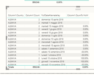
THe problem is when I add another dimension, the country dimension.
Instead of aggregating the values belonging to the same countires and showing me the total variation for each of the countries, it creates multiple entries for each of the countires:
To sum up: what I want to do, is to dispaly the list of countries with a QoQ or MoM variation in values, so that I can filter e.g. top 5 in growth.
Hope this helped in clarifying the issue!
thanks again!
- Mark as New
- Bookmark
- Subscribe
- Mute
- Subscribe to RSS Feed
- Permalink
- Report Inappropriate Content
Hi @Anonymous ,
I'm afraid that should be caused by your measure formula.
If it is convenient, could you share your quick measure formula here?
In addition, to solve your problem more quickly, please share your data sample as table format and your desired output so that we could help further on it.
Best Regards,
Cherry
If this post helps, then please consider Accept it as the solution to help the other members find it more quickly.
Helpful resources

Microsoft Fabric Learn Together
Covering the world! 9:00-10:30 AM Sydney, 4:00-5:30 PM CET (Paris/Berlin), 7:00-8:30 PM Mexico City

Power BI Monthly Update - April 2024
Check out the April 2024 Power BI update to learn about new features.

| User | Count |
|---|---|
| 116 | |
| 105 | |
| 69 | |
| 68 | |
| 43 |
| User | Count |
|---|---|
| 148 | |
| 103 | |
| 103 | |
| 88 | |
| 66 |


