- Power BI forums
- Updates
- News & Announcements
- Get Help with Power BI
- Desktop
- Service
- Report Server
- Power Query
- Mobile Apps
- Developer
- DAX Commands and Tips
- Custom Visuals Development Discussion
- Health and Life Sciences
- Power BI Spanish forums
- Translated Spanish Desktop
- Power Platform Integration - Better Together!
- Power Platform Integrations (Read-only)
- Power Platform and Dynamics 365 Integrations (Read-only)
- Training and Consulting
- Instructor Led Training
- Dashboard in a Day for Women, by Women
- Galleries
- Community Connections & How-To Videos
- COVID-19 Data Stories Gallery
- Themes Gallery
- Data Stories Gallery
- R Script Showcase
- Webinars and Video Gallery
- Quick Measures Gallery
- 2021 MSBizAppsSummit Gallery
- 2020 MSBizAppsSummit Gallery
- 2019 MSBizAppsSummit Gallery
- Events
- Ideas
- Custom Visuals Ideas
- Issues
- Issues
- Events
- Upcoming Events
- Community Blog
- Power BI Community Blog
- Custom Visuals Community Blog
- Community Support
- Community Accounts & Registration
- Using the Community
- Community Feedback
Register now to learn Fabric in free live sessions led by the best Microsoft experts. From Apr 16 to May 9, in English and Spanish.
- Power BI forums
- Forums
- Get Help with Power BI
- Desktop
- Re: pop up message
- Subscribe to RSS Feed
- Mark Topic as New
- Mark Topic as Read
- Float this Topic for Current User
- Bookmark
- Subscribe
- Printer Friendly Page
- Mark as New
- Bookmark
- Subscribe
- Mute
- Subscribe to RSS Feed
- Permalink
- Report Inappropriate Content
pop up message
is there a way to create pop up message on the report?
thanks!
- Mark as New
- Bookmark
- Subscribe
- Mute
- Subscribe to RSS Feed
- Permalink
- Report Inappropriate Content
No we can't create any pop up message in report.
Now we have only tooltip. thats it.
- Mark as New
- Bookmark
- Subscribe
- Mute
- Subscribe to RSS Feed
- Permalink
- Report Inappropriate Content
- Mark as New
- Bookmark
- Subscribe
- Mute
- Subscribe to RSS Feed
- Permalink
- Report Inappropriate Content
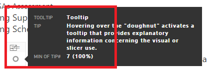
I use a technique of using the "doughnut" visual to provide a tooltip that becomes visible when you hover over the doughnut:

- Mark as New
- Bookmark
- Subscribe
- Mute
- Subscribe to RSS Feed
- Permalink
- Report Inappropriate Content
This is a fetching workaround! Thanks!
- Mark as New
- Bookmark
- Subscribe
- Mute
- Subscribe to RSS Feed
- Permalink
- Report Inappropriate Content
I am interested in more detail regarding the donut workaround.
Do you have a separate table for tool tips? Or perhaps multiple tables?
Is each row on the table a page in your dashboard? Or maybe a visualization on a page?
I see you show the MIN of Tooltip. Is there only 1 row in the table, thereby giving you the only record?
- Mark as New
- Bookmark
- Subscribe
- Mute
- Subscribe to RSS Feed
- Permalink
- Report Inappropriate Content
I created a tooltip table that has 3 columns: Tooltip (the tip title), Tip, and Tip Number. For the doughnut to work, you've got to include the value, for which I use Tip Number and change it to the Min which happens to coincide with that tip's Tip Number. Hope this helps. I use the doughnut's throughout my report (100+ pages) to provide amplification, explanation, and instruction on how to use a graphic (e.g., drilldown).
- Mark as New
- Bookmark
- Subscribe
- Mute
- Subscribe to RSS Feed
- Permalink
- Report Inappropriate Content
It took me a minute to understand that you (probably?) set a filter to the correct tip number on each page to show the correct tip.
Either way, I got it to work. ![]()
The donut is a picky visualization to use when it's so small, in that the cursor must hover over the rim (not the hole in the middle) in order for the tool tip to appear. I prefer a small pie chart - it ends up as a single colored circle which can be hovered over more easily (IMO).
I see how to change the background of the visualization, but I would really like to change the single pie slice to a custom color. Any ideas on that?
Your response was very timely and quite helpful. Thank you.
- Mark as New
- Bookmark
- Subscribe
- Mute
- Subscribe to RSS Feed
- Permalink
- Report Inappropriate Content
It doesn't appear that you can adjust the data colors unless you have more than one item going into the pie chart (legend or value). It just defaults to the first color to the right of the White and Black columns in the default color table. Perhaps you could "force" by using custom themes and have the color you want to use as the first one in your theme json?
- Mark as New
- Bookmark
- Subscribe
- Mute
- Subscribe to RSS Feed
- Permalink
- Report Inappropriate Content
Helpful resources

Microsoft Fabric Learn Together
Covering the world! 9:00-10:30 AM Sydney, 4:00-5:30 PM CET (Paris/Berlin), 7:00-8:30 PM Mexico City

Power BI Monthly Update - April 2024
Check out the April 2024 Power BI update to learn about new features.

| User | Count |
|---|---|
| 107 | |
| 93 | |
| 77 | |
| 63 | |
| 50 |
| User | Count |
|---|---|
| 147 | |
| 106 | |
| 104 | |
| 87 | |
| 61 |

