- Power BI forums
- Updates
- News & Announcements
- Get Help with Power BI
- Desktop
- Service
- Report Server
- Power Query
- Mobile Apps
- Developer
- DAX Commands and Tips
- Custom Visuals Development Discussion
- Health and Life Sciences
- Power BI Spanish forums
- Translated Spanish Desktop
- Power Platform Integration - Better Together!
- Power Platform Integrations (Read-only)
- Power Platform and Dynamics 365 Integrations (Read-only)
- Training and Consulting
- Instructor Led Training
- Dashboard in a Day for Women, by Women
- Galleries
- Community Connections & How-To Videos
- COVID-19 Data Stories Gallery
- Themes Gallery
- Data Stories Gallery
- R Script Showcase
- Webinars and Video Gallery
- Quick Measures Gallery
- 2021 MSBizAppsSummit Gallery
- 2020 MSBizAppsSummit Gallery
- 2019 MSBizAppsSummit Gallery
- Events
- Ideas
- Custom Visuals Ideas
- Issues
- Issues
- Events
- Upcoming Events
- Community Blog
- Power BI Community Blog
- Custom Visuals Community Blog
- Community Support
- Community Accounts & Registration
- Using the Community
- Community Feedback
Register now to learn Fabric in free live sessions led by the best Microsoft experts. From Apr 16 to May 9, in English and Spanish.
- Power BI forums
- Forums
- Get Help with Power BI
- Desktop
- plot multiple lines with different data filters on...
- Subscribe to RSS Feed
- Mark Topic as New
- Mark Topic as Read
- Float this Topic for Current User
- Bookmark
- Subscribe
- Printer Friendly Page
- Mark as New
- Bookmark
- Subscribe
- Mute
- Subscribe to RSS Feed
- Permalink
- Report Inappropriate Content
plot multiple lines with different data filters on one graph
Hi,
I would like to plot multiple line on one graph, but I can't do it with simple "line chart".
I have only one dataset, and what I want to do is to use lines to represent different filters.
I included few filters which are the same for all lines, but each line will have different filter for one collumn.
So, to be simple: I am using 4 filters for my dataset, and for all lines 3 filters are the same, but the lines are different because 4th filter is unique for each line (example: Collumn A = "1" for line A; Collumn A="2" for line B etc.)
Hope I could explain it well enough,
Looking forward for your answer!
- Mark as New
- Bookmark
- Subscribe
- Mute
- Subscribe to RSS Feed
- Permalink
- Report Inappropriate Content
Hi nn92,
You can do this. You will need to create different measures for each of the lines you want on your line chart.
The measures can each have their unique filters, and then you would use the filters that affect all of the measures as part of the page/report filters.
If you look at the CALCULATE function that will probably be the one you'll use to create the measures.
Hope that helps
Alex
- Mark as New
- Bookmark
- Subscribe
- Mute
- Subscribe to RSS Feed
- Permalink
- Report Inappropriate Content
Thanks for the answer!
Do you maybe know if there is some custom visualisation which can help with this?
I am not so into working with functions in Power BI, but I am taking some online courses...
- Mark as New
- Bookmark
- Subscribe
- Mute
- Subscribe to RSS Feed
- Permalink
- Report Inappropriate Content
I'm not aware of any custom visualisation, but this shouldnt be too hard to do.
If you post your data or some sample data, that'd be really helpful and me or someone else here could help with your formulas.
Alex
- Mark as New
- Bookmark
- Subscribe
- Mute
- Subscribe to RSS Feed
- Permalink
- Report Inappropriate Content
Hi,
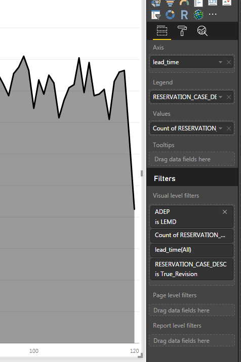
I attached you the current setings, if you could help, I would appreciate a lot.
I need to keep everything the same, only change the "ADEP is LEMD" into "ADEP is XXXX" and plot several same lines on one graph?
***edit: Table name is: TRP-Visual
Many thanks in advance!
- Mark as New
- Bookmark
- Subscribe
- Mute
- Subscribe to RSS Feed
- Permalink
- Report Inappropriate Content
Hi @nn92
I can't see everything in the screenshot you posted. If you can upload/post your model that would be helpful.
Your formulas would look something like this for each measure:
LEMD = calculate(countrows(RESERVATION_....),filter(ADEP="LEMD")
XXXX = calculate(countrows(RESERVATION_....),filter(ADEP="XXXX") etc
Hope that helps,
Alex
- Mark as New
- Bookmark
- Subscribe
- Mute
- Subscribe to RSS Feed
- Permalink
- Report Inappropriate Content
Hi, @alexei7 ,
thanks for trying to help!
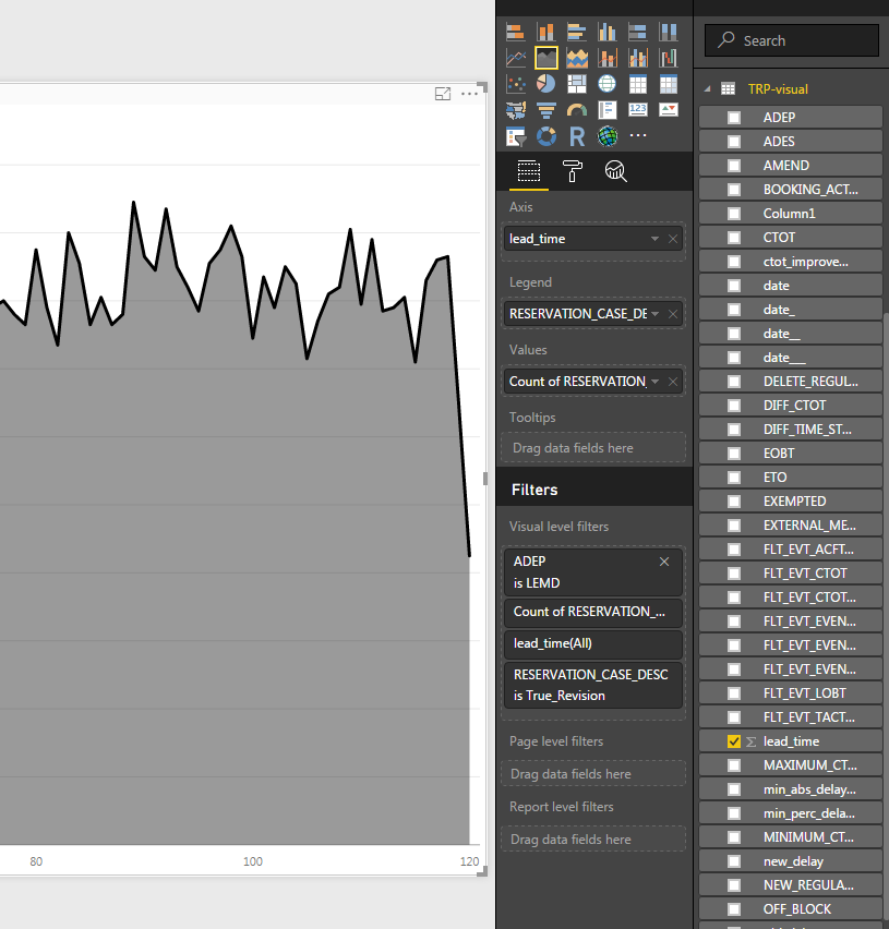
I posted bigger screenshot, with more info. Could you please tell me where exactly I need to type in this filter, and where to create new line (if it is under tabel->edit query...) or something ele?
THanks in advance!
- Mark as New
- Bookmark
- Subscribe
- Mute
- Subscribe to RSS Feed
- Permalink
- Report Inappropriate Content
Hi @nn92,
These are measures not filters.
One way you can create them is by right-clicking on the table and selecting "New Measure".
If you're able to remove any confidential information and share the model, I'm happy to help create the measures for you.
Alex
- Mark as New
- Bookmark
- Subscribe
- Mute
- Subscribe to RSS Feed
- Permalink
- Report Inappropriate Content
@alexei7 maybe this could help?
Problem is that my dataset is few GBs, so the model has 200mb and I cant upload it so easily.
Maybe this could help:
Axis = lead_time
Legent = RESERVATION_CASE_DESC
Values = Count of RESERVATION_CASE_DESC
Filters = ADEP is LEMD ***this is the one I want to vary for different lines
RESERVATION_CASE_DESC is True Revision
Table name is "TRP-visual"
Is this enough to write measure in the code? It takes a lot of space so I cant upload, sorry...
- Mark as New
- Bookmark
- Subscribe
- Mute
- Subscribe to RSS Feed
- Permalink
- Report Inappropriate Content
@nn92 - we may have to give up after this, it's quite hard to do this remotely!
Give this a go and see if this works as a measure for LEMB to put in your graph.
LEMB = CALCULATE(count('TRP-visual'[RESERVATION_CASE_DESC]),FILTER('TRP-visual',''TRP-visual'[ADEP]="LEMB"))If it works, you should be able to adapt it for other values.
Good luck,
Alex
- Mark as New
- Bookmark
- Subscribe
- Mute
- Subscribe to RSS Feed
- Permalink
- Report Inappropriate Content
Many thanks for the proposed solution!
I created a new measure and it is now on the list with all the columns. But I tried to drag&drop it, and there was nothing new displayed.. Am I doing something wrong?
Helpful resources

Microsoft Fabric Learn Together
Covering the world! 9:00-10:30 AM Sydney, 4:00-5:30 PM CET (Paris/Berlin), 7:00-8:30 PM Mexico City

Power BI Monthly Update - April 2024
Check out the April 2024 Power BI update to learn about new features.

| User | Count |
|---|---|
| 110 | |
| 94 | |
| 82 | |
| 66 | |
| 58 |
| User | Count |
|---|---|
| 151 | |
| 121 | |
| 104 | |
| 87 | |
| 67 |


