- Power BI forums
- Updates
- News & Announcements
- Get Help with Power BI
- Desktop
- Service
- Report Server
- Power Query
- Mobile Apps
- Developer
- DAX Commands and Tips
- Custom Visuals Development Discussion
- Health and Life Sciences
- Power BI Spanish forums
- Translated Spanish Desktop
- Power Platform Integration - Better Together!
- Power Platform Integrations (Read-only)
- Power Platform and Dynamics 365 Integrations (Read-only)
- Training and Consulting
- Instructor Led Training
- Dashboard in a Day for Women, by Women
- Galleries
- Community Connections & How-To Videos
- COVID-19 Data Stories Gallery
- Themes Gallery
- Data Stories Gallery
- R Script Showcase
- Webinars and Video Gallery
- Quick Measures Gallery
- 2021 MSBizAppsSummit Gallery
- 2020 MSBizAppsSummit Gallery
- 2019 MSBizAppsSummit Gallery
- Events
- Ideas
- Custom Visuals Ideas
- Issues
- Issues
- Events
- Upcoming Events
- Community Blog
- Power BI Community Blog
- Custom Visuals Community Blog
- Community Support
- Community Accounts & Registration
- Using the Community
- Community Feedback
Register now to learn Fabric in free live sessions led by the best Microsoft experts. From Apr 16 to May 9, in English and Spanish.
- Power BI forums
- Forums
- Get Help with Power BI
- Desktop
- not able/ don't know how to do economics graphics
- Subscribe to RSS Feed
- Mark Topic as New
- Mark Topic as Read
- Float this Topic for Current User
- Bookmark
- Subscribe
- Printer Friendly Page
- Mark as New
- Bookmark
- Subscribe
- Mute
- Subscribe to RSS Feed
- Permalink
- Report Inappropriate Content
not able/ don't know how to do economics graphics
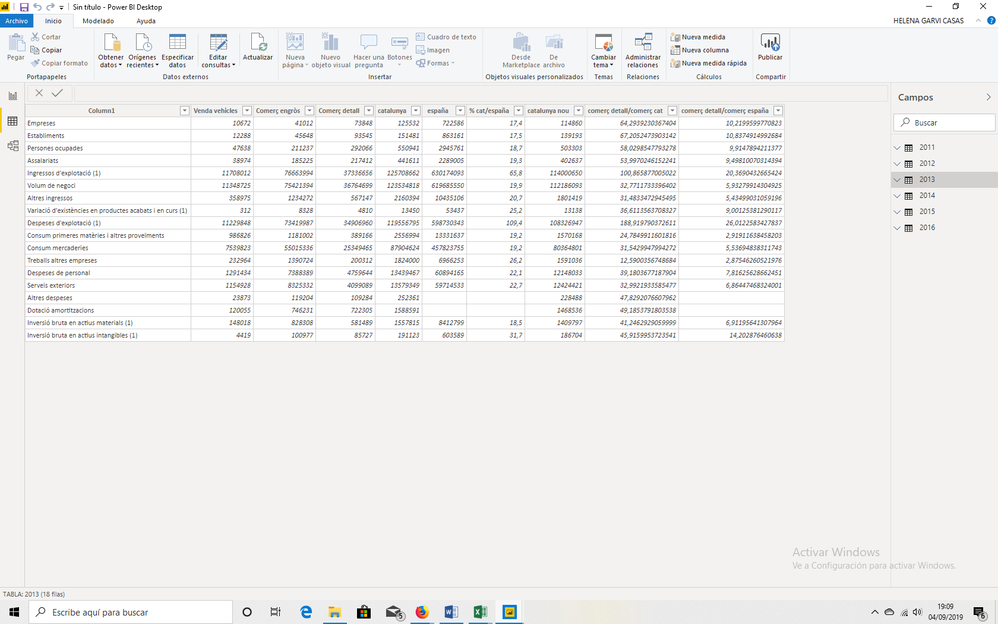
i have an excel with diferent sheets. all with the same structure like this from year 2011 until 2016. photo bellow:
what i want is to make some graphics to see the grow or the decrease of the%cat/españa, España, Cat, etc(things in columns) for each class of the rows (empreses, establiments, etc) for all years.
So i want to compare each over the years to see if it went better or worst. Meaning for España, see for each category over the years how it grew. another graphic for Cat for each category how it grew, etc.
i am an amateur in power bi but i think the worst is that i dont know a lot about economics and thus i dont exactly know how i can see all that in a graphic.
some help will be apreciated
Solved! Go to Solution.
- Mark as New
- Bookmark
- Subscribe
- Mute
- Subscribe to RSS Feed
- Permalink
- Report Inappropriate Content
Hi @Anonymous ,
You can use UNION() function in the DAX. Combine these tables to get a new table with columns you want regardless of whether the column name is the same.
Table 2 =
UNION (
    SELECTCOLUMNS (
        '2015',
        "name", '2015'[Name],
        "V1", '2015'[V1],
        "V2", '2015'[V2],
        "Year", "2015"
    ),
    SELECTCOLUMNS (
        '2016',
        "name", '2016'[Name],
        "V1", '2016'[V1],
        "V2", '2016'[V2],
        "Year", "2016"
    ),
    SELECTCOLUMNS (
        '2017',
        "name", '2017'[Name],
        "V1", '2017'[V1],
        "V2", '2017'[V2],
        "Year", "2017"
    )
)
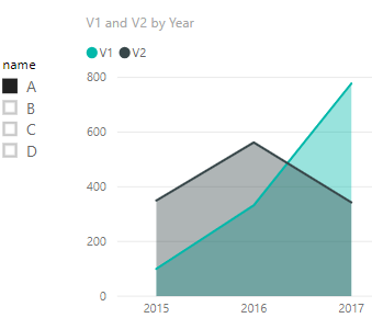
Then you can use Area visual and slicer to get the result.
If this post helps, then please consider Accept it as the solution to help the other members find it.
- Mark as New
- Bookmark
- Subscribe
- Mute
- Subscribe to RSS Feed
- Permalink
- Report Inappropriate Content
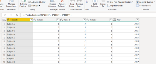
Assuming your column headers and row headers are the same across all tables, you need to add a year column and append all your tables together into one table. Here are the steps:
- Add a "Year" column with values of that year. So for 2015, you would add a custom column of "= Table.AddColumn(#"Changed Type", "Year", each 2015)"
- Repeat for all tables adjusting the year
- Append Queries as New and add all tables
Then you can create your visualizations to show year over year change.
Helpful resources

Microsoft Fabric Learn Together
Covering the world! 9:00-10:30 AM Sydney, 4:00-5:30 PM CET (Paris/Berlin), 7:00-8:30 PM Mexico City

Power BI Monthly Update - April 2024
Check out the April 2024 Power BI update to learn about new features.

| User | Count |
|---|---|
| 114 | |
| 97 | |
| 86 | |
| 70 | |
| 62 |
| User | Count |
|---|---|
| 151 | |
| 120 | |
| 103 | |
| 87 | |
| 68 |


