- Power BI forums
- Updates
- News & Announcements
- Get Help with Power BI
- Desktop
- Service
- Report Server
- Power Query
- Mobile Apps
- Developer
- DAX Commands and Tips
- Custom Visuals Development Discussion
- Health and Life Sciences
- Power BI Spanish forums
- Translated Spanish Desktop
- Power Platform Integration - Better Together!
- Power Platform Integrations (Read-only)
- Power Platform and Dynamics 365 Integrations (Read-only)
- Training and Consulting
- Instructor Led Training
- Dashboard in a Day for Women, by Women
- Galleries
- Community Connections & How-To Videos
- COVID-19 Data Stories Gallery
- Themes Gallery
- Data Stories Gallery
- R Script Showcase
- Webinars and Video Gallery
- Quick Measures Gallery
- 2021 MSBizAppsSummit Gallery
- 2020 MSBizAppsSummit Gallery
- 2019 MSBizAppsSummit Gallery
- Events
- Ideas
- Custom Visuals Ideas
- Issues
- Issues
- Events
- Upcoming Events
- Community Blog
- Power BI Community Blog
- Custom Visuals Community Blog
- Community Support
- Community Accounts & Registration
- Using the Community
- Community Feedback
Register now to learn Fabric in free live sessions led by the best Microsoft experts. From Apr 16 to May 9, in English and Spanish.
- Power BI forums
- Forums
- Get Help with Power BI
- Desktop
- Re: need help editing tooltip (title, measure info...
- Subscribe to RSS Feed
- Mark Topic as New
- Mark Topic as Read
- Float this Topic for Current User
- Bookmark
- Subscribe
- Printer Friendly Page
- Mark as New
- Bookmark
- Subscribe
- Mute
- Subscribe to RSS Feed
- Permalink
- Report Inappropriate Content
need help editing tooltip (title, measure information, column information)
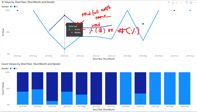
Hello! I have two visualizations where I wanted to modify some information in the tooltips. I know about report tooltip pages, however I am unsure how I can use them to customize information in tooltips in the graphs below.
For the line chart I wanted the graph tooltip to show Year and full month name. I have a full month name column however since the X-axis needs to have 3 letter month, the tooltip defaults to Axis value. Furthermore, I also have a Count Values column, and I was hoping that I can concatenate the Count Values to % Value information.
Next I have a stacked bar percent chart, and here I wanted to say Year, Month for the title of the First row. And similar to the line chart, say the full month name.
I have looked at similar values, however they are a bit unrelated:
https://community.powerbi.com/t5/Desktop/Edit-Tooltip-First-Last-Middle/m-p/297078#M131088
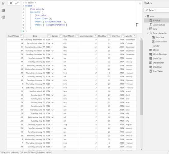
The model/data looks something like this:
data in .csv format:
Count Values,Date,Gender
33,9/27/2014,F
54,10/11/2014,M
45,11/27/2014,F
87,12/15/2014,M
78,12/30/2014,F
12,1/19/2014,M
78,1/21/2014,F
15,1/25/2014,M
63,1/29/2014,M
24,2/6/2014,M
4,1/27/2014,M
56,2/11/2014,M
4,2/27/2014,F
4,2/15/2014,M
25,3/30/2014,F
58,4/27/2014,M
35,5/11/2014,F
78,5/27/2014,M
12,6/15/2014,F
23,6/30/2014,M
23,7/15/2014,F
69,7/30/2014,M
23,7/15/2014,F
23,8/30/2014,F
23,1/19/2014,F
54,1/21/2014,F
23,1/25/2014,F
8,1/29/2014,F
7,2/6/2014,F
98,1/19/2014,F
1,1/21/2014,F
4,1/25/2014,F
9,1/29/2014,F
7,2/6/2014,F
7,1/19/2014,M
7,1/21/2014,M
97,1/25/2014,M
94,1/29/2014,M
1,2/6/2014,M
1,1/19/2014,M
56,1/21/2014,M
1,1/25/2014,M
89,1/29/2014,M
56,2/6/2014,M
Here are all the measures and columns created to make those visuals above:
Created Columns
---------------

ShortMonth = FORMAT(data[Date], "mmm")

MonthNumber = data[Date].[MonthNo]

ShortDay = DAY(data[Date])

ShortYear = YEAR(data[Date])

Month = FORMAT(data[Date], "mmmm", "en-US")


Created Measure
----------------

Sum Value = SUM ( data[Count Values] )

% Value =
DIVIDE (
    [Sum Value],
    CALCULATE (
        [Sum Value],
        ALLSELECTED (),
        VALUES ( data[ShortYear] ),
        VALUES (  data[ShortMonth] )
    )
)

Created Hiearchy (Custom date for the X axis, Year and 3 Letter Month)
----------------

Date Hiearchy : ShortYear -> ShortMonth
Please let me know if I can clarify anything. Thank you in advance 🙂
Solved! Go to Solution.
- Mark as New
- Bookmark
- Subscribe
- Mute
- Subscribe to RSS Feed
- Permalink
- Report Inappropriate Content
Hi @mkusf ,
The best option is to create a custom tooltip with the information how you need it:
https://docs.microsoft.com/en-us/power-bi/create-reports/desktop-tooltips
Regards
Miguel Félix
Did I answer your question? Mark my post as a solution!
Proud to be a Super User!
Check out my blog: Power BI em Português- Mark as New
- Bookmark
- Subscribe
- Mute
- Subscribe to RSS Feed
- Permalink
- Report Inappropriate Content
Hi @mkusf,
I think creating a tooltip page will the required information will solve your problem.
Here's a guide to help you: Using report tooltip pages in Power BI - Power BI | Microsoft Docs
- Mark as New
- Bookmark
- Subscribe
- Mute
- Subscribe to RSS Feed
- Permalink
- Report Inappropriate Content
Thank you @Anonymous ! Appreciate your help 🙂
- Mark as New
- Bookmark
- Subscribe
- Mute
- Subscribe to RSS Feed
- Permalink
- Report Inappropriate Content
Hi @mkusf ,
The best option is to create a custom tooltip with the information how you need it:
https://docs.microsoft.com/en-us/power-bi/create-reports/desktop-tooltips
Regards
Miguel Félix
Did I answer your question? Mark my post as a solution!
Proud to be a Super User!
Check out my blog: Power BI em Português- Mark as New
- Bookmark
- Subscribe
- Mute
- Subscribe to RSS Feed
- Permalink
- Report Inappropriate Content
Hi @MFelix, Thank you. I do have some knowledge about that. I was hoping there might be a straightforward way than that since I needed just minor changes to my tooltips. However I will give that a try 🙂
- Mark as New
- Bookmark
- Subscribe
- Mute
- Subscribe to RSS Feed
- Permalink
- Report Inappropriate Content
Hi @mkusf ,
You can also add the tooltip fields to the bottom of the visualization:
This will add additional fields to your tooltip but keeping the ones you already use.
Regards
Miguel Félix
Did I answer your question? Mark my post as a solution!
Proud to be a Super User!
Check out my blog: Power BI em Português- Mark as New
- Bookmark
- Subscribe
- Mute
- Subscribe to RSS Feed
- Permalink
- Report Inappropriate Content
Unfortunately when I do that with my actual data the tooltip loses some information on longer legend (That was the first thing I did before posting my question here!!).
- Mark as New
- Bookmark
- Subscribe
- Mute
- Subscribe to RSS Feed
- Permalink
- Report Inappropriate Content
@mkusf ,
Then you need to make use of the custom tooltip, that allows to have more customized sizes.
Regards
Miguel Félix
Did I answer your question? Mark my post as a solution!
Proud to be a Super User!
Check out my blog: Power BI em PortuguêsHelpful resources

Microsoft Fabric Learn Together
Covering the world! 9:00-10:30 AM Sydney, 4:00-5:30 PM CET (Paris/Berlin), 7:00-8:30 PM Mexico City

Power BI Monthly Update - April 2024
Check out the April 2024 Power BI update to learn about new features.

| User | Count |
|---|---|
| 116 | |
| 105 | |
| 69 | |
| 67 | |
| 43 |
| User | Count |
|---|---|
| 148 | |
| 103 | |
| 103 | |
| 88 | |
| 66 |


