- Power BI forums
- Updates
- News & Announcements
- Get Help with Power BI
- Desktop
- Service
- Report Server
- Power Query
- Mobile Apps
- Developer
- DAX Commands and Tips
- Custom Visuals Development Discussion
- Health and Life Sciences
- Power BI Spanish forums
- Translated Spanish Desktop
- Power Platform Integration - Better Together!
- Power Platform Integrations (Read-only)
- Power Platform and Dynamics 365 Integrations (Read-only)
- Training and Consulting
- Instructor Led Training
- Dashboard in a Day for Women, by Women
- Galleries
- Community Connections & How-To Videos
- COVID-19 Data Stories Gallery
- Themes Gallery
- Data Stories Gallery
- R Script Showcase
- Webinars and Video Gallery
- Quick Measures Gallery
- 2021 MSBizAppsSummit Gallery
- 2020 MSBizAppsSummit Gallery
- 2019 MSBizAppsSummit Gallery
- Events
- Ideas
- Custom Visuals Ideas
- Issues
- Issues
- Events
- Upcoming Events
- Community Blog
- Power BI Community Blog
- Custom Visuals Community Blog
- Community Support
- Community Accounts & Registration
- Using the Community
- Community Feedback
Register now to learn Fabric in free live sessions led by the best Microsoft experts. From Apr 16 to May 9, in English and Spanish.
- Power BI forums
- Forums
- Get Help with Power BI
- Desktop
- Re: line graph - adding additional line based on s...
- Subscribe to RSS Feed
- Mark Topic as New
- Mark Topic as Read
- Float this Topic for Current User
- Bookmark
- Subscribe
- Printer Friendly Page
- Mark as New
- Bookmark
- Subscribe
- Mute
- Subscribe to RSS Feed
- Permalink
- Report Inappropriate Content
line graph - adding additional line based on same table data
Hello community.
i'm a fairly novice user so please forgive my basic knowledge.
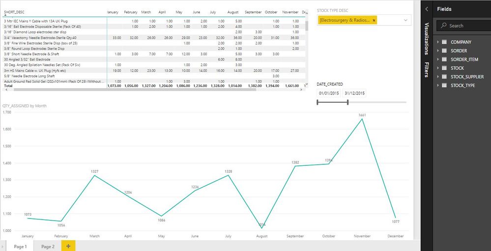
I have a line graph that shows quantity of stock sold every day/week/month/quarter/year which is filtered by a date slicer.
What I would like to do is have a line added for each year, (2015,2016,2017 etc) so I can see the trends in ordering.
My data is from an SQL database we have on premise and to keep the functionality the way I currently have it, there are 6 tables that have relationships to each other.
as far as I can tell, I would need to either add or seperate the data into seperate tables based on date, which would mean I would loose my necessary table relationships.
please see below for what I currently have, and thank you in advance for any advice/help you can provide.
Solved! Go to Solution.
- Mark as New
- Bookmark
- Subscribe
- Mute
- Subscribe to RSS Feed
- Permalink
- Report Inappropriate Content
@dalemoy,
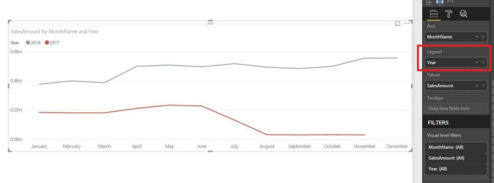
Do you want to add line to the existing line chart representing different years ?If so, create a year column using dax below, then drag the column to Legend of the line chart. There is an example for your reference.
Year= YEAR(Table[Date])
If the above steps don't help, please describe more details about what fields you use to create relationship among the tables and what field you want to add as X-axis of line chart.
Regards,
Lydia
If this post helps, then please consider Accept it as the solution to help the other members find it more quickly.
- Mark as New
- Bookmark
- Subscribe
- Mute
- Subscribe to RSS Feed
- Permalink
- Report Inappropriate Content
For a clustered column chart what I used was Axis FullDate made it a hierarchy and X-out evrything but month. Then Legend Fulldate hierarchy X-out everything but year. Muti-select slicer. try that and see if it gives you the grouping you need for the line chart.
- Mark as New
- Bookmark
- Subscribe
- Mute
- Subscribe to RSS Feed
- Permalink
- Report Inappropriate Content
Try looking into pushing your existing measures into new ones that filter your data by year, you should then be able to plot a measure for 2017, 2016, 2015 etc in your graph. There's quite a few posts discussing this, try looking at (for example) https://community.powerbi.com/t5/Desktop/Year-over-Year-in-line-chart/td-p/13691
- Mark as New
- Bookmark
- Subscribe
- Mute
- Subscribe to RSS Feed
- Permalink
- Report Inappropriate Content
Hi jthomson,
Thanks for replying so quickly!
I am familiar with creating new measures, but my DAX is quite poor, how would I formulate this with my dataset in mind?
This formula would have to take into account the relationships I have in mind - i.e clicking on a particular stock line or filtering by stock type would ultimately effect the graph.
if it helps, please find an example of the dataset i'm working with below.
Table 1: SORDER
SORDER_ID DATE_CREATED
| 10048 | 06/03/2015 00:00:00 |
| 10061 | 07/01/2015 00:00:00 |
| 10385 | 07/01/2015 00:00:00 |
table 2: SORDER_ITEM
SORDER_ID STOCK_ID STOCK_DESC QTY_ASSIGNED
| 29309 | 145 | 6mm Biopsy Punch Disposable Qty:10 | 2 |
| 29309 | 148 | Disposable CURETTE 7mm Qty:10 | 2 |
| 29311 | 240 | M1 Main Filter for Acu-Evac IE-2 | 1 |
Table 3: STOCK
STOCK_IDSTYPE_ID
| -1 | 3 |
| 1 | 1 |
| 10 | 6 |
| 100 | 10 |
Table 4: STOCK_TYPE
STYPE_ID STOCK TYPE DESC
| 1 | [System & Misc Types] System & Miscellaneous |
| 10 | [Surgical] Tourniquet & Splints |
| 11 | [Surgical] Punches & Curettes |
I really appreciate any help you give to a noob like me.
Thanks again,
- Mark as New
- Bookmark
- Subscribe
- Mute
- Subscribe to RSS Feed
- Permalink
- Report Inappropriate Content
@dalemoy,
Do you want to add line to the existing line chart representing different years ?If so, create a year column using dax below, then drag the column to Legend of the line chart. There is an example for your reference.
Year= YEAR(Table[Date])
If the above steps don't help, please describe more details about what fields you use to create relationship among the tables and what field you want to add as X-axis of line chart.
Regards,
Lydia
If this post helps, then please consider Accept it as the solution to help the other members find it more quickly.
- Mark as New
- Bookmark
- Subscribe
- Mute
- Subscribe to RSS Feed
- Permalink
- Report Inappropriate Content
Thanks a lot! apprecaite the help. this worked
Helpful resources

Microsoft Fabric Learn Together
Covering the world! 9:00-10:30 AM Sydney, 4:00-5:30 PM CET (Paris/Berlin), 7:00-8:30 PM Mexico City

Power BI Monthly Update - April 2024
Check out the April 2024 Power BI update to learn about new features.

| User | Count |
|---|---|
| 109 | |
| 95 | |
| 77 | |
| 65 | |
| 53 |
| User | Count |
|---|---|
| 144 | |
| 105 | |
| 102 | |
| 89 | |
| 63 |


