- Power BI forums
- Updates
- News & Announcements
- Get Help with Power BI
- Desktop
- Service
- Report Server
- Power Query
- Mobile Apps
- Developer
- DAX Commands and Tips
- Custom Visuals Development Discussion
- Health and Life Sciences
- Power BI Spanish forums
- Translated Spanish Desktop
- Power Platform Integration - Better Together!
- Power Platform Integrations (Read-only)
- Power Platform and Dynamics 365 Integrations (Read-only)
- Training and Consulting
- Instructor Led Training
- Dashboard in a Day for Women, by Women
- Galleries
- Community Connections & How-To Videos
- COVID-19 Data Stories Gallery
- Themes Gallery
- Data Stories Gallery
- R Script Showcase
- Webinars and Video Gallery
- Quick Measures Gallery
- 2021 MSBizAppsSummit Gallery
- 2020 MSBizAppsSummit Gallery
- 2019 MSBizAppsSummit Gallery
- Events
- Ideas
- Custom Visuals Ideas
- Issues
- Issues
- Events
- Upcoming Events
- Community Blog
- Power BI Community Blog
- Custom Visuals Community Blog
- Community Support
- Community Accounts & Registration
- Using the Community
- Community Feedback
Register now to learn Fabric in free live sessions led by the best Microsoft experts. From Apr 16 to May 9, in English and Spanish.
- Power BI forums
- Forums
- Get Help with Power BI
- Desktop
- line and column graph
- Subscribe to RSS Feed
- Mark Topic as New
- Mark Topic as Read
- Float this Topic for Current User
- Bookmark
- Subscribe
- Printer Friendly Page
- Mark as New
- Bookmark
- Subscribe
- Mute
- Subscribe to RSS Feed
- Permalink
- Report Inappropriate Content
line and column graph
Hi there,
I have data on an excel file that has rows containing the following data points on each column
A) date, (B) name, (C) value (D)source name.
The source name is either "WEB" or "INTERNAL"
I need to create a line and column graph with dates on the X axis. Value on the Y axis.
How can I show the "INTERNAL" as a Bar and "WEB" as a line? But can't see how to do this
Thanks
- Mark as New
- Bookmark
- Subscribe
- Mute
- Subscribe to RSS Feed
- Permalink
- Report Inappropriate Content
Hello @Fiona83 ,I assume your Column Source Name is categorical where it can only be WEB or INTERNAL.
Q. You want to display the different data sources categories separately or on the same visual?
If its on the same visual, I believe filters can work.
1. Use a Line and CLustered chart.
2. Drop the column twice on a Line and CLustered chart
3. Drop the column twice on the filter pane
. For each of the cases, ensure you filter out the other eg.
For the bar filter out the WEB and for the Line filter out the INTERNAL.
If this serves as the solution, please leave a like and accept this as the solution...
- Mark as New
- Bookmark
- Subscribe
- Mute
- Subscribe to RSS Feed
- Permalink
- Report Inappropriate Content
@Datagulf thank you for your response. Yes, I want this in one visual.
Sorry not sure what you mean about dropping the columns twice.
Do you mean to create two visuals, and then use transparency to overlap them?
- Mark as New
- Bookmark
- Subscribe
- Mute
- Subscribe to RSS Feed
- Permalink
- Report Inappropriate Content
@Fiona83 , nope .. Same visual.
what I wanted you to add twice was the column on the same visual.
This is because you are showing 2 different values( WEB and INTERNAL)in different ways, a bar and a line.
- Mark as New
- Bookmark
- Subscribe
- Mute
- Subscribe to RSS Feed
- Permalink
- Report Inappropriate Content
Hello @Fiona83 ,
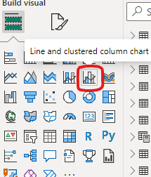
use this visual Line and Clustered column Chart as in the screenshot
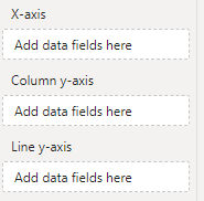
and you can add the field you want as a column in the column y-axis and the field as line in the ;ine y-axis
If I answered your question, please mark my post as solution, Appreciate your Kudos 👍
Proud to be a Super User! |  |
- Mark as New
- Bookmark
- Subscribe
- Mute
- Subscribe to RSS Feed
- Permalink
- Report Inappropriate Content
Thank you but when I add the source to the Y-axis is then adds this as a "count" not the value
Helpful resources

Microsoft Fabric Learn Together
Covering the world! 9:00-10:30 AM Sydney, 4:00-5:30 PM CET (Paris/Berlin), 7:00-8:30 PM Mexico City

Power BI Monthly Update - April 2024
Check out the April 2024 Power BI update to learn about new features.

| User | Count |
|---|---|
| 111 | |
| 95 | |
| 80 | |
| 68 | |
| 59 |
| User | Count |
|---|---|
| 150 | |
| 119 | |
| 104 | |
| 87 | |
| 67 |


