- Power BI forums
- Updates
- News & Announcements
- Get Help with Power BI
- Desktop
- Service
- Report Server
- Power Query
- Mobile Apps
- Developer
- DAX Commands and Tips
- Custom Visuals Development Discussion
- Health and Life Sciences
- Power BI Spanish forums
- Translated Spanish Desktop
- Power Platform Integration - Better Together!
- Power Platform Integrations (Read-only)
- Power Platform and Dynamics 365 Integrations (Read-only)
- Training and Consulting
- Instructor Led Training
- Dashboard in a Day for Women, by Women
- Galleries
- Community Connections & How-To Videos
- COVID-19 Data Stories Gallery
- Themes Gallery
- Data Stories Gallery
- R Script Showcase
- Webinars and Video Gallery
- Quick Measures Gallery
- 2021 MSBizAppsSummit Gallery
- 2020 MSBizAppsSummit Gallery
- 2019 MSBizAppsSummit Gallery
- Events
- Ideas
- Custom Visuals Ideas
- Issues
- Issues
- Events
- Upcoming Events
- Community Blog
- Power BI Community Blog
- Custom Visuals Community Blog
- Community Support
- Community Accounts & Registration
- Using the Community
- Community Feedback
Register now to learn Fabric in free live sessions led by the best Microsoft experts. From Apr 16 to May 9, in English and Spanish.
- Power BI forums
- Forums
- Get Help with Power BI
- Desktop
- Re: line and clustered column chart, line is not l...
- Subscribe to RSS Feed
- Mark Topic as New
- Mark Topic as Read
- Float this Topic for Current User
- Bookmark
- Subscribe
- Printer Friendly Page
- Mark as New
- Bookmark
- Subscribe
- Mute
- Subscribe to RSS Feed
- Permalink
- Report Inappropriate Content
line and clustered column chart, line is not long enough
Hi All -
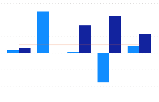
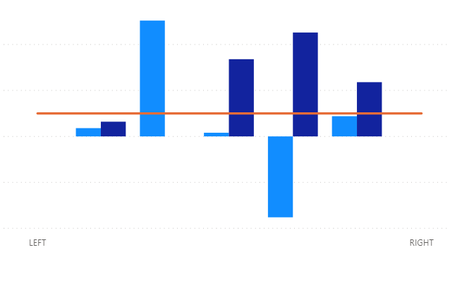
This is a presentation level issue with the chart as far as I can understand. The issue is the line stops at the mid-section on both the beginning and end of the data to display. This results in bisecting the clustered columns and is weird. My current workaround is to add arbitary columns to display (which have no data) and this extends the lines but is then displayed on the x-axis.
Anyone have any ideas on how to resolve this or have an alternate workaround? I don't like my workaround as it confuses people (whats left & right??).
Chart without workaround (axis labels whited out)

Chart with workaround (same labels whited out)

Solved! Go to Solution.
- Mark as New
- Bookmark
- Subscribe
- Mute
- Subscribe to RSS Feed
- Permalink
- Report Inappropriate Content
Hi @Nicho248 -
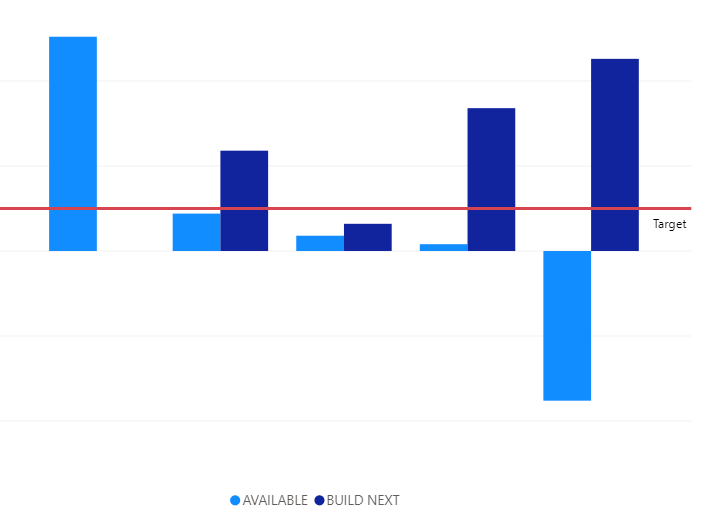
Is the line meant to be a constant value, or does it change depending on slicers? If the former, you can make the visual a clustered column chart and use the Analytics feature to create a constant line.
If the latter, does the line have a different scale than the columns? You can use a secondary Y-axis for the line that may move the line above where most of the columns are, thereby looking less confusing.
You can also try to shrink the width of the columns, so that the bisection is "less" noticeable.
The line point is going to hit right in the center of the axis value. That's what it would do if it were a line visual only as well. Best thing to do is to mitigate the confusion in the visual by making formatting choices. Another option, which I've done in reports, is to have two separate visuals - one the clustered column, one the line - place the line visual completely above the column visual, and then turn off the X-axis on the line visual. You have to do some playing with overall width of the visual to get it to line up perfectly, but it's possible.
Hope this helps
David
- Mark as New
- Bookmark
- Subscribe
- Mute
- Subscribe to RSS Feed
- Permalink
- Report Inappropriate Content
Hello David -
Thank you for the alternative options listed. I will check into these and advise.
Prior to loading into power bi, I had this simple chart working in excel no problem. Was extremely easy and the 'bisecting' issue isn't present there. Figured it was user error on my part in power bi. The graph is displaying product available, and what is required to build next in order to hit the desired safety stock level. The line is the safety stock level. So, in other words the available will vary from -200 to +200, the build next will vary between 0+ maybe 400, while the safety stock is 0 to maybe 100. In this example the safety stock is set the same for all products, but may change in the future.
I'll try the analytics recommendation and advise from there. Worried I may have to just attempt to stack charts or stack a line image instead.
N
- Mark as New
- Bookmark
- Subscribe
- Mute
- Subscribe to RSS Feed
- Permalink
- Report Inappropriate Content
Hi @Nicho248 -
One other thing to note is that if your two columns are separate measures (as opposed to a single measure split up by a field in "Legend", you could make the safety stock level a 3rd column, and put the 3 columns in an order that makes sense - not necessarily the best solution, but another "workround". Given what you've described the purpose of the report is, narrowing the columns as much as possible on the graph would probably give you the best result without having to resort to more extreme measures.
David
- Mark as New
- Bookmark
- Subscribe
- Mute
- Subscribe to RSS Feed
- Permalink
- Report Inappropriate Content
Hi @dedelman_clng -
I'm stopping at the first thing that gets me by for now. So the analytics/constant line works fine. May have issues down the road when the targets are different per product.
Thanks again for your help!
N
- Mark as New
- Bookmark
- Subscribe
- Mute
- Subscribe to RSS Feed
- Permalink
- Report Inappropriate Content
Hi @Nicho248 ,
The reason why your line is not shown complete is due to the missing data.
I don't think there is a workaround for this, because this is the missing data issue.
Thanks,
Pragati
- Mark as New
- Bookmark
- Subscribe
- Mute
- Subscribe to RSS Feed
- Permalink
- Report Inappropriate Content
Hello Pragati -
I don't understand your comment. My graph has no missing data. What are you thinking is missing?
N
Helpful resources

Microsoft Fabric Learn Together
Covering the world! 9:00-10:30 AM Sydney, 4:00-5:30 PM CET (Paris/Berlin), 7:00-8:30 PM Mexico City

Power BI Monthly Update - April 2024
Check out the April 2024 Power BI update to learn about new features.

| User | Count |
|---|---|
| 108 | |
| 100 | |
| 78 | |
| 64 | |
| 58 |
| User | Count |
|---|---|
| 148 | |
| 113 | |
| 97 | |
| 84 | |
| 67 |


