- Power BI forums
- Updates
- News & Announcements
- Get Help with Power BI
- Desktop
- Service
- Report Server
- Power Query
- Mobile Apps
- Developer
- DAX Commands and Tips
- Custom Visuals Development Discussion
- Health and Life Sciences
- Power BI Spanish forums
- Translated Spanish Desktop
- Power Platform Integration - Better Together!
- Power Platform Integrations (Read-only)
- Power Platform and Dynamics 365 Integrations (Read-only)
- Training and Consulting
- Instructor Led Training
- Dashboard in a Day for Women, by Women
- Galleries
- Community Connections & How-To Videos
- COVID-19 Data Stories Gallery
- Themes Gallery
- Data Stories Gallery
- R Script Showcase
- Webinars and Video Gallery
- Quick Measures Gallery
- 2021 MSBizAppsSummit Gallery
- 2020 MSBizAppsSummit Gallery
- 2019 MSBizAppsSummit Gallery
- Events
- Ideas
- Custom Visuals Ideas
- Issues
- Issues
- Events
- Upcoming Events
- Community Blog
- Power BI Community Blog
- Custom Visuals Community Blog
- Community Support
- Community Accounts & Registration
- Using the Community
- Community Feedback
Register now to learn Fabric in free live sessions led by the best Microsoft experts. From Apr 16 to May 9, in English and Spanish.
- Power BI forums
- Forums
- Get Help with Power BI
- Desktop
- how to display a basic line chart ?
- Subscribe to RSS Feed
- Mark Topic as New
- Mark Topic as Read
- Float this Topic for Current User
- Bookmark
- Subscribe
- Printer Friendly Page
- Mark as New
- Bookmark
- Subscribe
- Mute
- Subscribe to RSS Feed
- Permalink
- Report Inappropriate Content
how to display a basic line chart ?
Obviously this is a beginner question...
Here is a small set of data that I want to transcript into 3 line charts :
let
    Source = Table.FromRows(Json.Document(Binary.Decompress(Binary.FromText("i45WMjIwMjYwNDJV0lEyNAESZoZAwtLMQClWByppZGABkgSpMDaCScYCAA==", BinaryEncoding.Base64), Compression.Deflate)), let _t = ((type nullable text) meta [Serialized.Text = true]) in type table [Date = _t, Stream1 = _t, Stream2 = _t, Stream3 = _t]),
    #"Type modifié" = Table.TransformColumnTypes(Source,{{"Date", Date.Type}, {"Stream1", Int64.Type}, {"Stream2", Int64.Type}, {"Stream3", Int64.Type}})
in
    #"Type modifié"
I have 2 entries a my table, with 4 columns, one for the date and one for each "stream" I want to who progress on.
So when I have saved and applied the above code, I then created 3 line charts. They are set like this :
1st chart :
- the date column on the X axis
- Stream1 column on the Y axis
2nd chart :
- the date column on the X axis
- Stream2 column on the Y axis
3rd chart :
- the date column on the X axis
- Stream3 column on the Y axis
First of all, why do Power BI "changed" the summaries of Stream1, Stream2, Stream3 to SUM ? I have set "Do not summarize" for the 3 of them. I might not understand the concept behind this summary information, where can I find info about it ?
But the issue is that my 3 charts show a flat line at 1 and when I place the mouse over the line chart, it says "Number of Stream1 1", "Number of Stream2 1", "Number of Stream3 1".
What I expect/need is :
the first chart to show a line going from 14 to 15
the second chart to show a line going from 61 to 32
the third chart to show a line going from 960 to 960
Can you tell me why I see only line at 1, and how I can achieve what I actually want to show please ?
Also, it shows me a hierarchy in the dates (year/quarter/month/day). How can I just display in my X axis the dates like it is in my table : "mercredi 25 janvier 2023" or maybe "20230125" ?
Thanks for your help
Solved! Go to Solution.
- Mark as New
- Bookmark
- Subscribe
- Mute
- Subscribe to RSS Feed
- Permalink
- Report Inappropriate Content
Hello @Anonymous
The summarization will automatically apply when it comes to "numeric" values (the different Stream columns being defined as numeric). If we want to change that for a specific field we can go to the "Column tools" when a field is selected and set to "don't summarize". I think this is what you did.
In your case, you need to put that Stream1... values on the Y axis; as it's a Y axis, it has to do an aggregation. As you previously set to "do not summarize", power bi will still try to to an aggregation, which will be by default the Count.
This is why you always have 1: it couns the number of values, for each of your date. And thus, for each date, you only have 1 value.
To achieve what you want, you'll need to go back to sum, or min/max (it depends on the case, but for your example min/max could work as well).
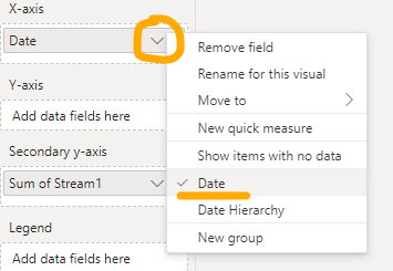
To remove that hiererchical part of the date, you need to just click on the "arrow" near your date, and select Date:
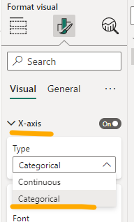
(Optional) Depending on the desired result, you may also need to change the X axis to Categorical to have that exact date shown:
If you want to change the format of your shown date, just go to the formatting pane:
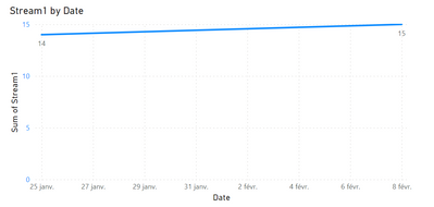
You'll obtain smth like that in the end (of course this is a draft that will need to be updated)
Don't hesitate if smth's not clear!
Regards,
- Mark as New
- Bookmark
- Subscribe
- Mute
- Subscribe to RSS Feed
- Permalink
- Report Inappropriate Content
Thank you.
I have changed the date and it looks better indeed. "But it shows on my Y axis all the days.
How can I do one (or ideally for my knowledge, the two) following things :
- Bold only the dates where there is a value
- Show only the dates where there is a value
- Mark as New
- Bookmark
- Subscribe
- Mute
- Subscribe to RSS Feed
- Permalink
- Report Inappropriate Content
Hello @Anonymous
Could you please send a screen capture of your visual? Just to check the "But it shows on my Y axis all the days" part.
Normally Power BI will only show data when you have values. So in your case, if you have 2 dates, it will show 2 dates with corresponding values. We can change that behaviour, and say to Power bI to show items with no data, but not sure if we talk about the same thing
So if you could provide me an example to understand what case do you have it could be great.
Thanks!
- Mark as New
- Bookmark
- Subscribe
- Mute
- Subscribe to RSS Feed
- Permalink
- Report Inappropriate Content
Sure, here is the screenshot @AnastasiaS :
I have data for only the 25th of January and the 8th of February but all the days in between are displayed (it's actually every 2 days that are displayed) as you can see between my 2 yellow highlights.
I have tried selecting "Show items with no data" but it doesn't change anything on my chart.
- Mark as New
- Bookmark
- Subscribe
- Mute
- Subscribe to RSS Feed
- Permalink
- Report Inappropriate Content
Hello @Anonymous
Thanks for the capture.
This is where the X axis type could "help".
If I take your example and try the 2 axis types:
We will have, for the "continuous", the result that you have, with details between:
And if we change it to "Categorical", we will obtain only dates we need:
Is this what you were looking for?
Regards,
- Mark as New
- Bookmark
- Subscribe
- Mute
- Subscribe to RSS Feed
- Permalink
- Report Inappropriate Content
Indeed @AnastasiaS , setting "Categorical" does the trick for the option "Show only the dates where there is a value", thank you !
Out of curiosity, is it possible to keep "Continuous" and have in bold the dates matching my data (which woiuld cover the other option I was talking about with "Bold only the dates where there is a value") ?
- Mark as New
- Bookmark
- Subscribe
- Mute
- Subscribe to RSS Feed
- Permalink
- Report Inappropriate Content
@Anonymous I am not sure that we can do that in this way. We could play with the conditional formatting but we wont be able to get the expected result.
If you want to keep the continuous mode, you could maybe use the stacked chart. in this case you'll only see bars for existing values and it will still keep the "blank spaces" between:
So it's not a continuous line as for the line chart:
Idk if this could be helpful.
Regards,
Helpful resources

Microsoft Fabric Learn Together
Covering the world! 9:00-10:30 AM Sydney, 4:00-5:30 PM CET (Paris/Berlin), 7:00-8:30 PM Mexico City

Power BI Monthly Update - April 2024
Check out the April 2024 Power BI update to learn about new features.

| User | Count |
|---|---|
| 115 | |
| 99 | |
| 86 | |
| 70 | |
| 62 |
| User | Count |
|---|---|
| 151 | |
| 120 | |
| 103 | |
| 87 | |
| 68 |


