- Power BI forums
- Updates
- News & Announcements
- Get Help with Power BI
- Desktop
- Service
- Report Server
- Power Query
- Mobile Apps
- Developer
- DAX Commands and Tips
- Custom Visuals Development Discussion
- Health and Life Sciences
- Power BI Spanish forums
- Translated Spanish Desktop
- Power Platform Integration - Better Together!
- Power Platform Integrations (Read-only)
- Power Platform and Dynamics 365 Integrations (Read-only)
- Training and Consulting
- Instructor Led Training
- Dashboard in a Day for Women, by Women
- Galleries
- Community Connections & How-To Videos
- COVID-19 Data Stories Gallery
- Themes Gallery
- Data Stories Gallery
- R Script Showcase
- Webinars and Video Gallery
- Quick Measures Gallery
- 2021 MSBizAppsSummit Gallery
- 2020 MSBizAppsSummit Gallery
- 2019 MSBizAppsSummit Gallery
- Events
- Ideas
- Custom Visuals Ideas
- Issues
- Issues
- Events
- Upcoming Events
- Community Blog
- Power BI Community Blog
- Custom Visuals Community Blog
- Community Support
- Community Accounts & Registration
- Using the Community
- Community Feedback
Register now to learn Fabric in free live sessions led by the best Microsoft experts. From Apr 16 to May 9, in English and Spanish.
- Power BI forums
- Forums
- Get Help with Power BI
- Desktop
- Re: how do we make some specific charts with Power...
- Subscribe to RSS Feed
- Mark Topic as New
- Mark Topic as Read
- Float this Topic for Current User
- Bookmark
- Subscribe
- Printer Friendly Page
- Mark as New
- Bookmark
- Subscribe
- Mute
- Subscribe to RSS Feed
- Permalink
- Report Inappropriate Content
how do we make some specific charts with Power BI
Hi, This in Nobuko_ao. very new user of Power BI.
I need your help to creating some chart with Power BI.
We would like to analyze our client’s “aptitude test” results (Over 3,000 lines), and create a summary with Power BI.
The data format of aptitude test are as follows;
Basically we have no idea to doing preliminary preparation with excel file, like as copy & past with switching cell(column) and row.
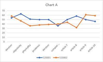
1) How do we make a chart A), with most simple and efficient way with Power BI?
2) How do we make a chart B), with most simple and efficient way with Power BI?.
3) How do we calculate “descriptive statistics value”, and make a chart C) with Power BI?
4) If using Power BI is not the efficient/productive way, please advise the best tools to make these chart,
e.g. using R, or anything else.
Many thanks in advance.
Nobuko_ao
Solved! Go to Solution.
- Mark as New
- Bookmark
- Subscribe
- Mute
- Subscribe to RSS Feed
- Permalink
- Report Inappropriate Content
Right click [ID] column and select Unpivot Other Columns in Query Editor, then you may use Line chart and Box and Whisker chart.
If this post helps, then please consider Accept it as the solution to help the other members find it more quickly.
- Mark as New
- Bookmark
- Subscribe
- Mute
- Subscribe to RSS Feed
- Permalink
- Report Inappropriate Content
Dear Sam,
I did it with your advise. Thanks !!
Chart A) and Chart B) are solved.
Do you have any idea regarding calcurate “descriptive statistics value”, and make a chart C) ?
My boss mentioned that it would be better to using "R" for Chart C), do you agree?
Many thanks in advance,
Nobuko_ao
Helpful resources

Microsoft Fabric Learn Together
Covering the world! 9:00-10:30 AM Sydney, 4:00-5:30 PM CET (Paris/Berlin), 7:00-8:30 PM Mexico City

Power BI Monthly Update - April 2024
Check out the April 2024 Power BI update to learn about new features.

| User | Count |
|---|---|
| 109 | |
| 98 | |
| 77 | |
| 66 | |
| 54 |
| User | Count |
|---|---|
| 144 | |
| 104 | |
| 100 | |
| 86 | |
| 64 |


