- Power BI forums
- Updates
- News & Announcements
- Get Help with Power BI
- Desktop
- Service
- Report Server
- Power Query
- Mobile Apps
- Developer
- DAX Commands and Tips
- Custom Visuals Development Discussion
- Health and Life Sciences
- Power BI Spanish forums
- Translated Spanish Desktop
- Power Platform Integration - Better Together!
- Power Platform Integrations (Read-only)
- Power Platform and Dynamics 365 Integrations (Read-only)
- Training and Consulting
- Instructor Led Training
- Dashboard in a Day for Women, by Women
- Galleries
- Community Connections & How-To Videos
- COVID-19 Data Stories Gallery
- Themes Gallery
- Data Stories Gallery
- R Script Showcase
- Webinars and Video Gallery
- Quick Measures Gallery
- 2021 MSBizAppsSummit Gallery
- 2020 MSBizAppsSummit Gallery
- 2019 MSBizAppsSummit Gallery
- Events
- Ideas
- Custom Visuals Ideas
- Issues
- Issues
- Events
- Upcoming Events
- Community Blog
- Power BI Community Blog
- Custom Visuals Community Blog
- Community Support
- Community Accounts & Registration
- Using the Community
- Community Feedback
Register now to learn Fabric in free live sessions led by the best Microsoft experts. From Apr 16 to May 9, in English and Spanish.
- Power BI forums
- Forums
- Get Help with Power BI
- Desktop
- Re: how can i make a clustered column chart based ...
- Subscribe to RSS Feed
- Mark Topic as New
- Mark Topic as Read
- Float this Topic for Current User
- Bookmark
- Subscribe
- Printer Friendly Page
- Mark as New
- Bookmark
- Subscribe
- Mute
- Subscribe to RSS Feed
- Permalink
- Report Inappropriate Content
how can i make a clustered column chart based on Top 5 data
Hi - Please can someone help me. I want to create a clustered table showing the Top 6 Root cause from my file, group based on date selected per month and also i wanted to see which root cause has the highest dollar paid as well. Please see attached graph i wanted to re-create in power bi. I have Root cause field, Audit date field which containes mm/dd/yy, dollar paid amount field.
Solved! Go to Solution.
- Mark as New
- Bookmark
- Subscribe
- Mute
- Subscribe to RSS Feed
- Permalink
- Report Inappropriate Content
Hi @joegie ,
Create a measure as below:
Measure =
VAR _rank=RANKX(FILTER(ALLSELECTED('Table'),'Table'[Month]=MAX('Table'[Month])),CALCULATE(SUM('Table'[dollar paid])),,DESC,Skip)
Return
IF(_rank<=5,MAX('Table'[dollar paid]),BLANK())
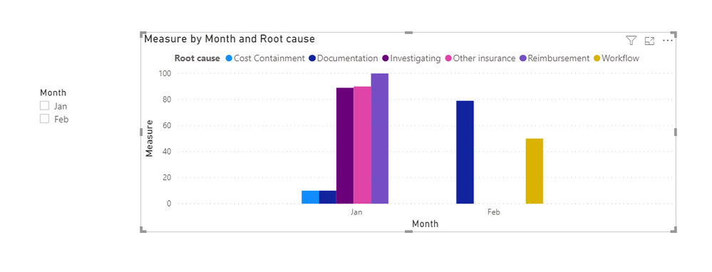
And you will see:
For the related .pbix file,pls see attached.
Best Regards,
Kelly
Did I answer your question? Mark my post as a solution!
- Mark as New
- Bookmark
- Subscribe
- Mute
- Subscribe to RSS Feed
- Permalink
- Report Inappropriate Content
Hi,
Share some data to work with. Also on the data that you share, show the expected result in a Table format. Thereafter we can always show any visual that you want.
Regards,
Ashish Mathur
http://www.ashishmathur.com
https://www.linkedin.com/in/excelenthusiasts/
- Mark as New
- Bookmark
- Subscribe
- Mute
- Subscribe to RSS Feed
- Permalink
- Report Inappropriate Content
Hi - here is the sample table I'm working with. I don' t know how to inser the excel file so adding here as body of the message:
| Root cause | audit date | dollar paid |
Reimbursement | 1/1/2020 | 100 |
| Duplicate payment | 1/1/2020 | 0 |
| Other insurance | 1/1/2020 | 90 |
| Cost Containment | 1/2/2020 | 10 |
| Investigating | 1/2/2020 | 89 |
| Documentation | 1/2/2020 | 10 |
| Documentation | 2/2/2020 | 20 |
| Workflow | 2/2/2020 | 50 |
| Documentation | 2/2/2020 | 79 |
- Mark as New
- Bookmark
- Subscribe
- Mute
- Subscribe to RSS Feed
- Permalink
- Report Inappropriate Content
Hi,
I still cannot relate your source data with your expected result. Share a slightly larger dataset and on that dataset show your expected result in a Table format. You may upload your file to Google Drive or a similar hosting service and share a download link here.
Regards,
Ashish Mathur
http://www.ashishmathur.com
https://www.linkedin.com/in/excelenthusiasts/
Helpful resources

Microsoft Fabric Learn Together
Covering the world! 9:00-10:30 AM Sydney, 4:00-5:30 PM CET (Paris/Berlin), 7:00-8:30 PM Mexico City

Power BI Monthly Update - April 2024
Check out the April 2024 Power BI update to learn about new features.

| User | Count |
|---|---|
| 114 | |
| 99 | |
| 82 | |
| 70 | |
| 60 |
| User | Count |
|---|---|
| 149 | |
| 114 | |
| 107 | |
| 89 | |
| 67 |


