- Power BI forums
- Updates
- News & Announcements
- Get Help with Power BI
- Desktop
- Service
- Report Server
- Power Query
- Mobile Apps
- Developer
- DAX Commands and Tips
- Custom Visuals Development Discussion
- Health and Life Sciences
- Power BI Spanish forums
- Translated Spanish Desktop
- Power Platform Integration - Better Together!
- Power Platform Integrations (Read-only)
- Power Platform and Dynamics 365 Integrations (Read-only)
- Training and Consulting
- Instructor Led Training
- Dashboard in a Day for Women, by Women
- Galleries
- Community Connections & How-To Videos
- COVID-19 Data Stories Gallery
- Themes Gallery
- Data Stories Gallery
- R Script Showcase
- Webinars and Video Gallery
- Quick Measures Gallery
- 2021 MSBizAppsSummit Gallery
- 2020 MSBizAppsSummit Gallery
- 2019 MSBizAppsSummit Gallery
- Events
- Ideas
- Custom Visuals Ideas
- Issues
- Issues
- Events
- Upcoming Events
- Community Blog
- Power BI Community Blog
- Custom Visuals Community Blog
- Community Support
- Community Accounts & Registration
- Using the Community
- Community Feedback
Register now to learn Fabric in free live sessions led by the best Microsoft experts. From Apr 16 to May 9, in English and Spanish.
- Power BI forums
- Forums
- Get Help with Power BI
- Desktop
- Re: histogram problem in displaying the frequencie...
- Subscribe to RSS Feed
- Mark Topic as New
- Mark Topic as Read
- Float this Topic for Current User
- Bookmark
- Subscribe
- Printer Friendly Page
- Mark as New
- Bookmark
- Subscribe
- Mute
- Subscribe to RSS Feed
- Permalink
- Report Inappropriate Content
histogram problem in displaying the frequencies in percentage
Dear Ladies/Gentleman
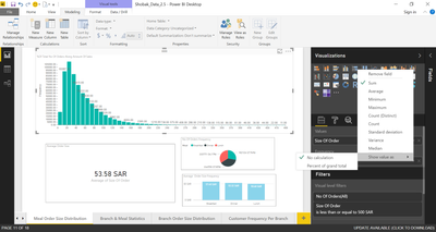
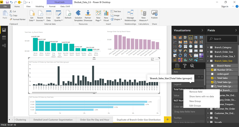
I have a histogram display the range of order total sales per order here is an example:
Assume the total number of orders is 600,000 and the total sales is 40,000,000 $, the histogram will
display the sales distribution according to the following sequence:
sales range order frequency
----------- ----------------
sales (0-10) $ ----> 100,000 orders out of 600,000
sales (10-20) $ ---> 97,564 orders out of 600,000
......etc
If I want to display the Histogram as frequency with show value as (no calculation) the histogram display the order frequency as above example , But If I want to display show value as (percent of grand total) it displays the frequencies equally 10 for each sale range (not right), anyone tell me how to solve this problem to display the frequency in percentage?

Solved! Go to Solution.
- Mark as New
- Bookmark
- Subscribe
- Mute
- Subscribe to RSS Feed
- Permalink
- Report Inappropriate Content
Hi,
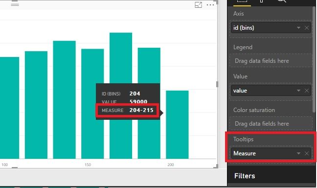
Add to the Tooltips, not the axis. Try it please.
Best Regards!
Dale
If this post helps, then please consider Accept it as the solution to help the other members find it more quickly.
- Mark as New
- Bookmark
- Subscribe
- Mute
- Subscribe to RSS Feed
- Permalink
- Report Inappropriate Content
Hi,
You must be using custom visual “Histogram”. It looks great. Maybe you used a wrong visual in your scenario. Frequency in “Histogram” usually count the frequency of “Values” in the visual. For example, frequency of “1-5” is 4 which counts the Sales, not the sum of “Whatever”. Reference here: https://en.wikipedia.org/wiki/Histogram
Sales Whatever
1 122
1 169
3 187
4 196
6 177
6 136
7 141
12 120
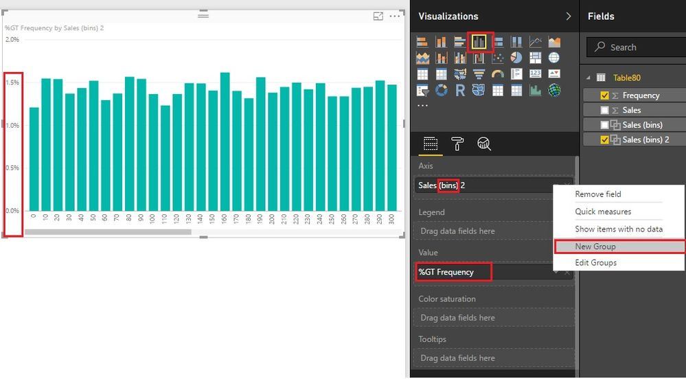
May be you need a Clustered Column Chart. Using bins to categorize the “Sales”. (Click New Group to create bins.)
Best Regards!
Dale
If this post helps, then please consider Accept it as the solution to help the other members find it more quickly.
- Mark as New
- Bookmark
- Subscribe
- Mute
- Subscribe to RSS Feed
- Permalink
- Report Inappropriate Content
Any Comment please about My last replay?
- Mark as New
- Bookmark
- Subscribe
- Mute
- Subscribe to RSS Feed
- Permalink
- Report Inappropriate Content
Hi,
If you used the Clustered Column Chart, you don't need to add legend. In the "axis", it should be "sales range" (in your first post). The value should be "order frequency" (show value as percentage of grand total). If your source data looked like this, it should be grouped.
sales range order frequency
0 10000
1 10000
2 10000
Grouping isn't needed in this scenario.
sales range order frequency
0 - 10 10000
11 - 20 10000
21 - 30 10000
Please have a try.
Best Regards!
Dale
If this post helps, then please consider Accept it as the solution to help the other members find it more quickly.
- Mark as New
- Bookmark
- Subscribe
- Mute
- Subscribe to RSS Feed
- Permalink
- Report Inappropriate Content
It looks better than before,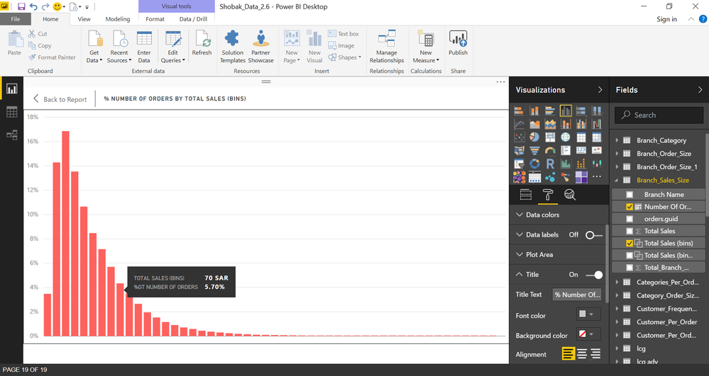
- Mark as New
- Bookmark
- Subscribe
- Mute
- Subscribe to RSS Feed
- Permalink
- Report Inappropriate Content
It looks now better than before.
What you said in our last post is:
sales range order frequency
0 - 10 10000
11 - 20 10000
21 - 30 10000
How can I do it on sales range?
- Mark as New
- Bookmark
- Subscribe
- Mute
- Subscribe to RSS Feed
- Permalink
- Report Inappropriate Content
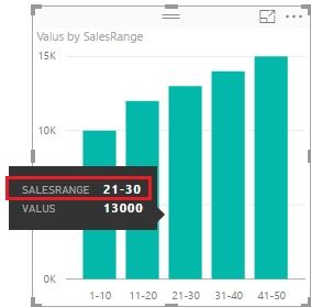
I mean in the tool tip how I can display it as sales range (0-10) (10-20) ,,,etc ?
- Mark as New
- Bookmark
- Subscribe
- Mute
- Subscribe to RSS Feed
- Permalink
- Report Inappropriate Content
Hi,
You don't need to add it. The visual will show the axis. Have a look at the picture. In the last scenario, no group needed.
Best Regards!
Dale
If this post helps, then please consider Accept it as the solution to help the other members find it more quickly.
- Mark as New
- Bookmark
- Subscribe
- Mute
- Subscribe to RSS Feed
- Permalink
- Report Inappropriate Content
Still, I'm not able to do it as label ranges !!
- Mark as New
- Bookmark
- Subscribe
- Mute
- Subscribe to RSS Feed
- Permalink
- Report Inappropriate Content
Hi,
You used bins. Maybe you can use this measure. (Make any changes necessary). And then add it to Tooltips.
Measure =
CONCATENATE (
    CONCATENATE ( MIN ( 'Table1'[Total sales] ), "-" ),
    MAX ( 'Table1'[Total sales] )
)
Best Regards!
Dale
If this post helps, then please consider Accept it as the solution to help the other members find it more quickly.
- Mark as New
- Bookmark
- Subscribe
- Mute
- Subscribe to RSS Feed
- Permalink
- Report Inappropriate Content
Not Accept Measure when I put it in the (Axies)
- Mark as New
- Bookmark
- Subscribe
- Mute
- Subscribe to RSS Feed
- Permalink
- Report Inappropriate Content
Hi,
Add to the Tooltips, not the axis. Try it please.
Best Regards!
Dale
If this post helps, then please consider Accept it as the solution to help the other members find it more quickly.
- Mark as New
- Bookmark
- Subscribe
- Mute
- Subscribe to RSS Feed
- Permalink
- Report Inappropriate Content
Thank You So much It works now, sorry that it takes much time but at the end, we achieve what we want.
- Mark as New
- Bookmark
- Subscribe
- Mute
- Subscribe to RSS Feed
- Permalink
- Report Inappropriate Content
Still Not Working Can You explain how I do it appears in the Graph again step by step?
- Mark as New
- Bookmark
- Subscribe
- Mute
- Subscribe to RSS Feed
- Permalink
- Report Inappropriate Content
I did it In groups but It doesn't look nice. I don't know how to deal with it do you have reference or tutorial do it step by step?
- Mark as New
- Bookmark
- Subscribe
- Mute
- Subscribe to RSS Feed
- Permalink
- Report Inappropriate Content
But Now Become worse , It does not group them in ranges (0-10) ,(10-20) ,,,,etc
- Mark as New
- Bookmark
- Subscribe
- Mute
- Subscribe to RSS Feed
- Permalink
- Report Inappropriate Content
- Mark as New
- Bookmark
- Subscribe
- Mute
- Subscribe to RSS Feed
- Permalink
- Report Inappropriate Content
No Updates?
Helpful resources

Microsoft Fabric Learn Together
Covering the world! 9:00-10:30 AM Sydney, 4:00-5:30 PM CET (Paris/Berlin), 7:00-8:30 PM Mexico City

Power BI Monthly Update - April 2024
Check out the April 2024 Power BI update to learn about new features.

| User | Count |
|---|---|
| 114 | |
| 98 | |
| 86 | |
| 70 | |
| 62 |
| User | Count |
|---|---|
| 151 | |
| 120 | |
| 103 | |
| 87 | |
| 68 |
