- Power BI forums
- Updates
- News & Announcements
- Get Help with Power BI
- Desktop
- Service
- Report Server
- Power Query
- Mobile Apps
- Developer
- DAX Commands and Tips
- Custom Visuals Development Discussion
- Health and Life Sciences
- Power BI Spanish forums
- Translated Spanish Desktop
- Power Platform Integration - Better Together!
- Power Platform Integrations (Read-only)
- Power Platform and Dynamics 365 Integrations (Read-only)
- Training and Consulting
- Instructor Led Training
- Dashboard in a Day for Women, by Women
- Galleries
- Community Connections & How-To Videos
- COVID-19 Data Stories Gallery
- Themes Gallery
- Data Stories Gallery
- R Script Showcase
- Webinars and Video Gallery
- Quick Measures Gallery
- 2021 MSBizAppsSummit Gallery
- 2020 MSBizAppsSummit Gallery
- 2019 MSBizAppsSummit Gallery
- Events
- Ideas
- Custom Visuals Ideas
- Issues
- Issues
- Events
- Upcoming Events
- Community Blog
- Power BI Community Blog
- Custom Visuals Community Blog
- Community Support
- Community Accounts & Registration
- Using the Community
- Community Feedback
Register now to learn Fabric in free live sessions led by the best Microsoft experts. From Apr 16 to May 9, in English and Spanish.
- Power BI forums
- Forums
- Get Help with Power BI
- Desktop
- hierarchy
- Subscribe to RSS Feed
- Mark Topic as New
- Mark Topic as Read
- Float this Topic for Current User
- Bookmark
- Subscribe
- Printer Friendly Page
- Mark as New
- Bookmark
- Subscribe
- Mute
- Subscribe to RSS Feed
- Permalink
- Report Inappropriate Content
hierarchy
Hello,
Newbie here. I made a bunch of line graphs with data from Google Analytics, for instance the amount of impressions a certain campaign has had. I put the results in a line graph. I then added a hierarchy to the graph, which allows me to look at the results on a campaign level, advertising group level, and keyword level.
I came across a problem here. On the highest level, campaign, it shows me the results for campaigns per day. So that means i got the amount of impressions on the y-axis and date on the x-axis.
If I drill down to a lower level, say advertising group, the Y-axis remains, however the x-axis dissapears. Instead of showing the results per day, it sums up the total amount of impressions making the result a single dot, as opposed to a line graph. What am I doing wrong?
Solved! Go to Solution.
- Mark as New
- Bookmark
- Subscribe
- Mute
- Subscribe to RSS Feed
- Permalink
- Report Inappropriate Content
Hi @uberscore,
If I understand correctly, you put campaign, advertising and keyword in Axis of line chart, and the amount of impressions in Values, right?
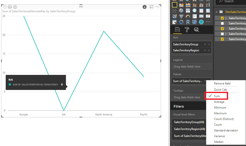
When you drill down from campaign level to advertising group level, the X-axis will display the advertising group values. The line value will based on the aggregate function used for Values.
Besides, we can drill down all fields at once, or drill down one field at a time. For more information, please refer to this article: Drill down in a visualization in Power BI.
If issue persists, please share some sample data and screenshots about the line chart for our analysis.
Best Regards,
Qiuyun Yu
If this post helps, then please consider Accept it as the solution to help the other members find it more quickly.
- Mark as New
- Bookmark
- Subscribe
- Mute
- Subscribe to RSS Feed
- Permalink
- Report Inappropriate Content
Hello Qiuyun_Yu,
Your description is accurate for what I am doing, but it's not what I want to have. I want to be in a situation where the axis has date, the values are impressions and the legend(containing the hierarchy of campaign) allows me to drill down. I looked around on the forum and saw that this is currently a suggestion. I'll go vote there and hope for the best.
Thanks for your reply,
Uberscore
Helpful resources

Microsoft Fabric Learn Together
Covering the world! 9:00-10:30 AM Sydney, 4:00-5:30 PM CET (Paris/Berlin), 7:00-8:30 PM Mexico City

Power BI Monthly Update - April 2024
Check out the April 2024 Power BI update to learn about new features.

| User | Count |
|---|---|
| 109 | |
| 99 | |
| 77 | |
| 66 | |
| 54 |
| User | Count |
|---|---|
| 144 | |
| 104 | |
| 102 | |
| 87 | |
| 64 |

