- Power BI forums
- Updates
- News & Announcements
- Get Help with Power BI
- Desktop
- Service
- Report Server
- Power Query
- Mobile Apps
- Developer
- DAX Commands and Tips
- Custom Visuals Development Discussion
- Health and Life Sciences
- Power BI Spanish forums
- Translated Spanish Desktop
- Power Platform Integration - Better Together!
- Power Platform Integrations (Read-only)
- Power Platform and Dynamics 365 Integrations (Read-only)
- Training and Consulting
- Instructor Led Training
- Dashboard in a Day for Women, by Women
- Galleries
- Community Connections & How-To Videos
- COVID-19 Data Stories Gallery
- Themes Gallery
- Data Stories Gallery
- R Script Showcase
- Webinars and Video Gallery
- Quick Measures Gallery
- 2021 MSBizAppsSummit Gallery
- 2020 MSBizAppsSummit Gallery
- 2019 MSBizAppsSummit Gallery
- Events
- Ideas
- Custom Visuals Ideas
- Issues
- Issues
- Events
- Upcoming Events
- Community Blog
- Power BI Community Blog
- Custom Visuals Community Blog
- Community Support
- Community Accounts & Registration
- Using the Community
- Community Feedback
Register now to learn Fabric in free live sessions led by the best Microsoft experts. From Apr 16 to May 9, in English and Spanish.
- Power BI forums
- Forums
- Get Help with Power BI
- Desktop
- help with multiple graphs
- Subscribe to RSS Feed
- Mark Topic as New
- Mark Topic as Read
- Float this Topic for Current User
- Bookmark
- Subscribe
- Printer Friendly Page
- Mark as New
- Bookmark
- Subscribe
- Mute
- Subscribe to RSS Feed
- Permalink
- Report Inappropriate Content
help with multiple graphs
I have huge dataset, where I would like to plot multiple plots from.
I have two problems:
1.
Sadly, the dataset is build in a way, where i need to use multiple slicers to get the plot I want to. Each datapoint has a running unique ID(=x-axis), that is connected to result set. Since each datapoint has unique running number, It seems I cannot make stacked graph with multiple plots in one vizualization.
2.
I managed to get a one plot out, by using multiple slicers. Now i want to make another plot, from the same dataset, without messing up the first plot. To get second plot, I would have to change slicers settings and that would alter the first plot.
I could make two different plots by creating a page for each plot. But in the end, I would like to summarize these plots in one page, how to do that?
Solved! Go to Solution.
- Mark as New
- Bookmark
- Subscribe
- Mute
- Subscribe to RSS Feed
- Permalink
- Report Inappropriate Content
- Mark as New
- Bookmark
- Subscribe
- Mute
- Subscribe to RSS Feed
- Permalink
- Report Inappropriate Content
Hi @y-k,
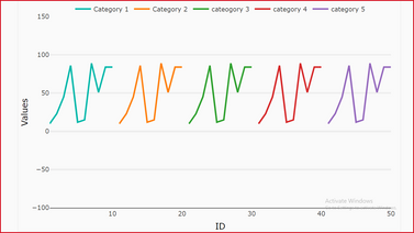
Here is multiple line chart side-by-side it will help you to plot line charts side by side with unique x axis values.


Download link for the custom visual file in this page
https://pbivizedit.com/gallery/side-by-side-multiple-line-chart
This was made with our Custom Visual creator tool PBIVizEdit.com. With this tool,
- anyone, irrespective of technical skills, can create their own visuals
- 15 minutes to create a visual from scratch
- opens up many additional attributes to edit (for e.g. labels, tooltips, legends position, etc)
Give this a shot and let us know if you face any problem/errors.
You can use the editor to modify your visual further (some modifications cannot be done in Power BI window and have to be in editor).
Thanks,
Team PBIVizEdit
- Mark as New
- Bookmark
- Subscribe
- Mute
- Subscribe to RSS Feed
- Permalink
- Report Inappropriate Content
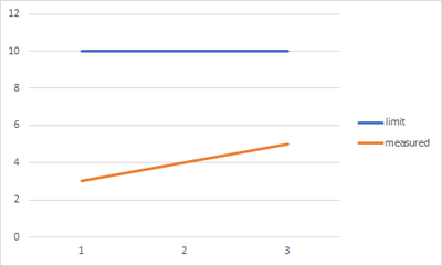
so my data looks like this:
| index | value | datatype |
| 1 | 10 | limit |
| 2 | 3 | measured |
| 3 | 10 | limit |
| 4 | 4 | measured |
| 5 | 10 | limit |
| 6 | 5 | measured |
So i want my graph to look like this:
- Mark as New
- Bookmark
- Subscribe
- Mute
- Subscribe to RSS Feed
- Permalink
- Report Inappropriate Content
Hi @y-k,
Here is multiple line chart side-by-side it will help you to plot line charts side by side with unique x axis values.


Download link for the custom visual file in this page
https://pbivizedit.com/gallery/side-by-side-multiple-line-chart
This was made with our Custom Visual creator tool PBIVizEdit.com. With this tool,
- anyone, irrespective of technical skills, can create their own visuals
- 15 minutes to create a visual from scratch
- opens up many additional attributes to edit (for e.g. labels, tooltips, legends position, etc)
Give this a shot and let us know if you face any problem/errors.
You can use the editor to modify your visual further (some modifications cannot be done in Power BI window and have to be in editor).
Thanks,
Team PBIVizEdit
- Mark as New
- Bookmark
- Subscribe
- Mute
- Subscribe to RSS Feed
- Permalink
- Report Inappropriate Content
Thank you for reply and sorry for very late reply.
I tried this tool, but i actually want to do exact opposite what this tool does.
I have two plots, which have x-axis as running numbers. All my data have unique x-axis value. One of axis values is measured value, other one is limit value. For every measured point, there is limit value.
What I want, is to stack my plots together, showing measured value and limit value in same graph, together in same x-axis.
Is such possible in powerbi?
- Mark as New
- Bookmark
- Subscribe
- Mute
- Subscribe to RSS Feed
- Permalink
- Report Inappropriate Content
Hi @y-k ,
Yes, it is possible to do in Power Bi with PBIVizEdit tool. However, as far I have understood you have to stack two plots on same x axis. Then, try this visual and just select the "None" in Fill Style option in area chart formatting options.
To try and use the visual visit,
https://pbivizedit.com/gallery/stacked-area-with-custom-tooltip
Hope this helps,
Team PBIVizEdit,
- Mark as New
- Bookmark
- Subscribe
- Mute
- Subscribe to RSS Feed
- Permalink
- Report Inappropriate Content
1. I guess I need to create new running index numbers for each datapoint, is there automated/easy way of doing this? The data set first needs to be filtered, before index number can be given.
2. Thanks, looked it creating seperate filters is doable, it just takes so much time to fix each graph by hand. I wish Microsoft had made graph filters to be copy pastable.
- Mark as New
- Bookmark
- Subscribe
- Mute
- Subscribe to RSS Feed
- Permalink
- Report Inappropriate Content
Hi @y-k ,
As @bcdobbs mentioned,If users do not need interact with slicers, it is a better choice to use visual level filters in each visual. The creation of each visual does not affect each other.
If you need to use slicers,please set the interaction of each visual correctly .
https://docs.microsoft.com/en-us/power-bi/create-reports/service-reports-visual-interactions
Best Regards,
Liang
If this post helps, then please consider Accept it as the solution to help the other members find it more quickly.
- Mark as New
- Bookmark
- Subscribe
- Mute
- Subscribe to RSS Feed
- Permalink
- Report Inappropriate Content
Helpful resources

Microsoft Fabric Learn Together
Covering the world! 9:00-10:30 AM Sydney, 4:00-5:30 PM CET (Paris/Berlin), 7:00-8:30 PM Mexico City

Power BI Monthly Update - April 2024
Check out the April 2024 Power BI update to learn about new features.

| User | Count |
|---|---|
| 113 | |
| 97 | |
| 84 | |
| 67 | |
| 60 |
| User | Count |
|---|---|
| 150 | |
| 120 | |
| 99 | |
| 87 | |
| 68 |


