- Power BI forums
- Updates
- News & Announcements
- Get Help with Power BI
- Desktop
- Service
- Report Server
- Power Query
- Mobile Apps
- Developer
- DAX Commands and Tips
- Custom Visuals Development Discussion
- Health and Life Sciences
- Power BI Spanish forums
- Translated Spanish Desktop
- Power Platform Integration - Better Together!
- Power Platform Integrations (Read-only)
- Power Platform and Dynamics 365 Integrations (Read-only)
- Training and Consulting
- Instructor Led Training
- Dashboard in a Day for Women, by Women
- Galleries
- Community Connections & How-To Videos
- COVID-19 Data Stories Gallery
- Themes Gallery
- Data Stories Gallery
- R Script Showcase
- Webinars and Video Gallery
- Quick Measures Gallery
- 2021 MSBizAppsSummit Gallery
- 2020 MSBizAppsSummit Gallery
- 2019 MSBizAppsSummit Gallery
- Events
- Ideas
- Custom Visuals Ideas
- Issues
- Issues
- Events
- Upcoming Events
- Community Blog
- Power BI Community Blog
- Custom Visuals Community Blog
- Community Support
- Community Accounts & Registration
- Using the Community
- Community Feedback
Register now to learn Fabric in free live sessions led by the best Microsoft experts. From Apr 16 to May 9, in English and Spanish.
- Power BI forums
- Forums
- Get Help with Power BI
- Desktop
- group ranking
- Subscribe to RSS Feed
- Mark Topic as New
- Mark Topic as Read
- Float this Topic for Current User
- Bookmark
- Subscribe
- Printer Friendly Page
- Mark as New
- Bookmark
- Subscribe
- Mute
- Subscribe to RSS Feed
- Permalink
- Report Inappropriate Content
group ranking
I have a lot of hierarchical data about stocks the data is not aggregated.
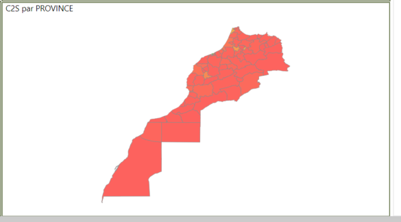
I created a map with these stocks (summarizing them by regions). Then I colored the provinces based on the regions value. The problem is that I have 3 regions that have a very high stock compared with the rest of the regions so these regions are green and all others are red. I want to rank them (1 for the region with the biggest stock) and change color by this rank.
Can I somehow calculate this rank?
Solved! Go to Solution.
- Mark as New
- Bookmark
- Subscribe
- Mute
- Subscribe to RSS Feed
- Permalink
- Report Inappropriate Content
Hi @Valerica_G ,
Please check the measures below.
Measure = SUM('Table'[stock])
rank = RANKX(ALLSELECTED('Table'[region]),[Measure],,DESC)
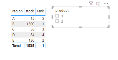
Result would be shown as below.
Best Regards,
Jay
Community Support Team _ Jay Wang
If this post helps, then please consider Accept it as the solution to help the other members find it more quickly.
If this post helps, then please consider Accept it as the solution to help the other members find it.
- Mark as New
- Bookmark
- Subscribe
- Mute
- Subscribe to RSS Feed
- Permalink
- Report Inappropriate Content
Hi @Valerica_G ,
Honestly, I'm not sure what you want.
Are you want to rank 1 to 3 for the 3 regions that have a very high stock and 1 to N for the others? And then distinguish them by red and green?
Could you please share some sample data and expected result if you don't have any Confidential Information?
Best Regards,
Jay
Community Support Team _ Jay Wang
If this post helps, then please consider Accept it as the solution to help the other members find it more quickly.
If this post helps, then please consider Accept it as the solution to help the other members find it.
- Mark as New
- Bookmark
- Subscribe
- Mute
- Subscribe to RSS Feed
- Permalink
- Report Inappropriate Content
Thanks for the answer @v-jayw-msft
So lets say we have some sample data
date | region | province | stock |
2020-01-01 00:00 | A | X | 5 |
2020-01-01 00:00 | A | Y | 10 |
2020-01-01 00:00 | B | Z | 1000 |
2020-01-01 00:00 | B | W | 300 |
2020-01-01 00:15 | C | k | 12 |
2020-01-01 00:15
| C | l | 44 |
2020-01-01 00:15
| D | m | 20 |
| 2020-01-01 00:15 | D | n | 14 |
And I have some filters, on date or other columns (like product, severity etc.). I want to summarize this filtered stock by regions and then rank them by this value.
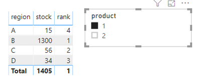
If the sample data are my filter results then the rank will be something like that:
region | stock
| rank |
A | 15 | 4 |
B | 1300 | 1 |
| C | 56 | 2 |
| D | 34 | 3 |
So if I set in put in the chart color saturation by sum of stock the map will be red on 3 region and green just in one because the difference between the first one and the second are very big. If I put color saturation by this rank that I don't know how to calculate in power bi then all 4 regions will have a distinct color something like green, yellow, orange, red. This way I can see the differences between the smaller regions more clearly.
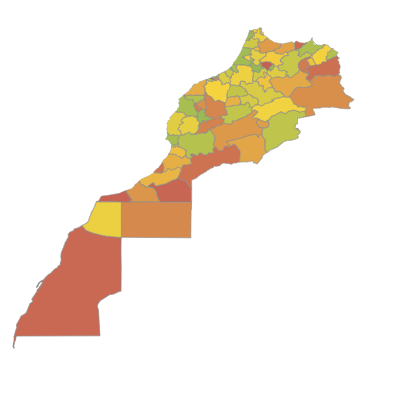
On the real data I want to rank them from 1 to n (number of regions) and the map will be something like that, each region with a different shade representing that rank. I did this map by aggregating them in the database and rank that, but this does not help me because I need to be able to change filters before aggregation.
- Mark as New
- Bookmark
- Subscribe
- Mute
- Subscribe to RSS Feed
- Permalink
- Report Inappropriate Content
Hi @Valerica_G ,
Please check the measures below.
Measure = SUM('Table'[stock])
rank = RANKX(ALLSELECTED('Table'[region]),[Measure],,DESC)
Result would be shown as below.
Best Regards,
Jay
Community Support Team _ Jay Wang
If this post helps, then please consider Accept it as the solution to help the other members find it more quickly.
If this post helps, then please consider Accept it as the solution to help the other members find it.
Helpful resources

Microsoft Fabric Learn Together
Covering the world! 9:00-10:30 AM Sydney, 4:00-5:30 PM CET (Paris/Berlin), 7:00-8:30 PM Mexico City

Power BI Monthly Update - April 2024
Check out the April 2024 Power BI update to learn about new features.

| User | Count |
|---|---|
| 109 | |
| 98 | |
| 80 | |
| 64 | |
| 57 |
| User | Count |
|---|---|
| 145 | |
| 111 | |
| 92 | |
| 84 | |
| 66 |


