- Power BI forums
- Updates
- News & Announcements
- Get Help with Power BI
- Desktop
- Service
- Report Server
- Power Query
- Mobile Apps
- Developer
- DAX Commands and Tips
- Custom Visuals Development Discussion
- Health and Life Sciences
- Power BI Spanish forums
- Translated Spanish Desktop
- Power Platform Integration - Better Together!
- Power Platform Integrations (Read-only)
- Power Platform and Dynamics 365 Integrations (Read-only)
- Training and Consulting
- Instructor Led Training
- Dashboard in a Day for Women, by Women
- Galleries
- Community Connections & How-To Videos
- COVID-19 Data Stories Gallery
- Themes Gallery
- Data Stories Gallery
- R Script Showcase
- Webinars and Video Gallery
- Quick Measures Gallery
- 2021 MSBizAppsSummit Gallery
- 2020 MSBizAppsSummit Gallery
- 2019 MSBizAppsSummit Gallery
- Events
- Ideas
- Custom Visuals Ideas
- Issues
- Issues
- Events
- Upcoming Events
- Community Blog
- Power BI Community Blog
- Custom Visuals Community Blog
- Community Support
- Community Accounts & Registration
- Using the Community
- Community Feedback
Register now to learn Fabric in free live sessions led by the best Microsoft experts. From Apr 16 to May 9, in English and Spanish.
- Power BI forums
- Forums
- Get Help with Power BI
- Desktop
- graphic formatting
- Subscribe to RSS Feed
- Mark Topic as New
- Mark Topic as Read
- Float this Topic for Current User
- Bookmark
- Subscribe
- Printer Friendly Page
- Mark as New
- Bookmark
- Subscribe
- Mute
- Subscribe to RSS Feed
- Permalink
- Report Inappropriate Content
graphic formatting
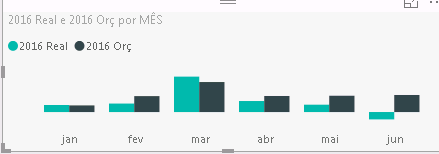
Hello , could you help me?
I would like to make a formatting as follows on the chart. If the ' 2016 orc ' column is greater than the column ' 2016 Real' column turns red if it is lower is green . Does anyone know any way that I can do this ?
Solved! Go to Solution.
- Mark as New
- Bookmark
- Subscribe
- Mute
- Subscribe to RSS Feed
- Permalink
- Report Inappropriate Content
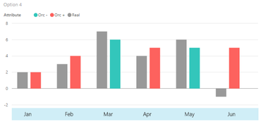
Hi... sharing with you my attempt. This is not really a straight-forward solution, so this is more of a work-around to approximate the visualization preferred.
Basically, I've split the column with preferred conditional formatting (apologies, not sure which column, hence the sample snapshots are for either of the two) into 2 separate columns (or attributes), i.e. with (+) and (-). And then transformed the dataset using the 'unpivot' facility thereby converting the data-value columns into "attribute" and "value" data fields instead. Then charting them using the stacked columnar visual, with 3 rows set per month (1 row for the conditional columns/attribute, 1 for the fixed column, and 1 as buffer/spacer). The x-labels though are just plain text-box overriding the otherwise 'non-user-friendly' captions which are 'programmatic' labelling used to effect the grouping of stacked bars per month.
Just in case the sample pbix files are here and here.
- Mark as New
- Bookmark
- Subscribe
- Mute
- Subscribe to RSS Feed
- Permalink
- Report Inappropriate Content
Roeder , great alternative . I liked very good implemented method , enjoyed the tes2 , option 2 . But I think the middle of concern in a BI tool terms to use artificial methods to achieve a result , it is the basic of a BI tool. I think it's not such complexity deploy it. If not so advanced and pressed for deliveries of dashboards , I would resign this platform. I think she has a lot to grow, but to grow giving priority to basic concepts like this that I exposed . Roeder , thank you ..
- Mark as New
- Bookmark
- Subscribe
- Mute
- Subscribe to RSS Feed
- Permalink
- Report Inappropriate Content
ur welcome mr walnei... indeed there's still a lot of promise for this platform, and I would rather stick and grow in knowledge with it for a while as well. Other than qlik-sense, there's just no other online BI facility that covers as much feature-sets and as practically accessible to me for now (regardless of its frustrating if not challenging limitations).
- Mark as New
- Bookmark
- Subscribe
- Mute
- Subscribe to RSS Feed
- Permalink
- Report Inappropriate Content
Alguém consegue ajudar?
- Mark as New
- Bookmark
- Subscribe
- Mute
- Subscribe to RSS Feed
- Permalink
- Report Inappropriate Content
Voce Puede poner formato condicional.. Jejejej fale en 3 idiomas, con algunas palabras en portuñol!'
- Mark as New
- Bookmark
- Subscribe
- Mute
- Subscribe to RSS Feed
- Permalink
- Report Inappropriate Content
Yes, but I wanted to make conditional formatting comparing a metric with the other
- Mark as New
- Bookmark
- Subscribe
- Mute
- Subscribe to RSS Feed
- Permalink
- Report Inappropriate Content
Hey walnei,
for or this you need to create a new measure that takes care of that I guess. Have you tried that?
- Mark as New
- Bookmark
- Subscribe
- Mute
- Subscribe to RSS Feed
- Permalink
- Report Inappropriate Content
fabianhenzler , thanks but this tutorial does not help me . The precise format that is comparing two different dimensions to the image
- Mark as New
- Bookmark
- Subscribe
- Mute
- Subscribe to RSS Feed
- Permalink
- Report Inappropriate Content
Help?
Helpful resources

Microsoft Fabric Learn Together
Covering the world! 9:00-10:30 AM Sydney, 4:00-5:30 PM CET (Paris/Berlin), 7:00-8:30 PM Mexico City

Power BI Monthly Update - April 2024
Check out the April 2024 Power BI update to learn about new features.

| User | Count |
|---|---|
| 117 | |
| 105 | |
| 69 | |
| 67 | |
| 43 |
| User | Count |
|---|---|
| 151 | |
| 103 | |
| 102 | |
| 87 | |
| 63 |


