- Power BI forums
- Updates
- News & Announcements
- Get Help with Power BI
- Desktop
- Service
- Report Server
- Power Query
- Mobile Apps
- Developer
- DAX Commands and Tips
- Custom Visuals Development Discussion
- Health and Life Sciences
- Power BI Spanish forums
- Translated Spanish Desktop
- Power Platform Integration - Better Together!
- Power Platform Integrations (Read-only)
- Power Platform and Dynamics 365 Integrations (Read-only)
- Training and Consulting
- Instructor Led Training
- Dashboard in a Day for Women, by Women
- Galleries
- Community Connections & How-To Videos
- COVID-19 Data Stories Gallery
- Themes Gallery
- Data Stories Gallery
- R Script Showcase
- Webinars and Video Gallery
- Quick Measures Gallery
- 2021 MSBizAppsSummit Gallery
- 2020 MSBizAppsSummit Gallery
- 2019 MSBizAppsSummit Gallery
- Events
- Ideas
- Custom Visuals Ideas
- Issues
- Issues
- Events
- Upcoming Events
- Community Blog
- Power BI Community Blog
- Custom Visuals Community Blog
- Community Support
- Community Accounts & Registration
- Using the Community
- Community Feedback
Register now to learn Fabric in free live sessions led by the best Microsoft experts. From Apr 16 to May 9, in English and Spanish.
- Power BI forums
- Forums
- Get Help with Power BI
- Desktop
- graph with dynamic start and end form selected row
- Subscribe to RSS Feed
- Mark Topic as New
- Mark Topic as Read
- Float this Topic for Current User
- Bookmark
- Subscribe
- Printer Friendly Page
- Mark as New
- Bookmark
- Subscribe
- Mute
- Subscribe to RSS Feed
- Permalink
- Report Inappropriate Content
graph with dynamic start and end form selected row
Hey Guys
I have tried to make a solution and/or searching for on without any luck.
I have a dataset starttime and endtime (datetime (datetime)) for each product ID from a machine.
I have another dataset with temperatures and a timestamp (datetime) for the logging time.
I want to have a table with all the product ID and start/end time. when I select one a graph should show be the temperature within starttime and endtime
do I need to have a dynamic table with the datetime in bewteeen, or how can I do this
Thanks
Kristian
Solved! Go to Solution.
- Mark as New
- Bookmark
- Subscribe
- Mute
- Subscribe to RSS Feed
- Permalink
- Report Inappropriate Content
Hi, @Kristianhk
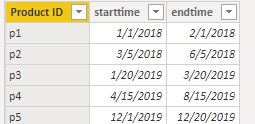
Based on your description, I created data to reproduce your scenario.
Table:
DateTable:
DateTable = CALENDARAUTO()
Then you may create a measure as follows.
IsDisplay =
var _currentproduct = SELECTEDVALUE('Table'[Product ID])
var _currentdate = MIN(DateTable[Date])

return
IF(
        _currentproduct<>BLANK(),
        IF(
            _currentdate <= VALUES('Table'[endtime])&&
            _currentdate >= VALUES('Table'[starttime]),
            1,
            0
        )
)
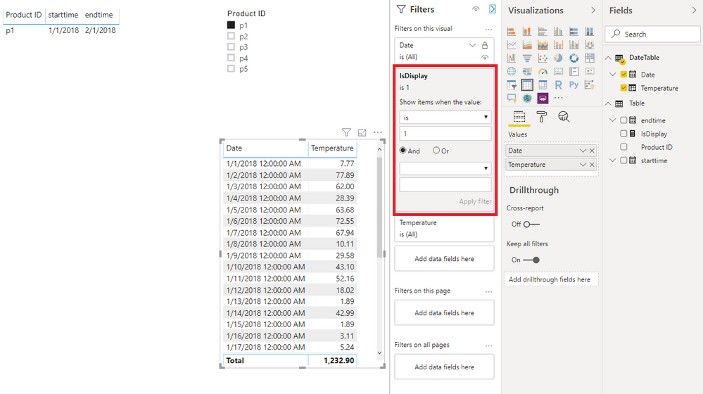
Finally, you may put the measure in the visual level filter. Here is the result.
If I misunderstand your thought, please show me your sample data and expected output. Do mask sensitive data before uploading. I am glad to solve the problem for you.
Best Regards
Allan
If this post helps, then please consider Accept it as the solution to help the other members find it more quickly.
- Mark as New
- Bookmark
- Subscribe
- Mute
- Subscribe to RSS Feed
- Permalink
- Report Inappropriate Content
Hi Allan (@v-alq-msft)
I got it working!
I changed
_currentdate = MIN(DateTable[Date])to
_currentdate = MIN(Temperatures[Date])
and then it worked like a charm!!.. I did not need a DateTable after all
thank you for your help
- Mark as New
- Bookmark
- Subscribe
- Mute
- Subscribe to RSS Feed
- Permalink
- Report Inappropriate Content
Hi Allan
I ams orry for the very late reply. I think you are on the right track to solve the issue. however the filtered table with temperatures is blank when I put on the IsDisplay filter. I think the issue is that my start time and end time are having the format datetime and the IsDisplay are looking at dates and 12:00 AM.
how to fix?
best regards
Kristian
- Mark as New
- Bookmark
- Subscribe
- Mute
- Subscribe to RSS Feed
- Permalink
- Report Inappropriate Content
Hi, @Kristianhk
You may change the data type to datatime in the 'Modeling' ribbon .
Best Regards
Allan
- Mark as New
- Bookmark
- Subscribe
- Mute
- Subscribe to RSS Feed
- Permalink
- Report Inappropriate Content
One of the ways is to bring the temperature into the table having the product. This can be done with a formula similar to one given below. But you will be able to bring min or max temperature during that time. Not all
A new Column in table 1 = minx(filter(table2,table1[col1] =table2[col1] && table1[col2] =table2[col2]),table1[col4])

A new Column in table 1 = maxx(filter(table2,table1[col1] =table2[col1] && table1[col2] =table2[col2]),table1[col4])
Appreciate your Kudos. In case, this is the solution you are looking for, mark it as the Solution. In case it does not help, please provide additional information and mark me with @
Thanks. My Recent Blog -
Winner-Topper-on-Map-How-to-Color-States-on-a-Map-with-Winners , HR-Analytics-Active-Employee-Hire-and-Termination-trend
Power-BI-Working-with-Non-Standard-Time-Periods And Comparing-Data-Across-Date-Ranges
Connect on Linkedin
Microsoft Power BI Learning Resources, 2023 !!
Learn Power BI - Full Course with Dec-2022, with Window, Index, Offset, 100+ Topics !!
Did I answer your question? Mark my post as a solution! Appreciate your Kudos !! Proud to be a Super User! !!
- Mark as New
- Bookmark
- Subscribe
- Mute
- Subscribe to RSS Feed
- Permalink
- Report Inappropriate Content
Hi @amitchandak
thank you for your answer,
I have not tried your solution yet what I want is every temperature readings within the start end time for the selected product.
table A:
Start datetime | End datetime | machine ID | Product ID | ............
table B:
datetime | machine ID | Product ID | Temperature
so when I select a row in table A I want a graph showing me all temperatures (table B) between start time and end time for that machine
- Mark as New
- Bookmark
- Subscribe
- Mute
- Subscribe to RSS Feed
- Permalink
- Report Inappropriate Content
Please check how we created active employees in this blog. The same way you should able to get all the temperature.
HR-Analytics-Active-Employee-Hire-and-Termination-trend
Microsoft Power BI Learning Resources, 2023 !!
Learn Power BI - Full Course with Dec-2022, with Window, Index, Offset, 100+ Topics !!
Did I answer your question? Mark my post as a solution! Appreciate your Kudos !! Proud to be a Super User! !!
Helpful resources

Microsoft Fabric Learn Together
Covering the world! 9:00-10:30 AM Sydney, 4:00-5:30 PM CET (Paris/Berlin), 7:00-8:30 PM Mexico City

Power BI Monthly Update - April 2024
Check out the April 2024 Power BI update to learn about new features.

| User | Count |
|---|---|
| 110 | |
| 94 | |
| 80 | |
| 66 | |
| 58 |
| User | Count |
|---|---|
| 150 | |
| 119 | |
| 104 | |
| 87 | |
| 67 |


