- Power BI forums
- Updates
- News & Announcements
- Get Help with Power BI
- Desktop
- Service
- Report Server
- Power Query
- Mobile Apps
- Developer
- DAX Commands and Tips
- Custom Visuals Development Discussion
- Health and Life Sciences
- Power BI Spanish forums
- Translated Spanish Desktop
- Power Platform Integration - Better Together!
- Power Platform Integrations (Read-only)
- Power Platform and Dynamics 365 Integrations (Read-only)
- Training and Consulting
- Instructor Led Training
- Dashboard in a Day for Women, by Women
- Galleries
- Community Connections & How-To Videos
- COVID-19 Data Stories Gallery
- Themes Gallery
- Data Stories Gallery
- R Script Showcase
- Webinars and Video Gallery
- Quick Measures Gallery
- 2021 MSBizAppsSummit Gallery
- 2020 MSBizAppsSummit Gallery
- 2019 MSBizAppsSummit Gallery
- Events
- Ideas
- Custom Visuals Ideas
- Issues
- Issues
- Events
- Upcoming Events
- Community Blog
- Power BI Community Blog
- Custom Visuals Community Blog
- Community Support
- Community Accounts & Registration
- Using the Community
- Community Feedback
Register now to learn Fabric in free live sessions led by the best Microsoft experts. From Apr 16 to May 9, in English and Spanish.
- Power BI forums
- Forums
- Get Help with Power BI
- Desktop
- Re: getting power BI tooltips on Deneb line chart
- Subscribe to RSS Feed
- Mark Topic as New
- Mark Topic as Read
- Float this Topic for Current User
- Bookmark
- Subscribe
- Printer Friendly Page
- Mark as New
- Bookmark
- Subscribe
- Mute
- Subscribe to RSS Feed
- Permalink
- Report Inappropriate Content
getting power BI tooltips on Deneb line chart
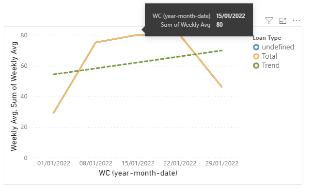
I'm using the wonderful Deneb custom visual, but don't seem to be able to get power bi tooltips on a line chart - hopefully with drill through. it works fine on a bar chart, but lines seem to not care how much i hover and where.
any hints?
#deneb #customVis
- Mark as New
- Bookmark
- Subscribe
- Mute
- Subscribe to RSS Feed
- Permalink
- Report Inappropriate Content
ok, so i think that my issue is with me using an aggregate in my mark encoding. looks like the tooltip won't appear if you do this:
"y": {
"field": "Weekly Avg Enquiries",
"aggregate": "sum"
},
- Mark as New
- Bookmark
- Subscribe
- Mute
- Subscribe to RSS Feed
- Permalink
- Report Inappropriate Content
Hi @jonespossibly ,
Please add "tooltip": true to your code:
{
  "data": {"name": "dataset"},
  "layer": [
    {
      "mark": {"type": "line","tooltip": true},
      "encoding": {
        "y": {
          "field": "Weekly Avg"
        },
        "color": {
          "field": "Loan Type",
          "scale": {
            "range": [
              "#4795CA",
              "#F9B96A",
              "#779E41",
              "#F54f0F",
              "#cfcfcf"
            ]
          }
        }
      }
    },
    {
      "mark": {"type": "line","tooltip": true},
      "encoding": {
        "y": {
          "field": "Weekly Avg",
          "aggregate": "sum"
        },

        "color": {"datum": "Total"}
      }
    },
    {
      "mark": {
        "type": "line",
        "strokeDash": [5, 5]
      },
      "transform": [
        {
          "regression": "Weekly Avg",
          "on": "WC",
          "groupBy": "WC"

        }
      ],
      "encoding": {
        "y": {
          "field": "Weekly Avg"
        },
        "color": {"datum": "Trend"}
      }
    }
  ],
  "encoding": {
    "x": {
      "field": "WC",
      "timeUnit": "monthdateyear",
      "type": "ordinal",
      "axis": {"format": "%d/%m/%Y"}
    },
    "y": {
      "type": "quantitative",
      "axis": {"format": "~s"}
    }
  }
}
If the problem is still not resolved, please provide detailed error information or the expected result you expect. Let me know immediately, looking forward to your reply.
Best Regards,
Winniz
If this post helps, then please consider Accept it as the solution to help the other members find it more quickly.
- Mark as New
- Bookmark
- Subscribe
- Mute
- Subscribe to RSS Feed
- Permalink
- Report Inappropriate Content
It is finicky. You need to put the very tip of the mouse on where the points would be (and make sure you the "tooltip": true .
Pat
Did I answer your question? Mark my post as a solution! Kudos are also appreciated!
To learn more about Power BI, follow me on Twitter or subscribe on YouTube.
@mahoneypa HoosierBI on YouTube
Helpful resources

Microsoft Fabric Learn Together
Covering the world! 9:00-10:30 AM Sydney, 4:00-5:30 PM CET (Paris/Berlin), 7:00-8:30 PM Mexico City

Power BI Monthly Update - April 2024
Check out the April 2024 Power BI update to learn about new features.

| User | Count |
|---|---|
| 109 | |
| 99 | |
| 77 | |
| 66 | |
| 54 |
| User | Count |
|---|---|
| 144 | |
| 104 | |
| 101 | |
| 86 | |
| 64 |


